
悠后 元气蜂蜜水


BRAND:Yohoo 悠后
PROJECT MANAGER:Kevin、Gary Lau
DESIGNER:小万
3D EFFECT:Mega
YEAR:2021.12

The new packaging has enabled the product to rapidly expand its market territory and successfully enter premium supermarkets, chain convenience systems, new retail stores, Douyin e-commerce, and other online and offline channels. The differentiated visual design stands out among the numerous beverage shelves, significantly improving the terminal conversion rate, achieving a breakthrough growth in single-product sales, and successfully creating a highly potential health beverage hit product.

Yoohou focuses on the natural health beverage sector, aligning with the consumption trend of young people's light health care. It creates high-quality, burden-free natural beverages. The Energy Honey Water, as the brand's flagship new product, uses high-quality honey as the core ingredient, emphasizing natural sweetness and quick energy replenishment, targeting urban office workers and health-conscious young people. The product is suitable for various scenarios such as commuting, afternoon tea, outdoor outings, and after-meal refreshing, breaking away from the high-sugar beverage category and providing consumers with a natural, healthy, and refreshing honey beverage that can instantly revitalize their bodies and minds.

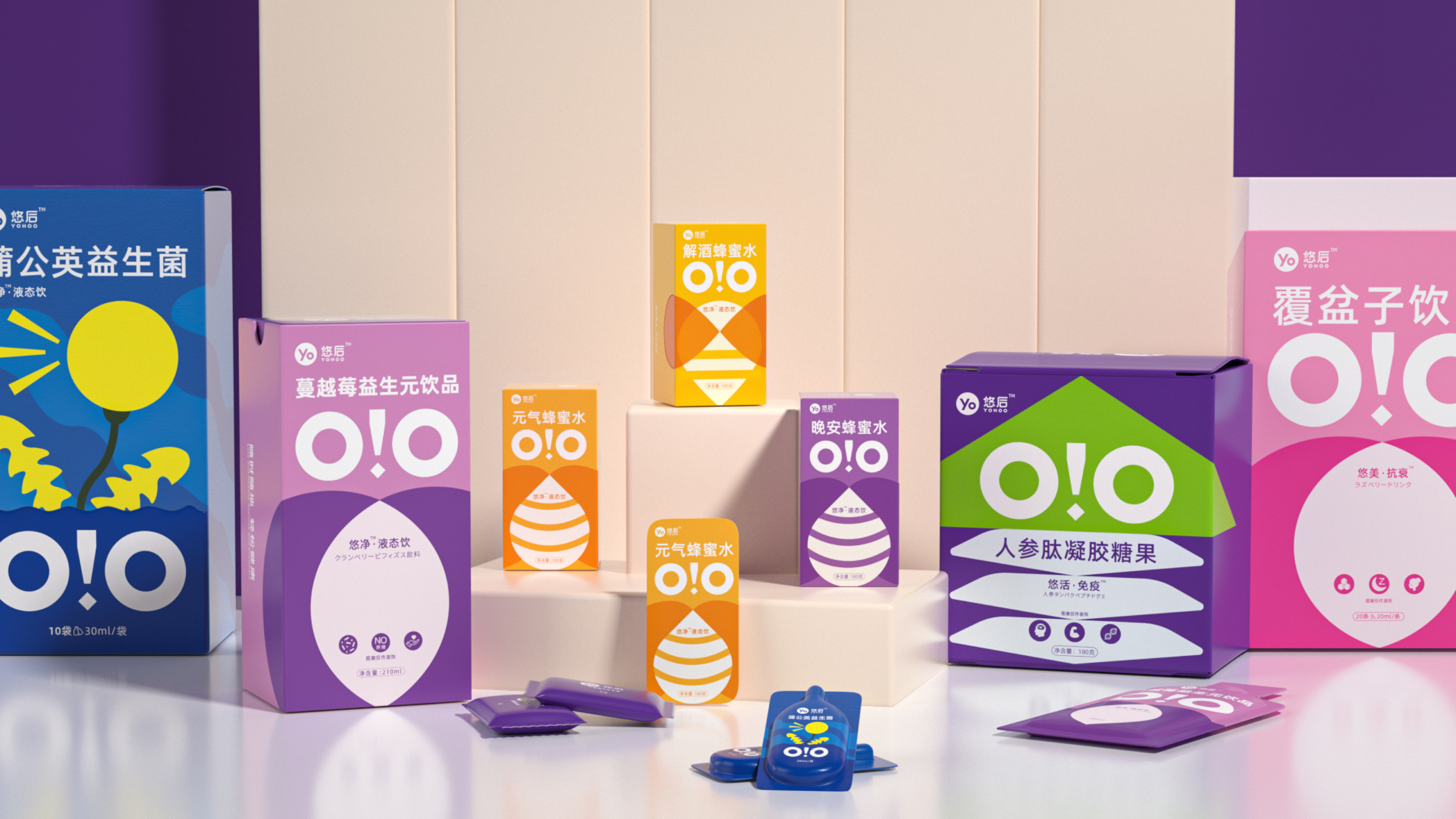
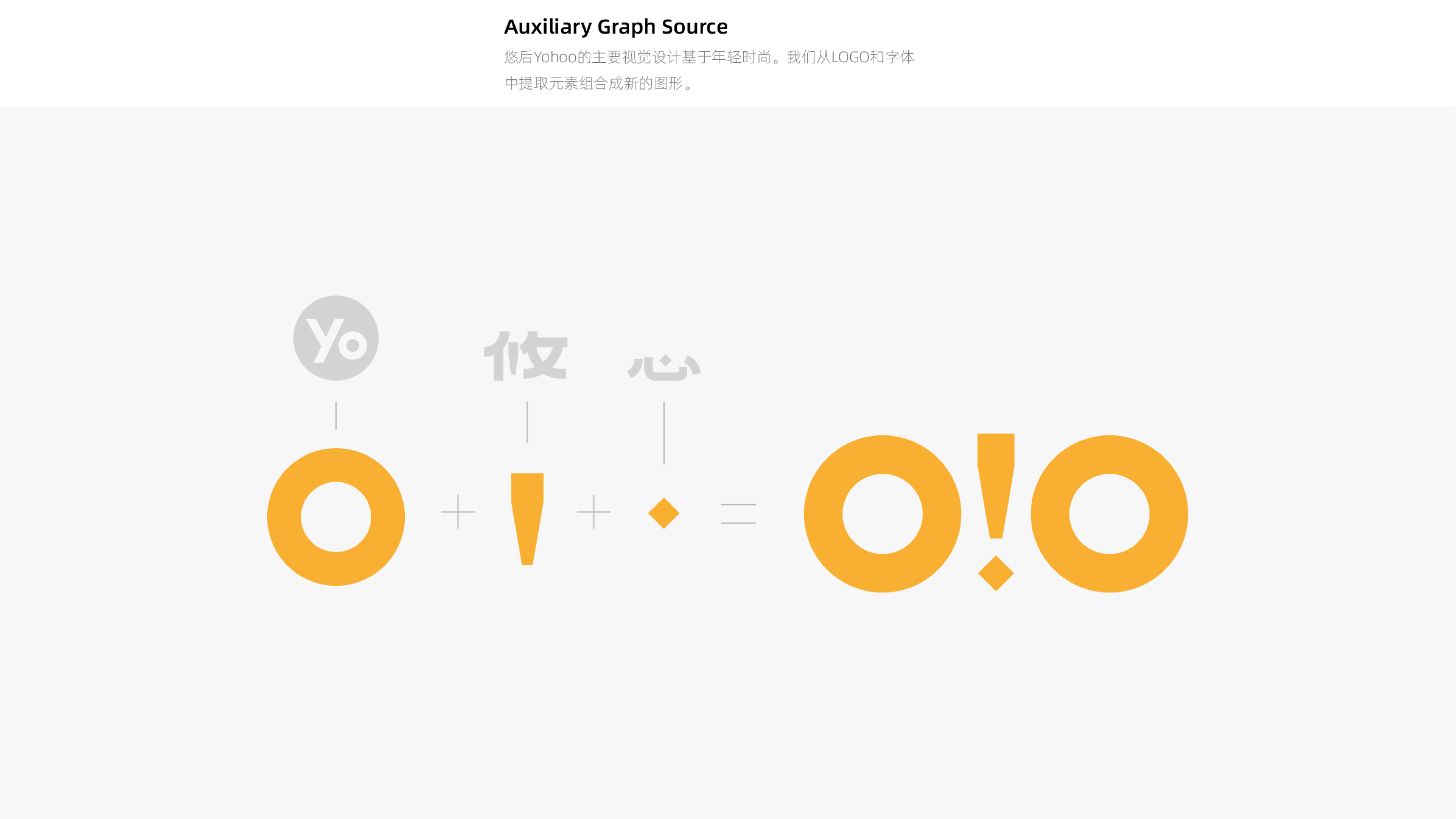
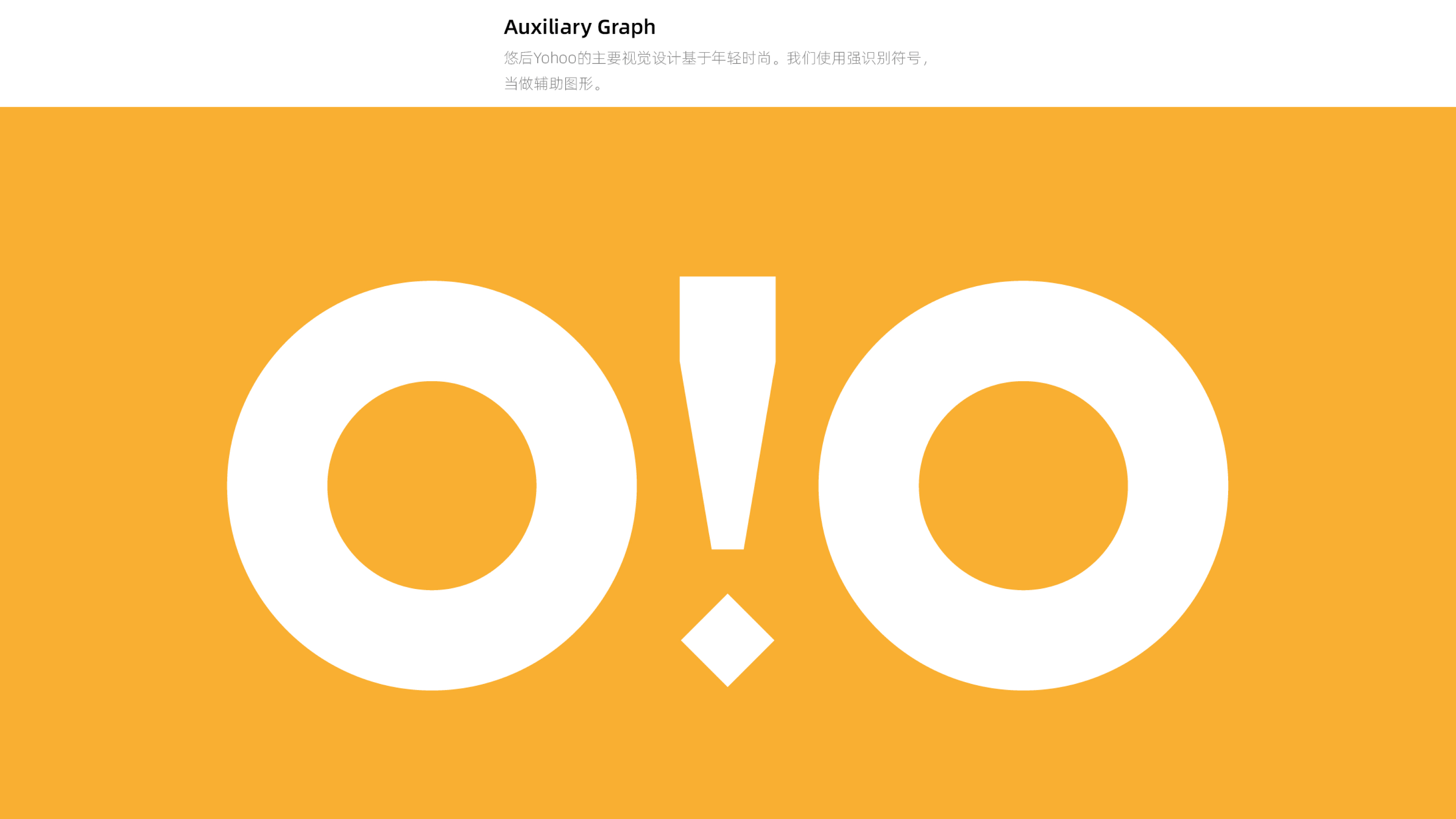
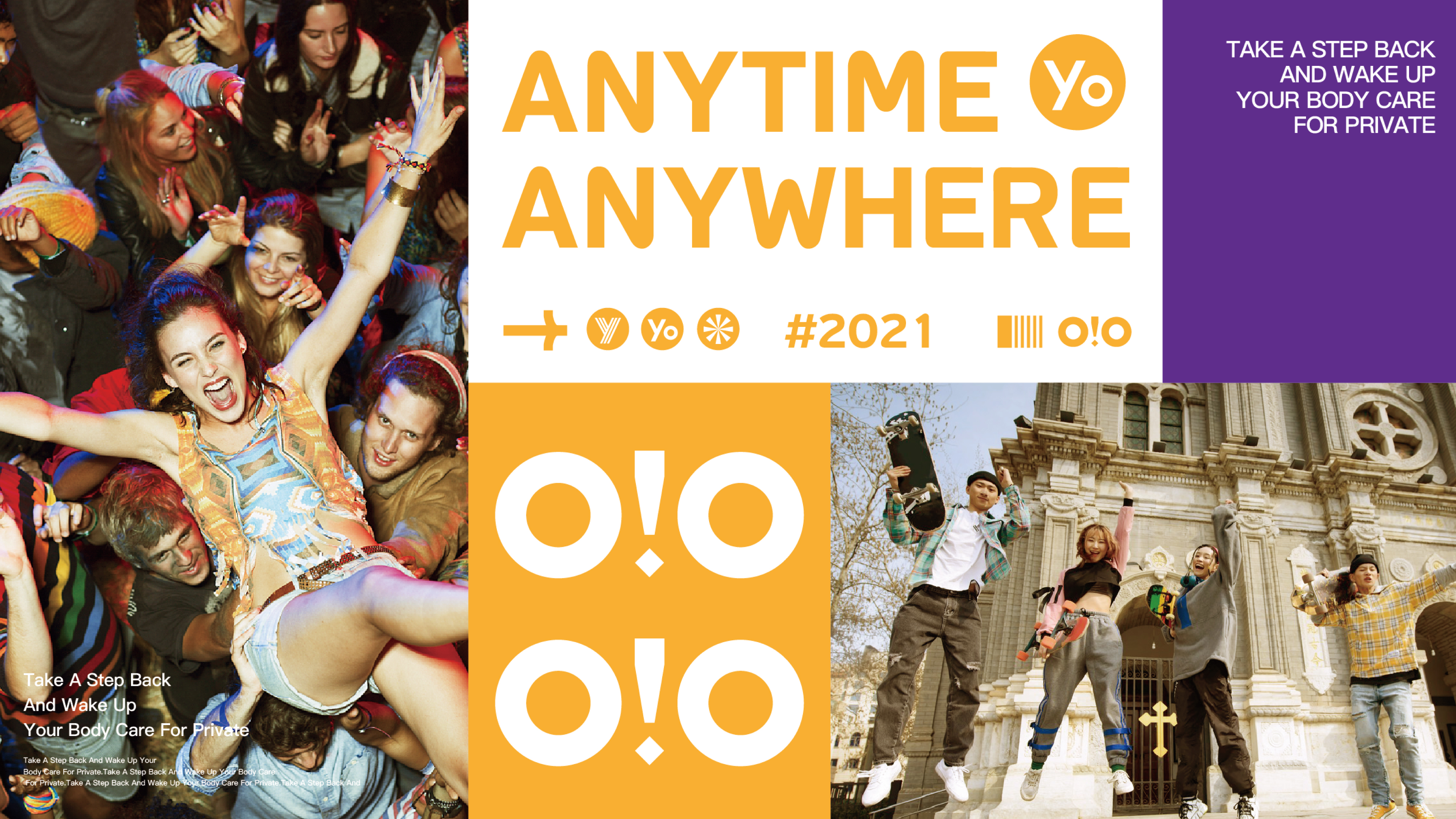
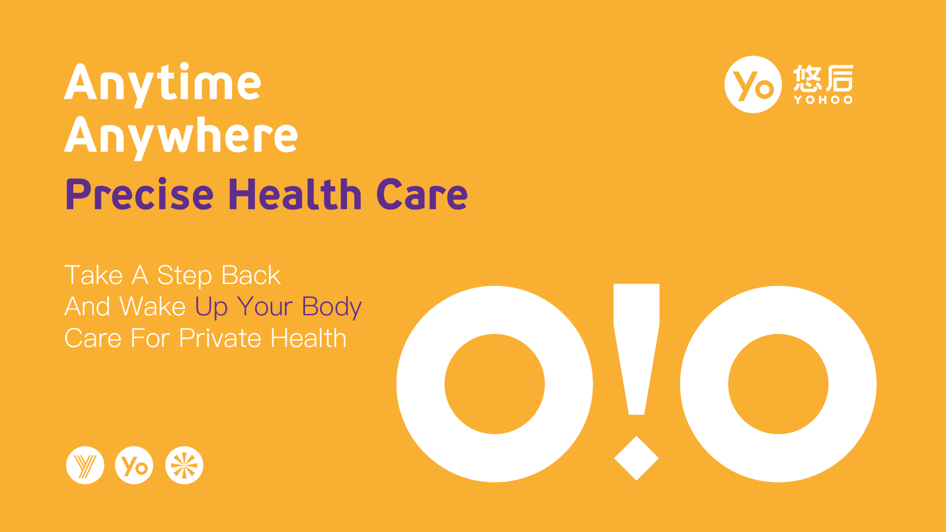
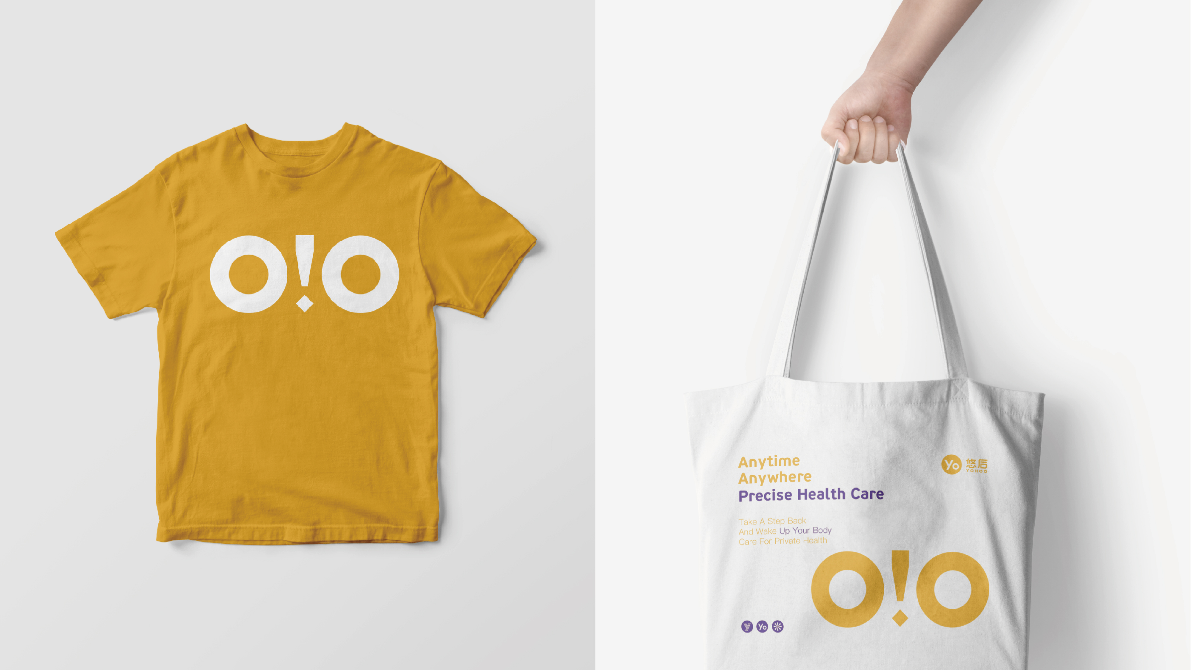
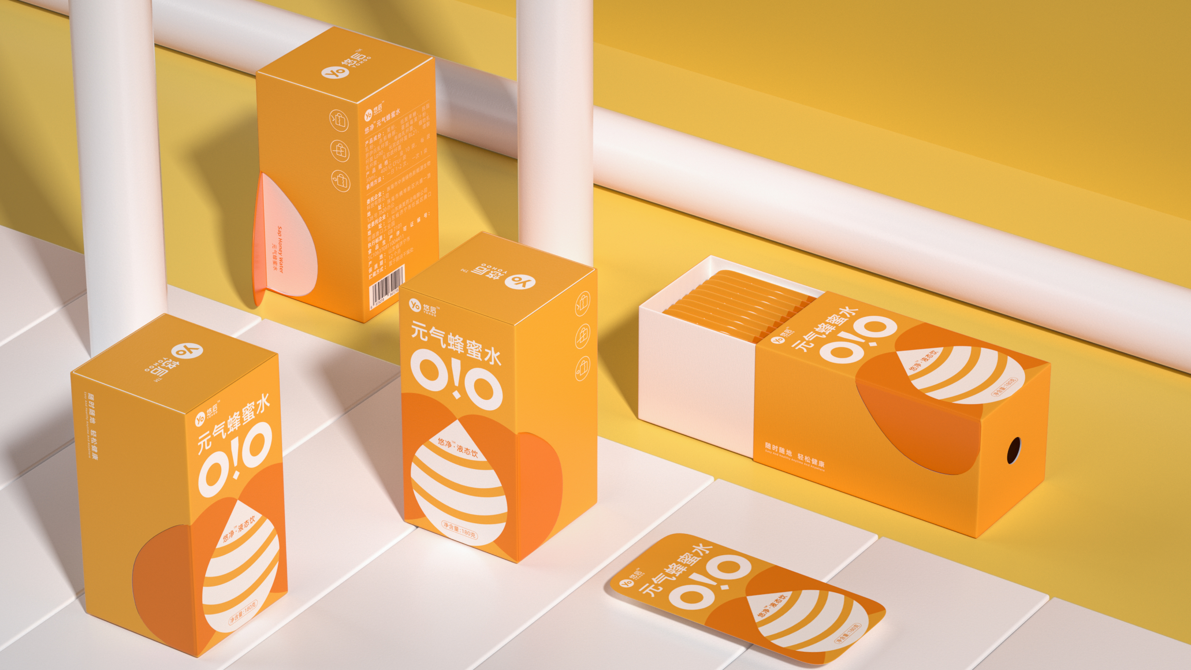
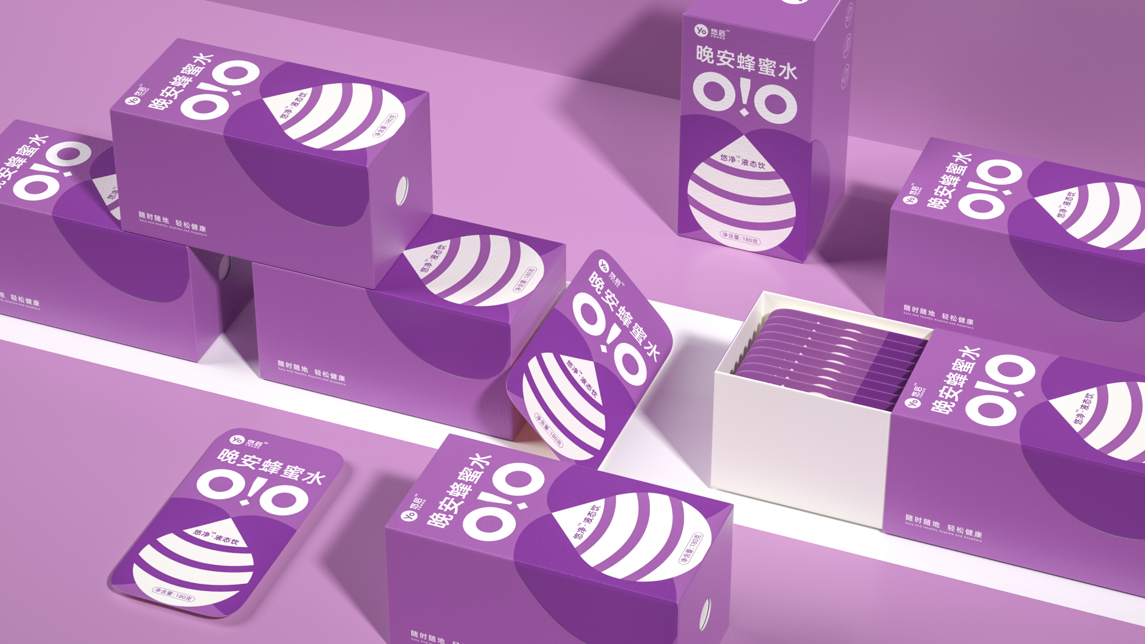
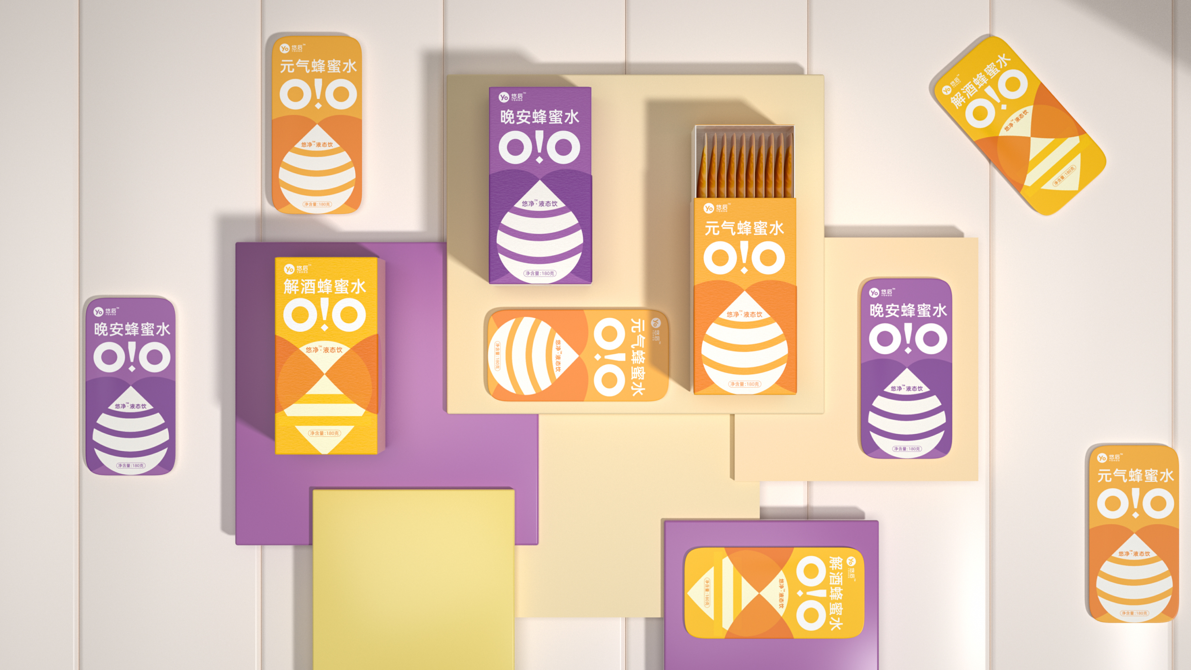
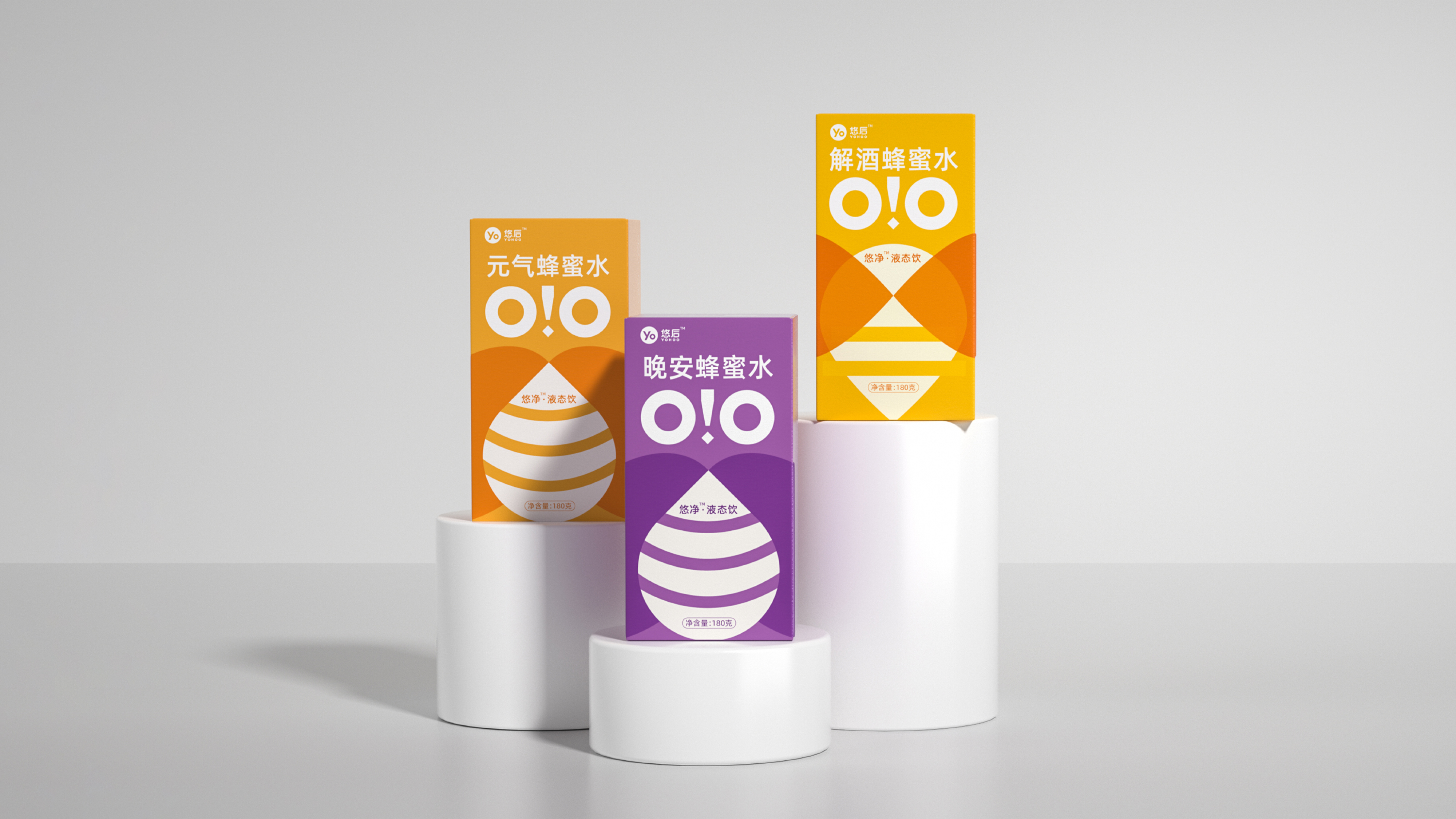
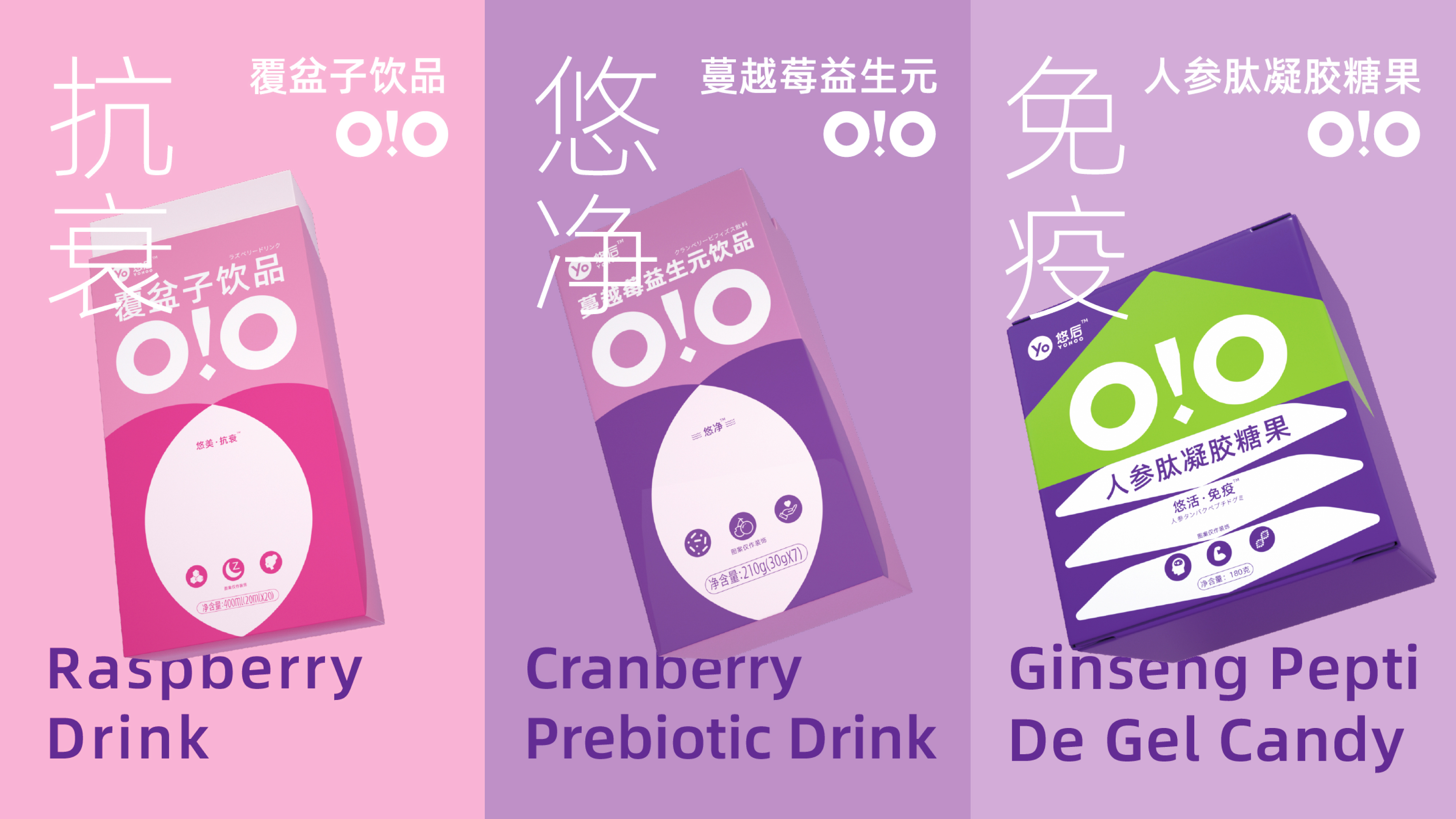
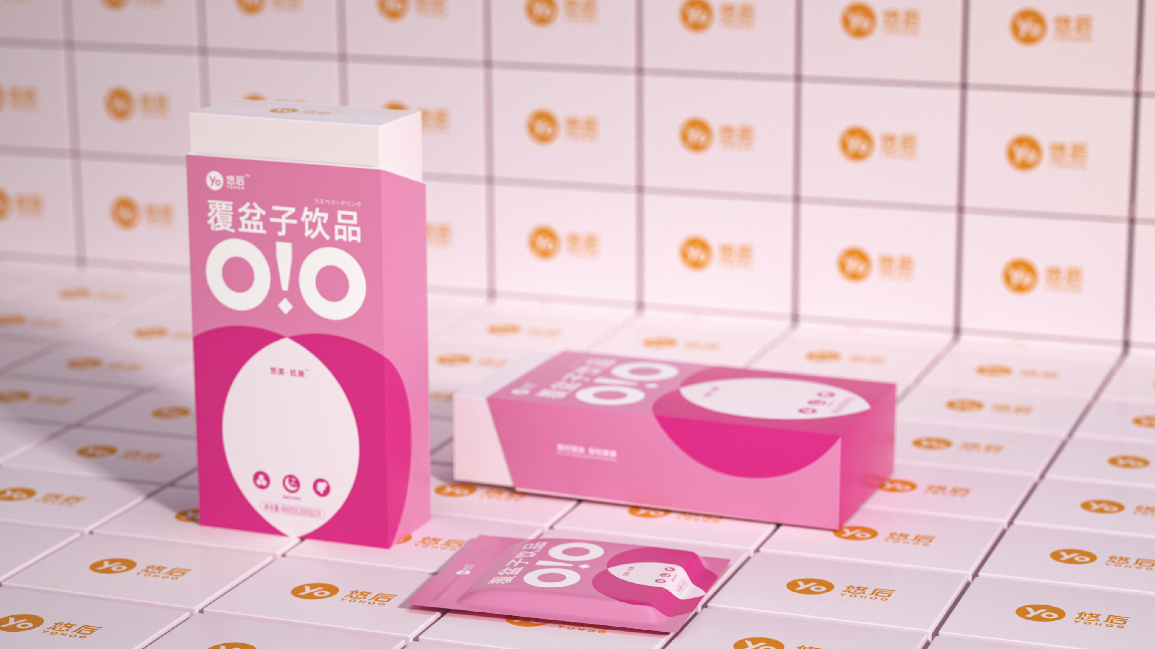
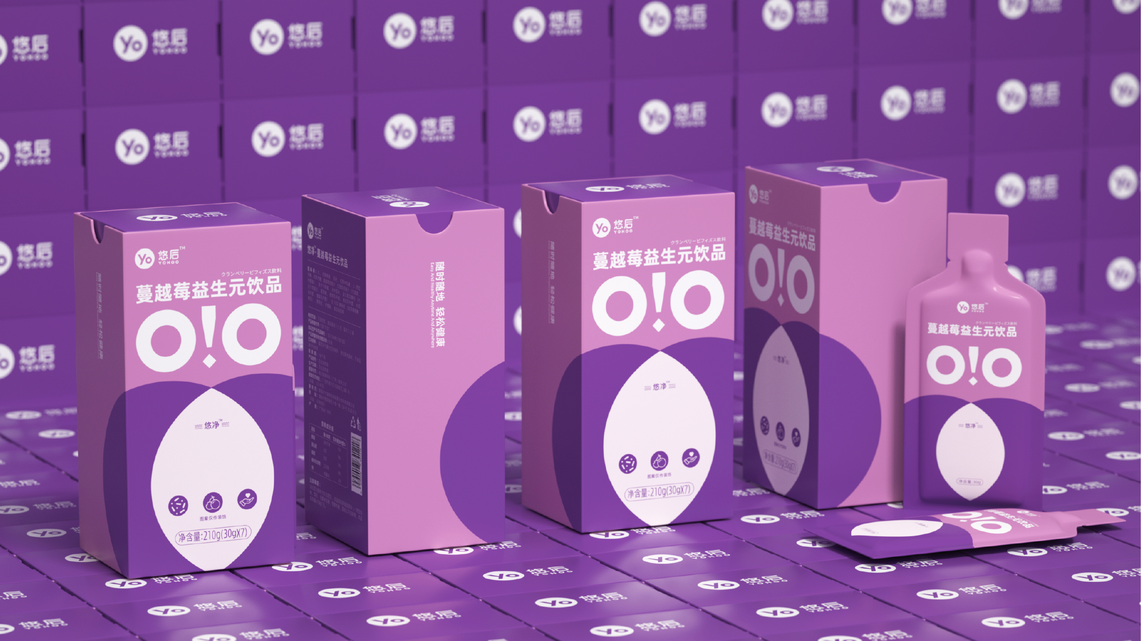
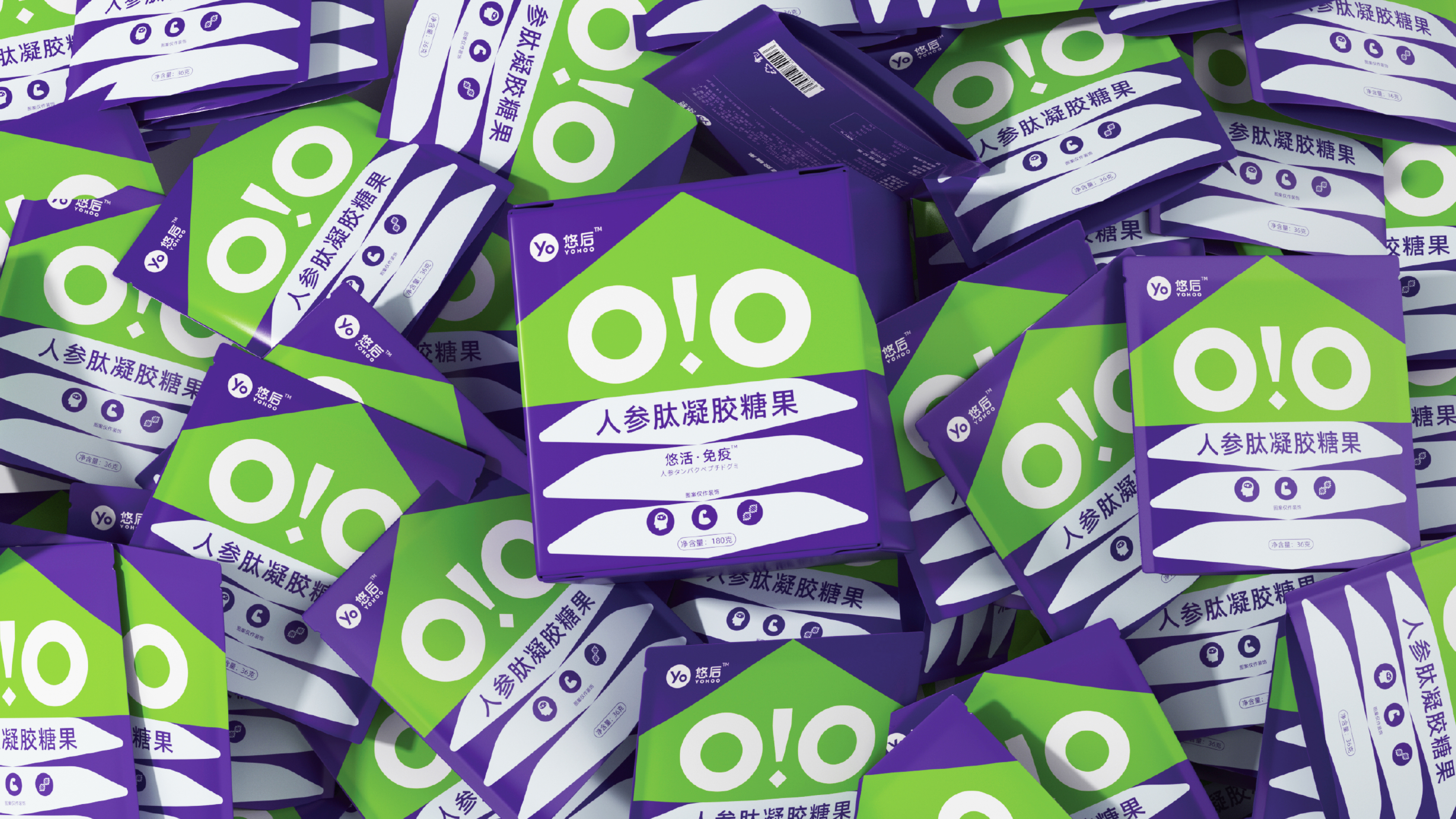
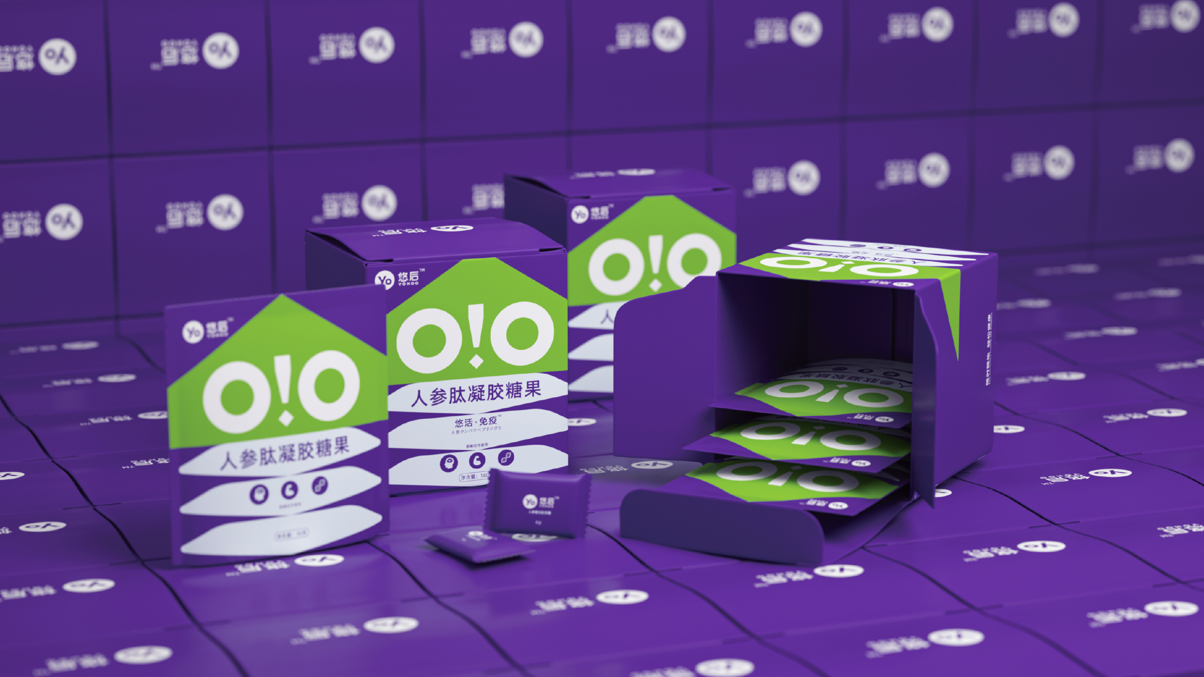
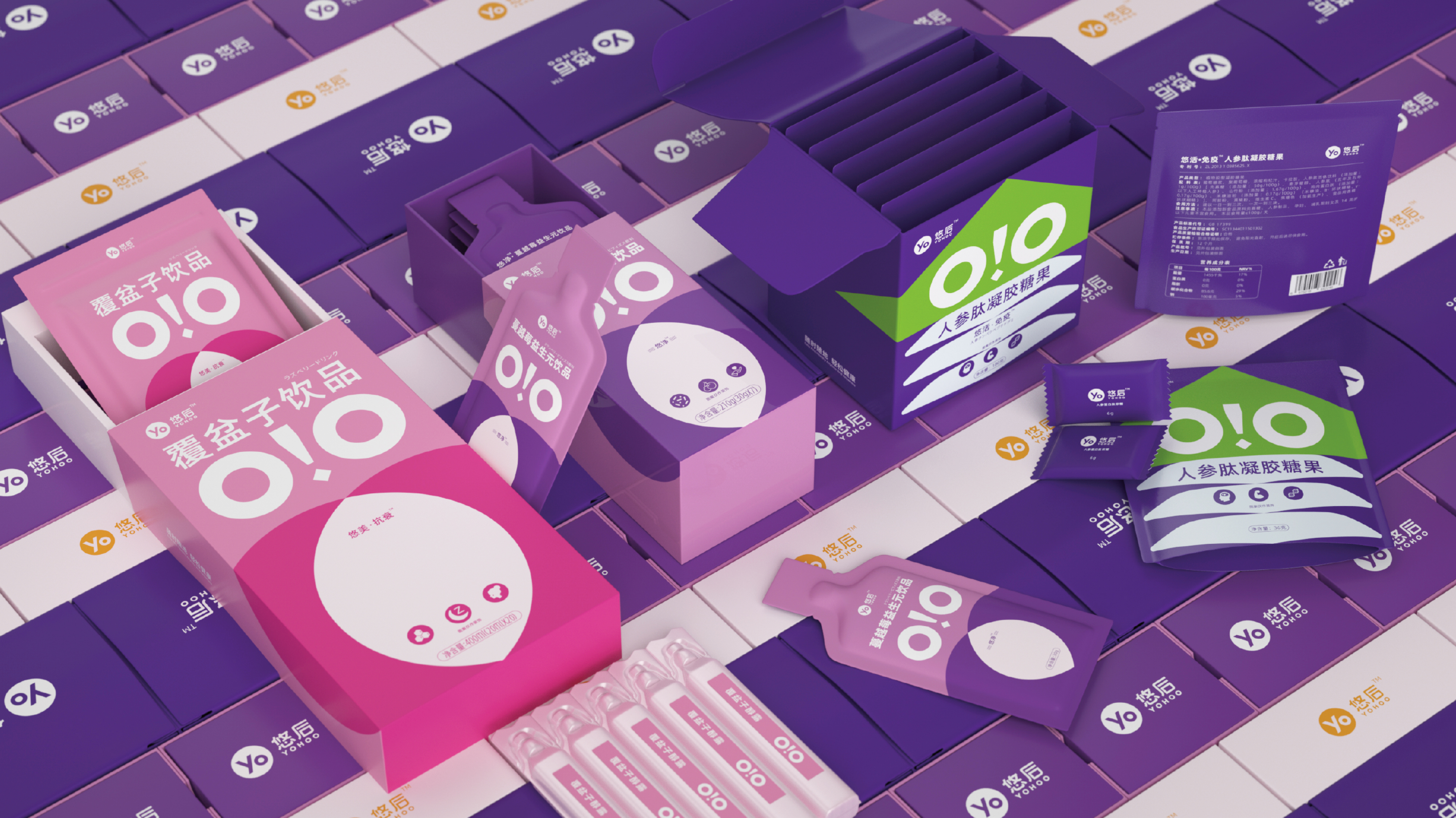
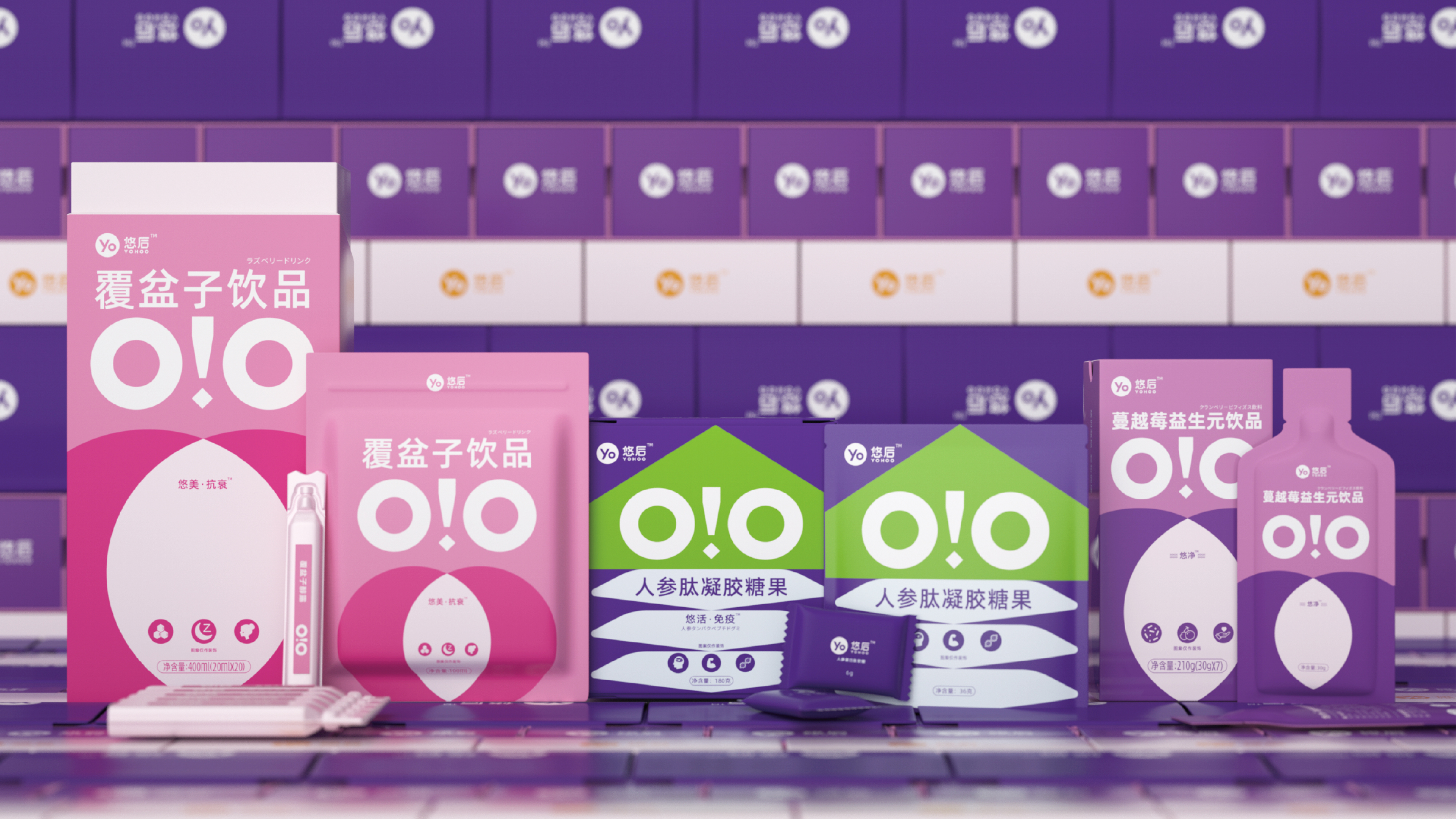
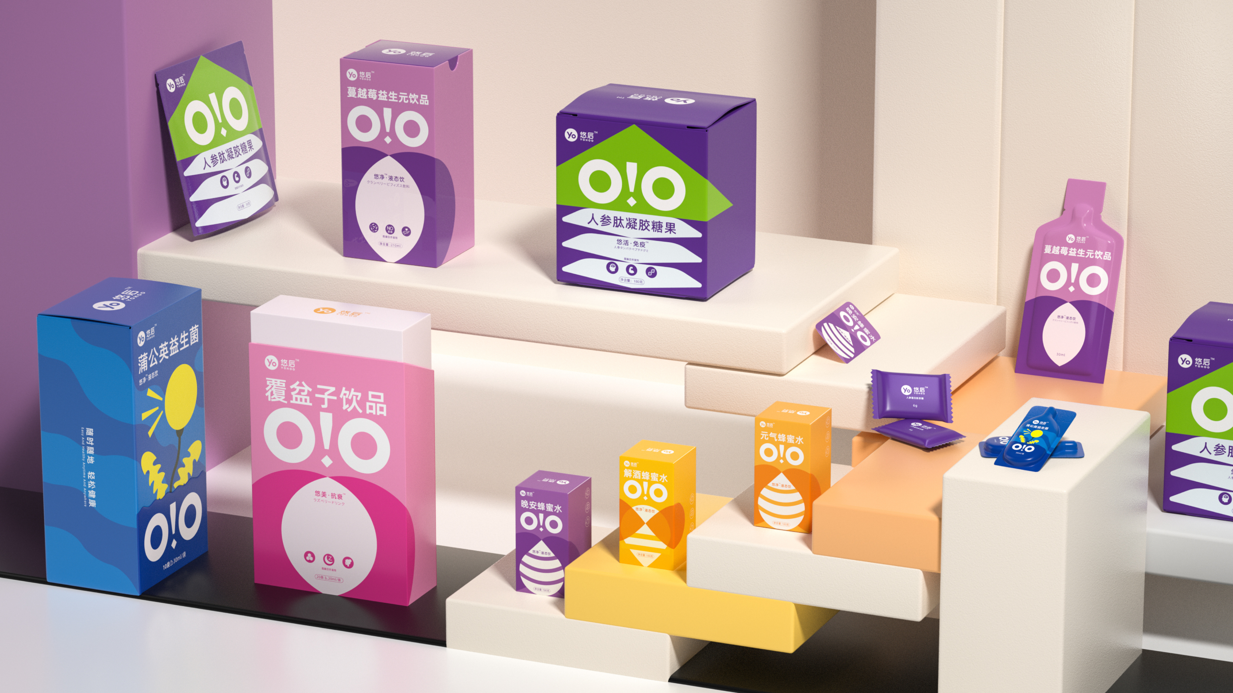
This packaging design is centered around the core themes of energy, nature, lightness, and healing. It delves into the product's natural and healthy essence of honey, avoiding the outdated and traditional visual patterns in the honey beverage market. Starting from the style of candy snacks, it aims to make Yoohou a shareable health food without psychological pressure. We designed an auxiliary graphic based on the owl's eyes for Yoohou, which is highly recognizable and memorable on any promotional page or layout, adding a touch of playfulness. The layout is simple and expansive, highlighting the health-boosting and rejuvenating product features of the Energy Honey Water, integrating natural and vibrant symbols to enhance the atmosphere of energy and vitality.

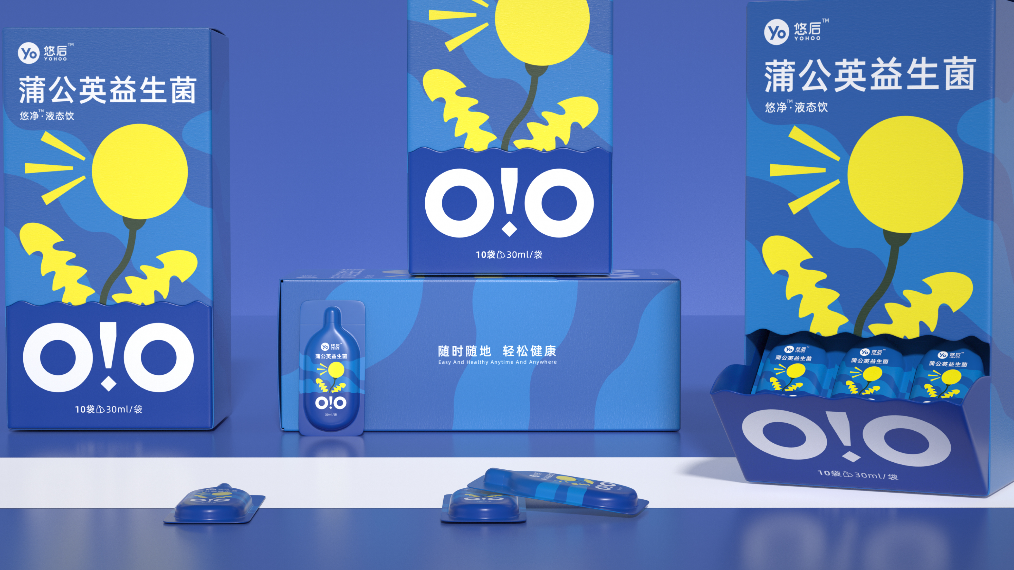
The entire visual design runs through the main visual of the bottle, the outer packaging, and e-commerce promotional materials, forming a unified and complete product visual system. This enables the product to have high recognition on the shelves, intuitively conveying the natural and lively product temperament, achieving a high degree of alignment between product positioning, visual expression, and the aesthetic preferences of target consumers.

全新包装赋能产品快速拓宽市场版图,成功打入精品商超、连锁便利系统、新零售门店、抖音电商等线上线下全渠道。差异化视觉在琳琅满目的饮品货架中脱颖而出,终端转化效果显著提升,单品销量迎来突破性增长,成功打造出一款极具长线潜力的健康饮品爆款。


悠后聚焦天然健康饮品赛道,顺应当代年轻人轻养生的消费趋势,打造高品质、无负担的天然饮品。元气蜂蜜水作为品牌主打新品,以优质蜂蜜为核心原料,主打天然清甜、快速补给元气,面向都市上班族、养生青年群体。产品适配通勤、下午茶、户外出行、餐后解腻等多场景饮用,跳出高糖饮料的赛道,为消费者提供一款自然健康、可以随时焕活身心的蜂蜜饮品。


本次包装设计围绕元气、自然、轻盈、治愈的核心调性展开创作。深挖蜂蜜天然健康的产品内核,避开市面上蜂蜜饮品老旧传统的视觉套路。以糖果零食的风格着手设计,想让悠后成为可以分享无心理压力的保健食品,我们根据猫头鹰的眼睛为悠后设计了辅助图形,在任何宣传页面或者版面都非常具有识别性和记忆程度,也增加了些许玩味。版面布局简约舒展,重点突出元气蜂蜜水健康焕活的产品卖点,视觉元素融入自然生机符号,强化元气、活力的氛围感。整套视觉贯穿瓶身主视觉、外包装、电商宣传物料,形成统一完整的产品视觉体系,让产品在货架上拥有极高辨识度,直观传递天然、鲜活的产品气质,实现产品定位、视觉表达与目标消费者审美的高度契合。


©® 2017-2026 MARVELLAND DESIGN & BASE IN HANGZHOU

美域盛华简介&联系我们 新闻 全部