
芊芳源 枇杷鲜梨膏
BRAND:芊芳源
PROJECT MANAGER:Kevin、Gary Lau
DESIGNER:燕子
3D EFFECT:君枫
YEAR:2023
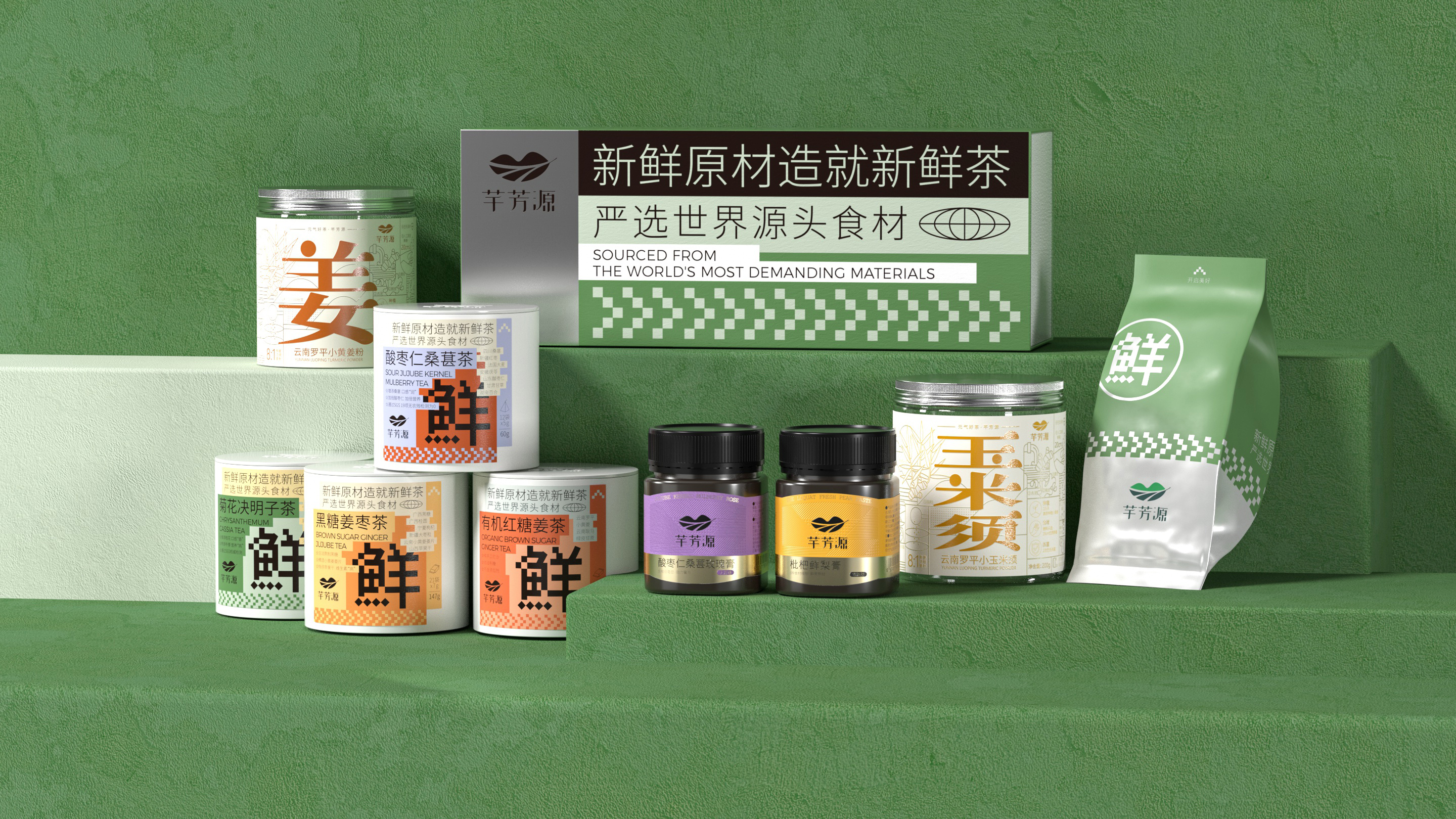
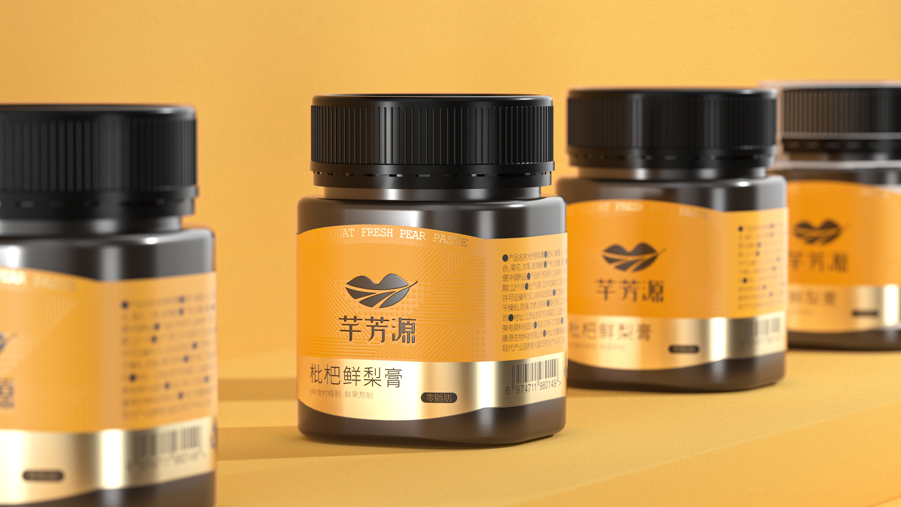
Qianfangyuan Peach and Pear Fresh Pear Paste has successfully achieved explosive growth in the competitive health drink market through systematic brand visual and packaging design upgrades. In the marketing campaign of its another core product, "Acid Plum Soup", the young visual system and creative content we created for it have achieved remarkable results - within just two months of its launch, sales exceeded 20,000 units, quickly becoming the leading brand in this category, and effectively driving the overall sales of other products under the brand. This achievement fully validates the core value of design-driven business growth. The refreshed Qianfangyuan brand visual system has been fully applied to tea drink gift boxes, ginger powder, and pill series products. With differentiated brand recognition and the unique visual language of "New Chinese Style + Pixel Style", Qianfangyuan successfully stood out from traditional health food brands and became a new-style health tea drink brand favored by young consumers.
Qianfangyuan belongs to Jiangxi Taime Food Co., Ltd. and is a sub-brand of its tea drink series. The brand has always adhered to the concept of "Root Seeking", tracing the origin of all ingredients, and insisting on finding high-quality ingredients with the most meticulous standards in the most suitable soil. Each tea drink undergoes natural extraction and careful selection. In this fast-food era, Qianfangyuan hopes to lead consumers to enjoy a slow life in just a cup of tea. The brand is committed to providing healthy lifestyle concepts and healthy and safe ingredients. The parent company is located in Ji'an, Jiangxi Province.
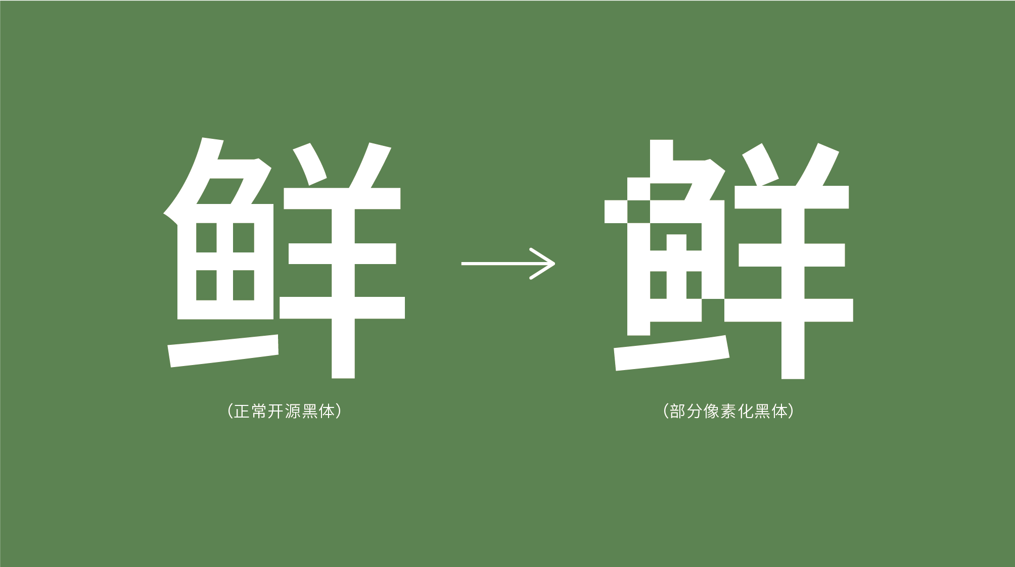
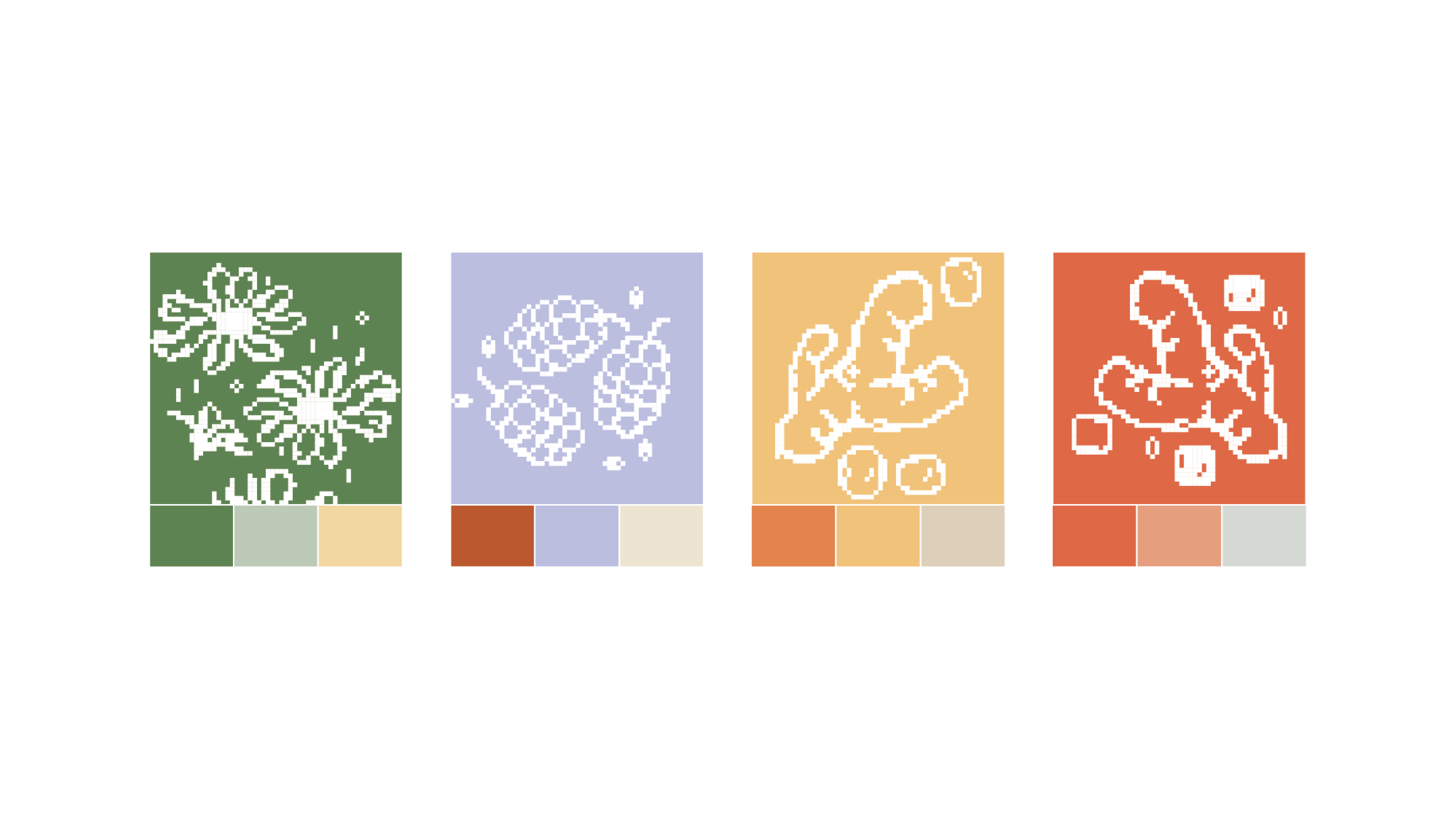
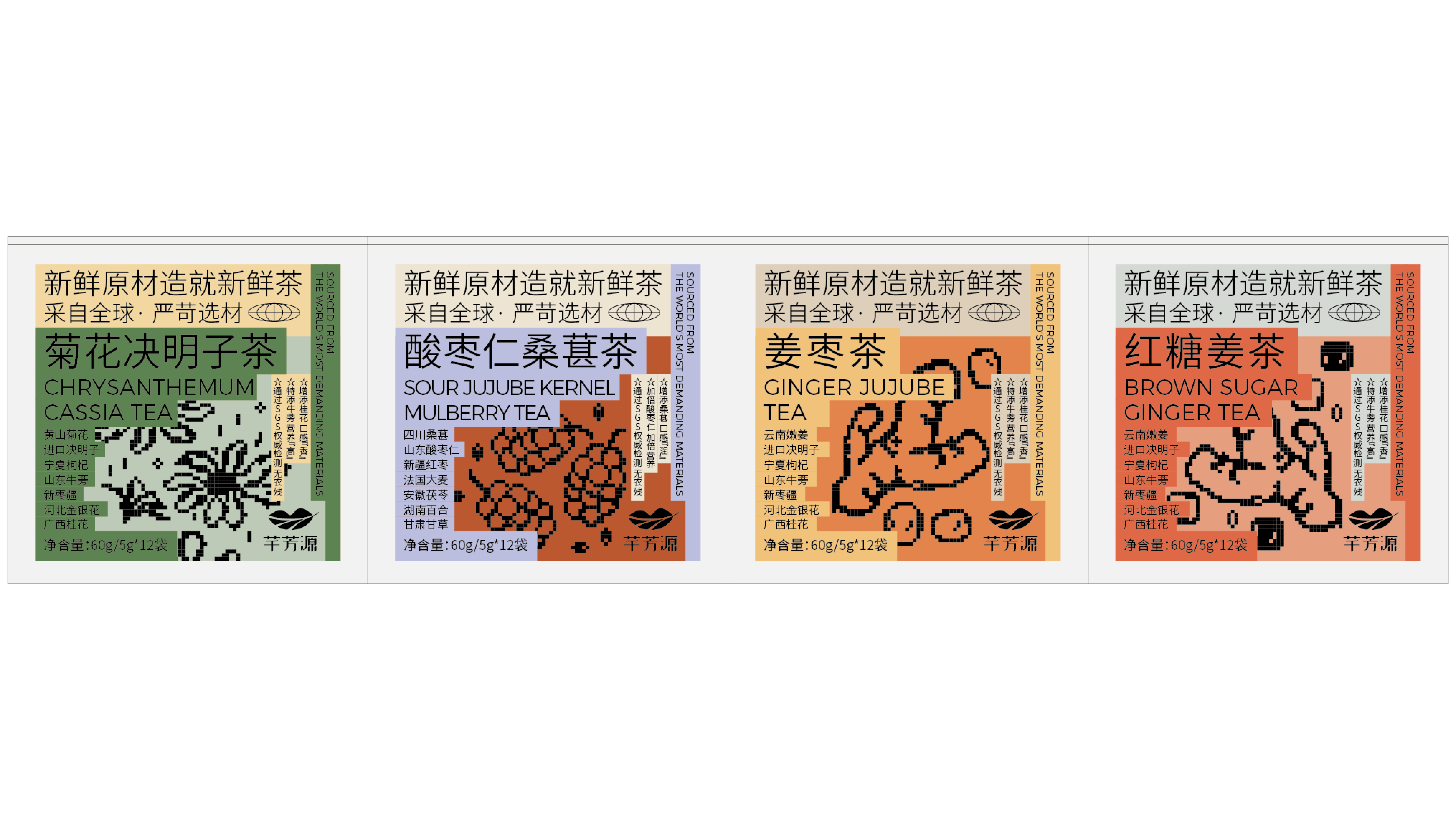
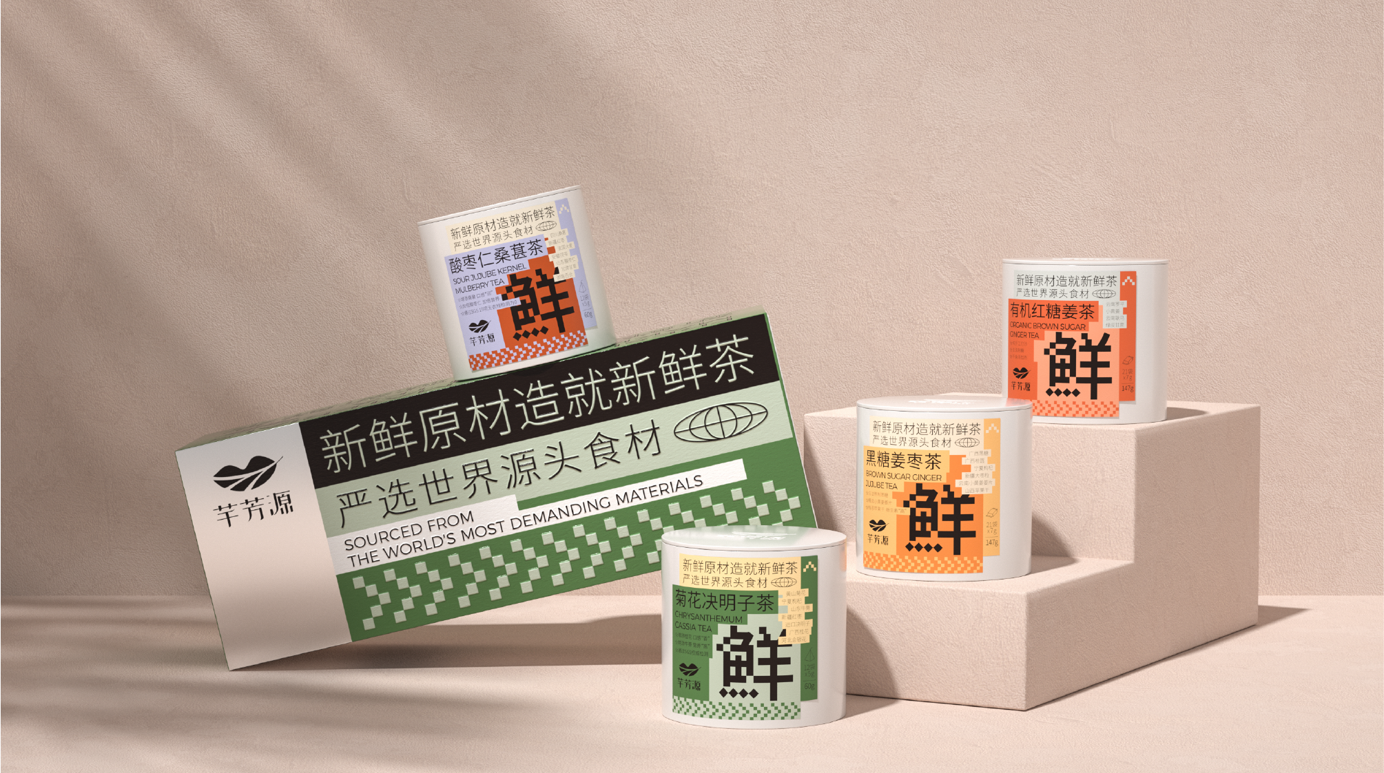
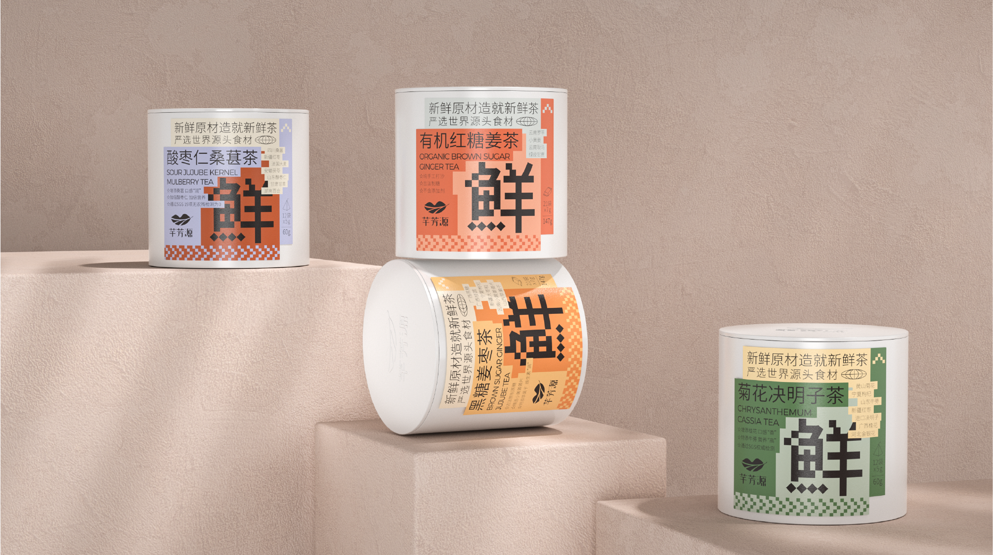
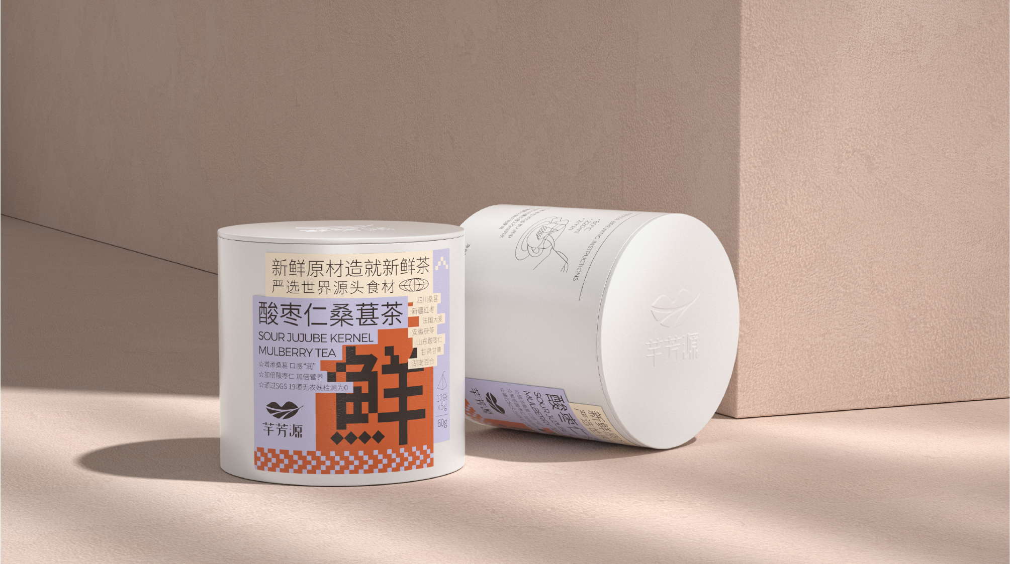
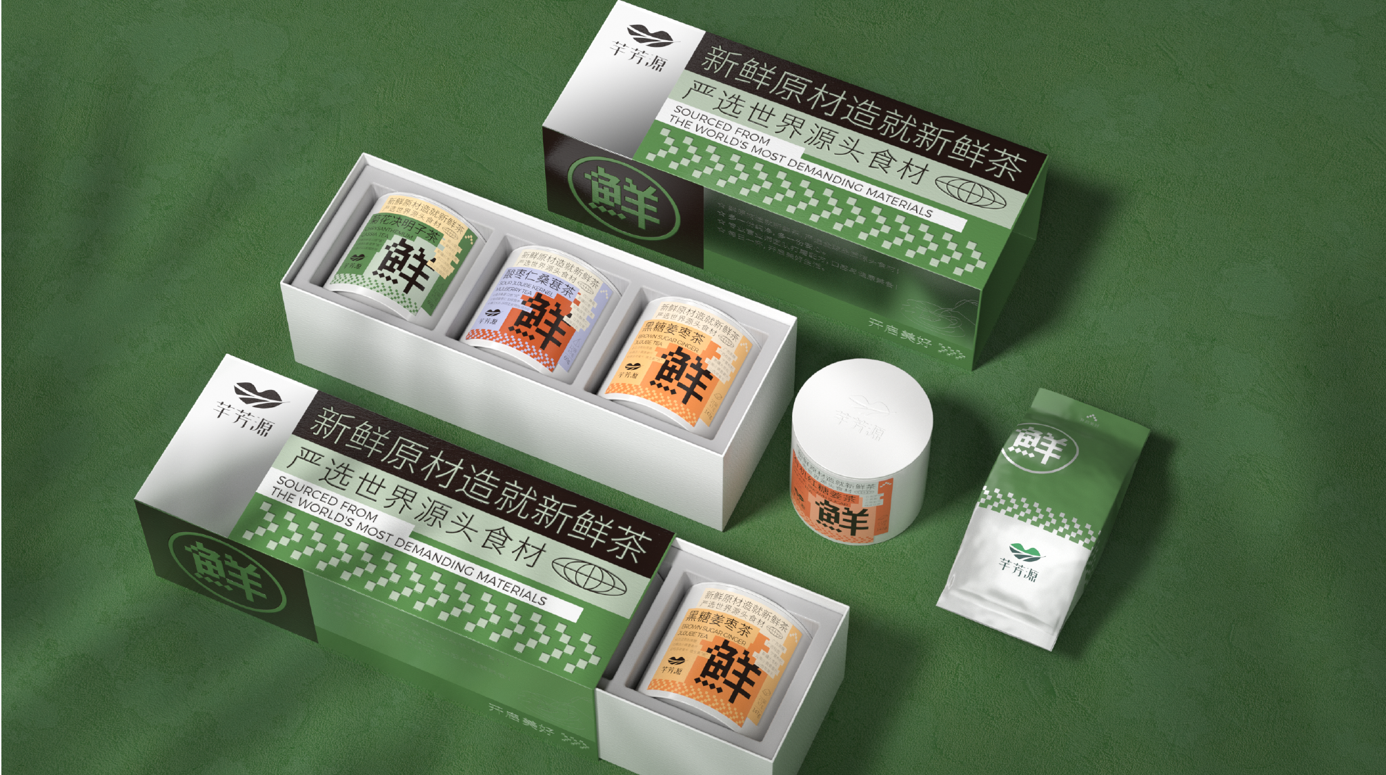
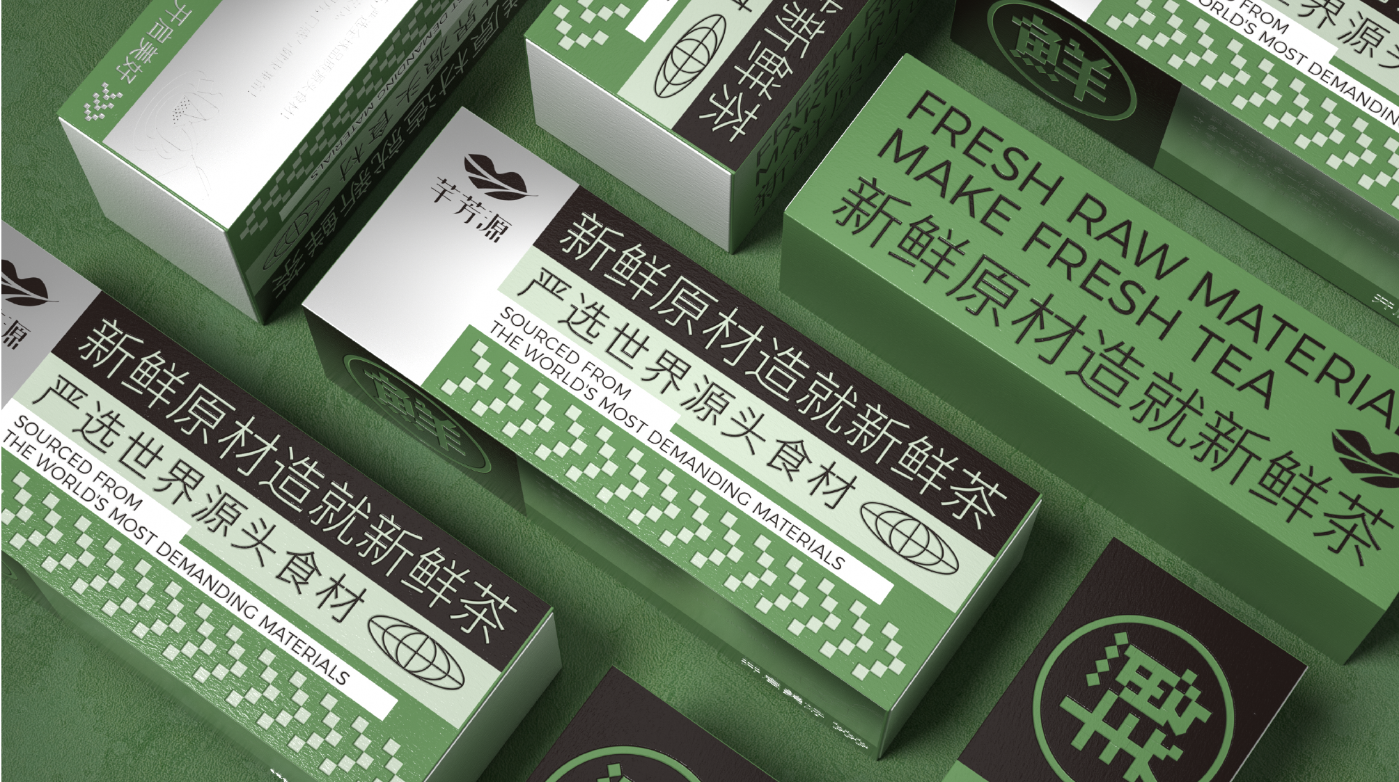
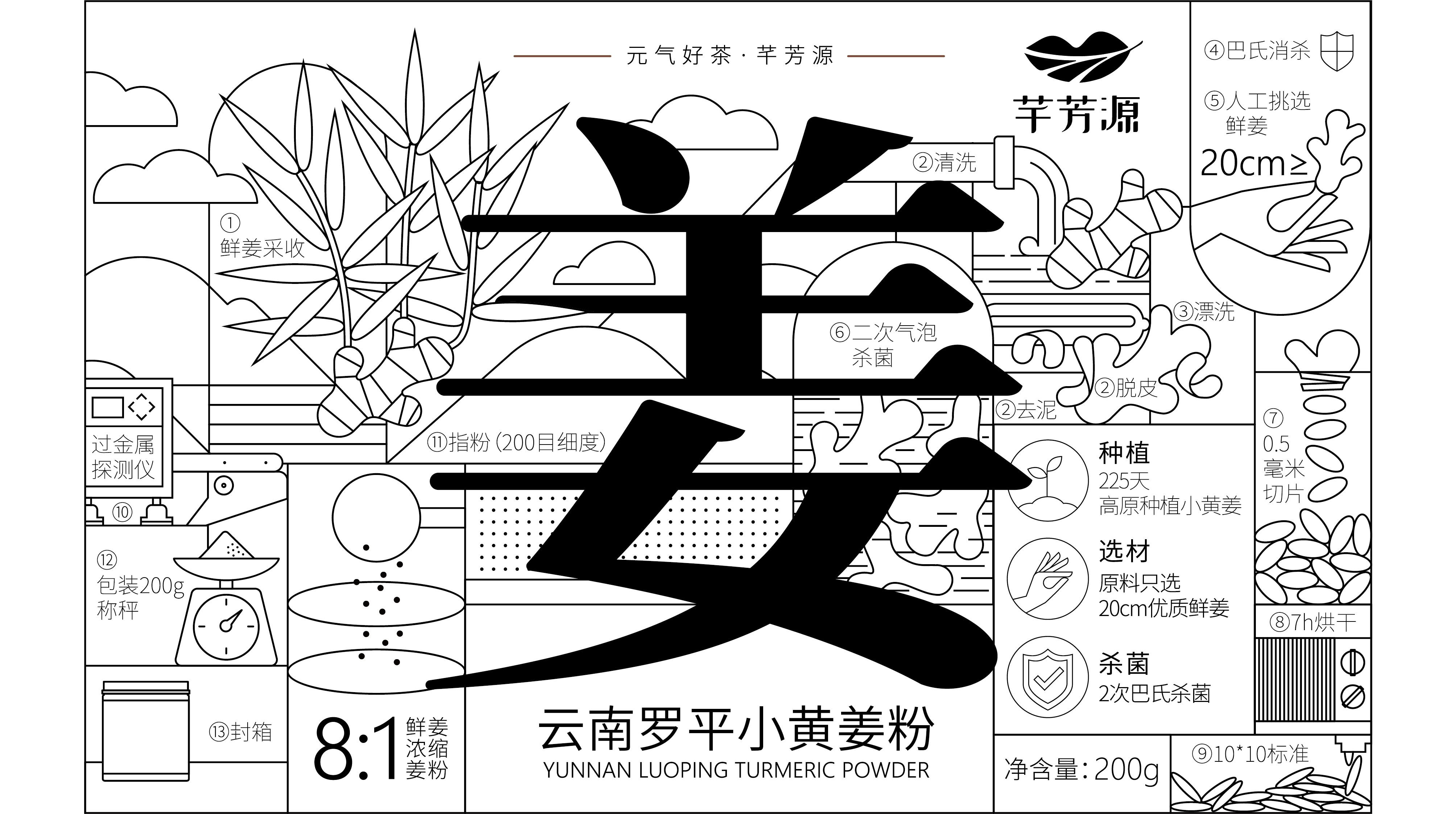
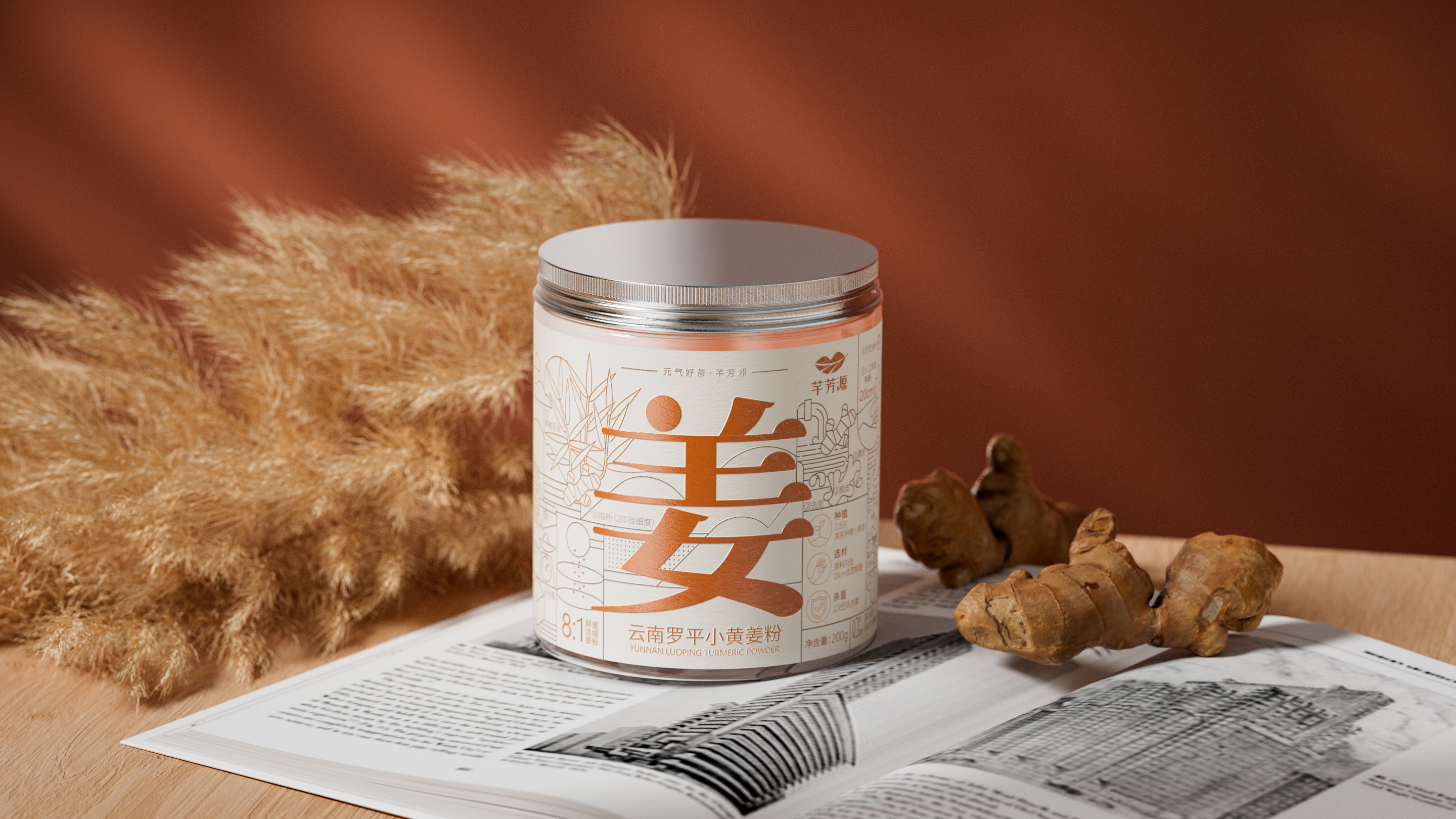
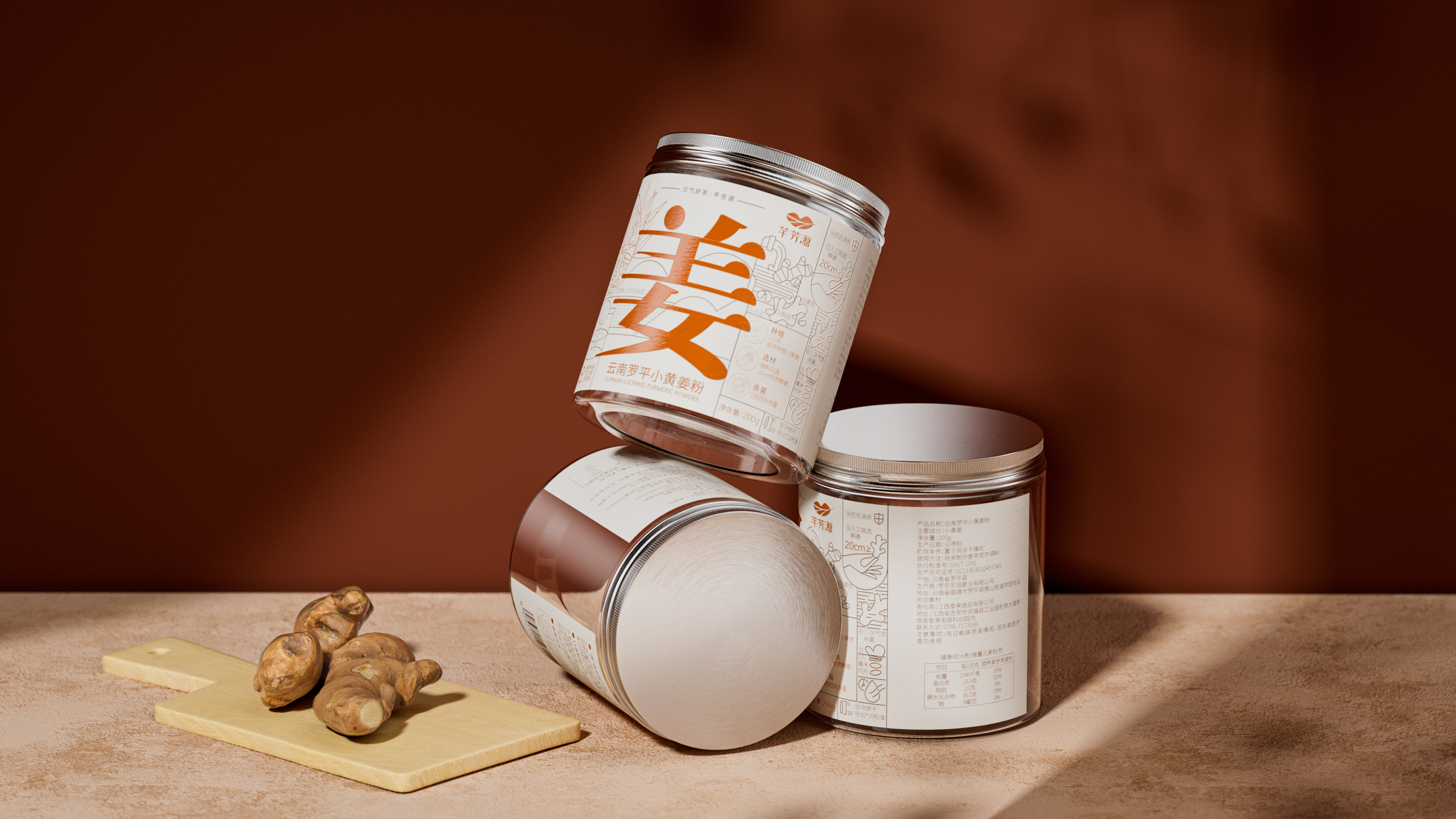
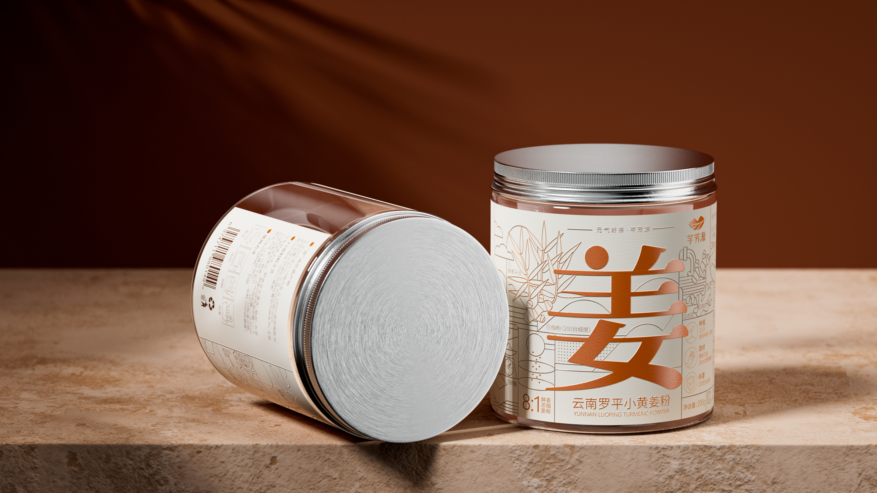
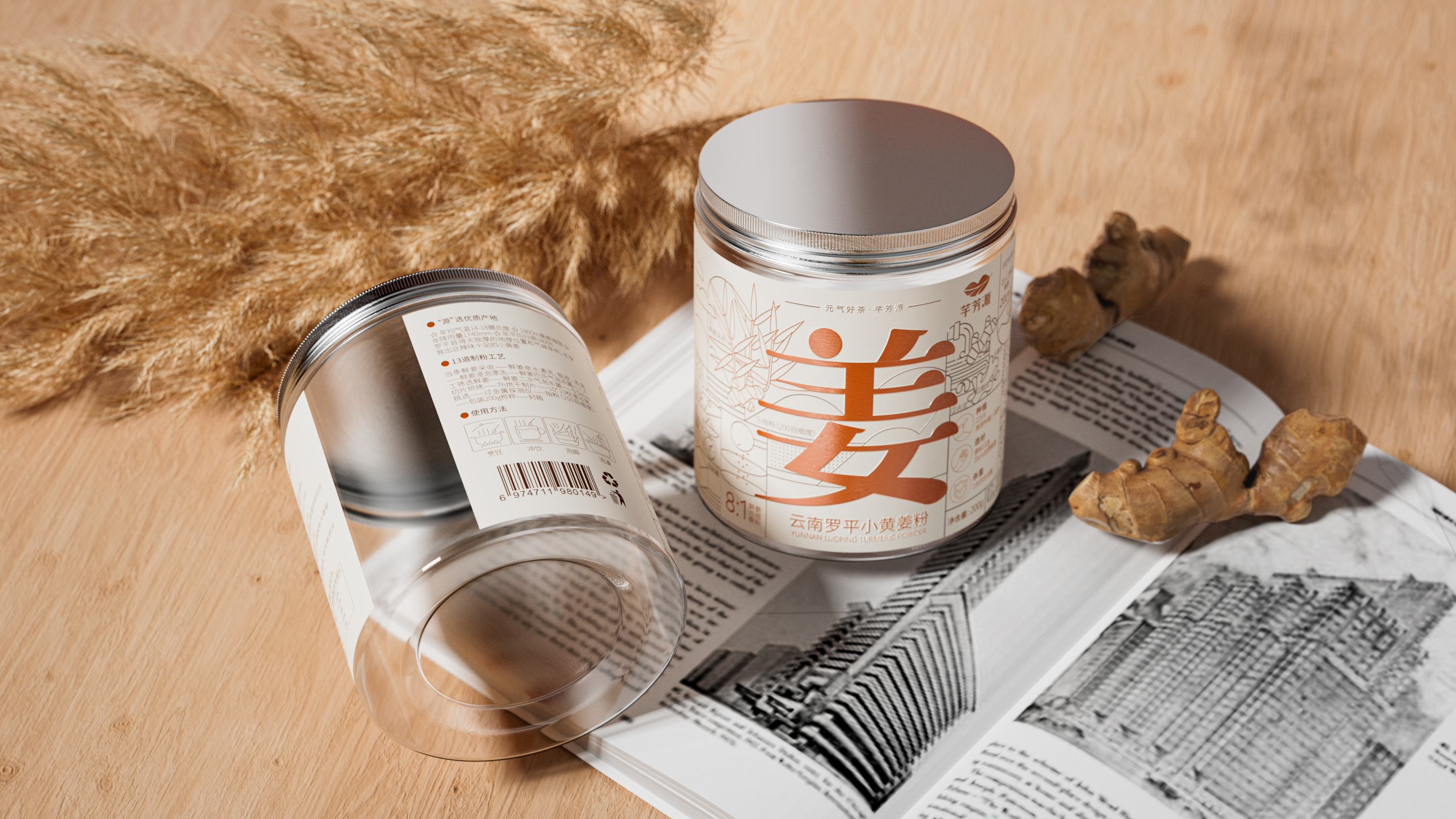
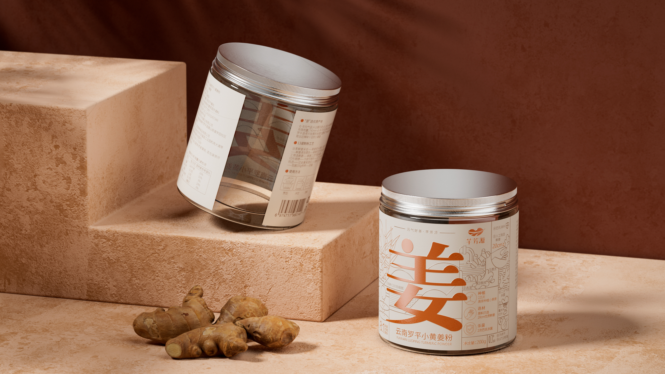
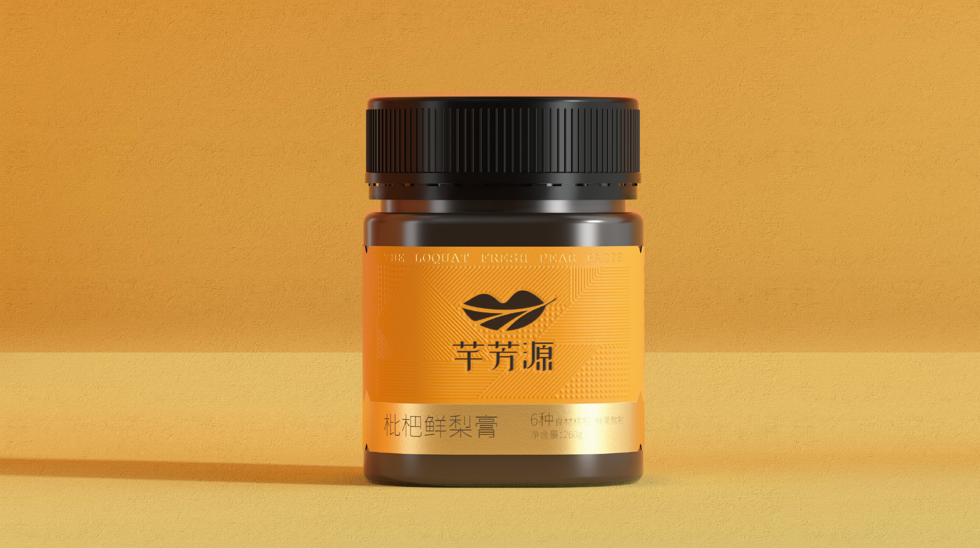
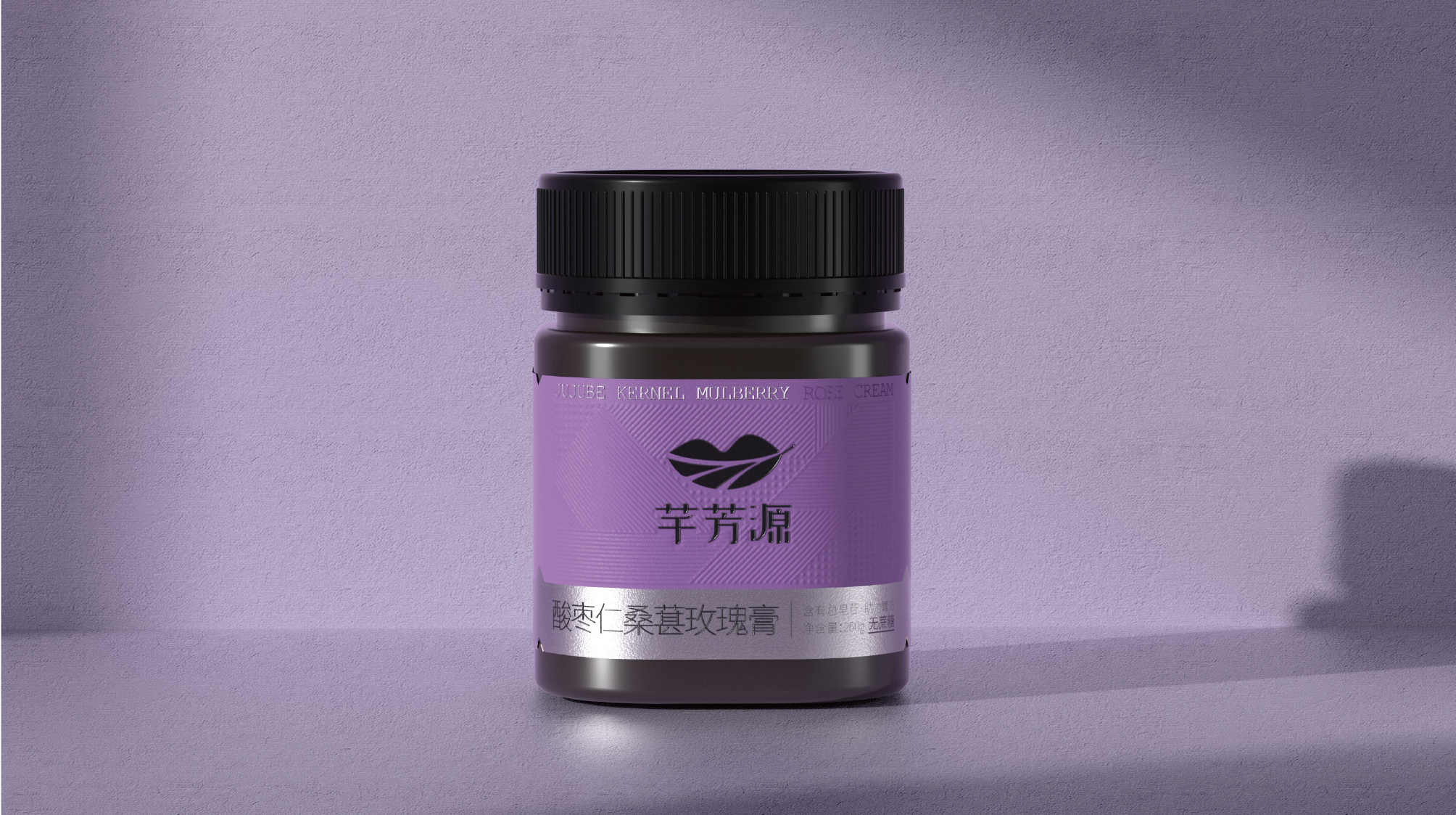
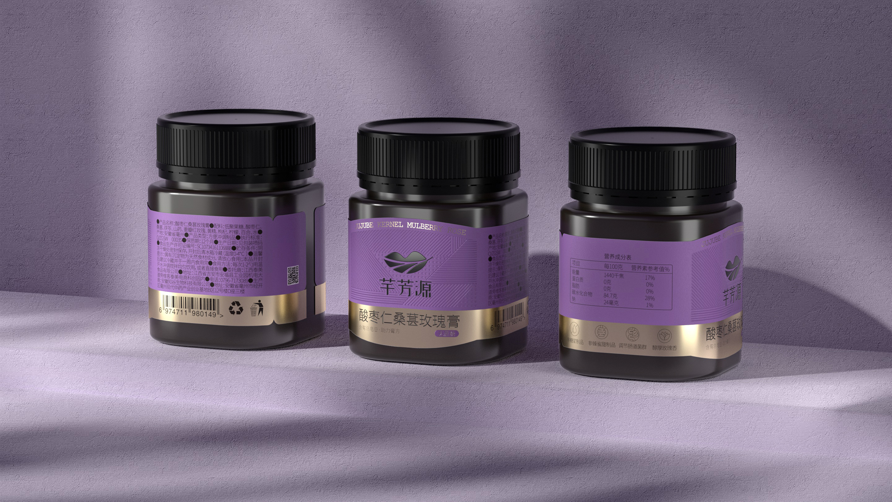
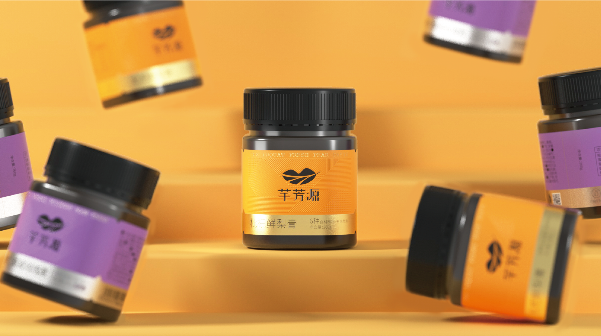
This project is to create a unified brand visual and packaging design system for Qianfangyuan tea drink gift boxes, ginger powder, and pill series products. The core goal is to help the brand establish a young and differentiated brand recognition in the traditional health food market. Tea drink gift box packaging: The design is centered around the core concept of "Fresh Ingredients Create Fresh Tea", focusing on "Freshness". We provided two sets of solutions: Solution A will illustrate the main raw materials of each tea drink with illustrations, with the background color uniformly using fresh green, which is both unified and convenient for distinction; Solution B emphasizes the word "Fresh", making "Fresh" the first visual element. The final solution combines the new Chinese style design style with the popular pixel elements as auxiliary graphics, expressing "Freshness" while not forgetting the fun of recognition. Ginger powder packaging: According to the product's audience, the client hopes to update while retaining some traditional flavors and use the ginger powder's production process as a design element. Pill series packaging: This series is relatively expensive and the client hopes the packaging is both simple and textured. We use the texture of the pill itself as the background pattern source and add a touch of sauce color to distinguish different products. Young marketing: In addition to packaging design, Qianfangyuan also created creative advertisements and IP characters. To promote the new product "Acid Plum Soup", an advertisement film "My Irritable Leader" was launched, and IP characters "Xiaofang" and a series of related products were designed. The advertisement focuses on young people's "Light Health" and proposes the concept of "Cherish with Qianfangyuan", triggering consumer resonance through office stories. Through this design system with a youthful tone, recognition efficiency, and category innovation, Qianfangyuan successfully upgraded from a traditional health brand to a new-style health tea drink brand with strong visual recognition, young brand assets, and market validation.
芊芳源枇杷鲜梨膏通过系统化的品牌视觉与包装设计升级,成功助力品牌在竞争激烈的养生饮品市场中实现了爆发式增长。在品牌另一款核心单品“酸乌梅梅汤”的营销战役中,我们为其打造的年轻化视觉体系与创意内容成效显著——产品上市仅两个月,销量即突破2万单,迅速成为该品类的头部品牌,并有效带动了品牌旗下其他产品的整体销量。这一成绩充分验证了设计驱动商业增长的核心价值。焕新后的芊芳源品牌视觉体系已全面应用于茶饮礼盒、姜粉及膏方等系列产品。凭借差异化的品牌识别与“新中式+像素风”的独特视觉语言,芊芳源成功从传统养生品牌中脱颖而出,成为备受年轻消费者青睐的新式养生茶饮品牌。
芊芳源隶属于江西泰美食品有限公司,是其旗下茶饮系列子品牌。品牌始终坚守“寻根溯源”的理念,追寻所有食材的源头,坚持在最合适的土壤上,以最挑剔的标准寻找有品质的食材。每一道茶饮都经过自然凝萃,用心萃选。在这个快餐时代,芊芳源希望能用一盏茶的时间,引领消费者去享受慢生活。品牌致力于提供健康的生活理念和健康安全的食材。母公司坐落于江西吉安。
本次项目是为芊芳源茶饮礼盒装、姜粉以及膏方系列打造统一的品牌视觉与包装设计体系,核心目标是在传统养生食品市场中,帮助品牌建立年轻化、差异化的品牌识别。茶饮礼盒包装:围绕“新鲜原材造就新鲜茶”的核心展开设计,重在“鲜”。我们提供了两套方案:方案A将每款茶最主要的原料进行插画设计,底色统一用新鲜的绿色,既统一又方便区分;方案B则强调“鲜”字,将“鲜”作为第一视觉。最终方案融合新中式设计风格与火爆的像素元素作为辅助图形,在表达“鲜”的同时不忘识别趣味性。姜粉包装:根据产品的受众,客户希望在更新的同时保留一些传统的味道,并将姜粉的制作流程作为设计元素。膏方系列包装:这一系列是相对较贵的膏产品,客户希望包装既简约又有质感。我们以膏体本身质感作为底纹来源,配一抹酱色来区分不同产品。年轻化营销:除包装设计外,还为芊芳源打造了创意广告与IP形象。为推广新品“酸乌梅梅汤”,推出广告片《我的暴躁领导》,并设计了IP形象“小芳”及系列周边。广告围绕年轻人“轻养生”展开,提出“虚要芊芳源”的概念,通过办公室故事引起消费者共鸣。通过这一兼具年轻调性、识别效率与品类创新的设计体系,芊芳源成功从传统养生品牌升级为具有强视觉识别、年轻化品牌资产与市场验证的新式养生茶饮品牌。