
小朱圆紫 金桔竹蒲滋阴清热茶
BRAND:小朱圆紫
PROJECT MANAGER:Kevin、Gary Lau
DESIGNER:珈百
3D EFFECT:Mega
YEAR:2023.03
Through systematic brand visual and packaging design, Xiao Zhu Yuanzi successfully established a highly recognizable and youthful brand image in the emerging market segment of "New Chinese Trend in Traditional Chinese Medicine Health Care". After the brand was refreshed, it adopted the core concept of "Ancient Formula New Use - New Chinese Trend in Traditional Chinese Medicine Health Care", integrating traditional Chinese medicine with modern research, and successfully upgraded from traditional health tea to a pioneering Chinese trend health brand favored by young consumers. It has established a differentiated brand recognition in the rapidly growing market of "Chinese-style health tea with the same medicinal and edible properties".
Xiao Zhu Yuanzi is a pioneering Chinese trend health brand that adheres to the core concept of "Ancient Formula New Use - New Chinese Trend in Traditional Chinese Medicine Health Care". The brand is dedicated to interpreting the sensory experience brought by new tea drinks, combining traditional Chinese medicine with modern research, and spreading simple and understandable health care methods, making health care more scientific. The brand products cover health tea series such as rose tea and golden orange bamboo chrysanthemum and yin-clearing and heat-reducing tea.
This project is to create a brand visual and packaging design system for Xiao Zhu Yuanzi. The core objective is to help the brand establish a young, Chinese trend, and differentiated brand recognition in the market environment where traditional health tea is highly homogenized.
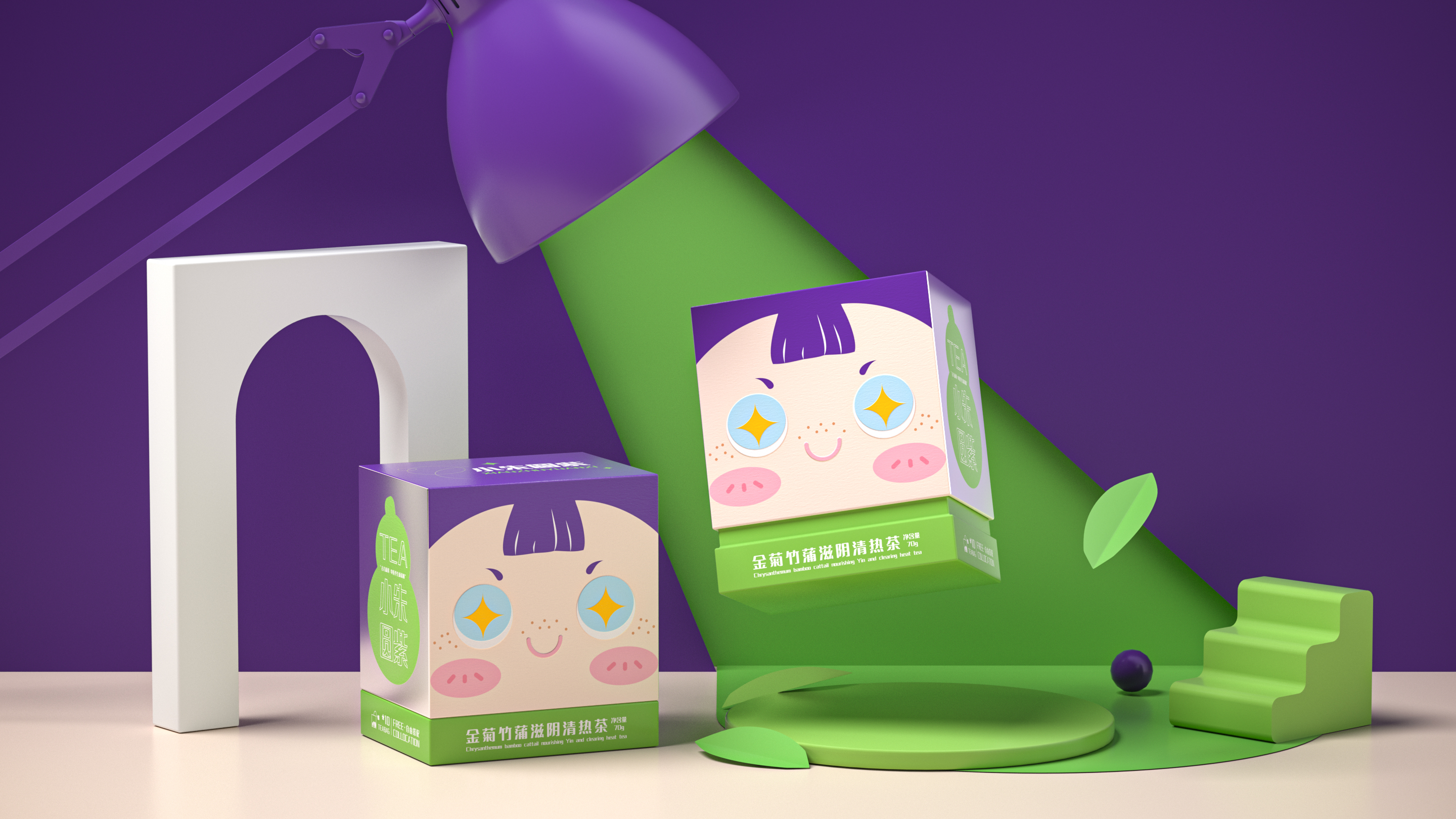
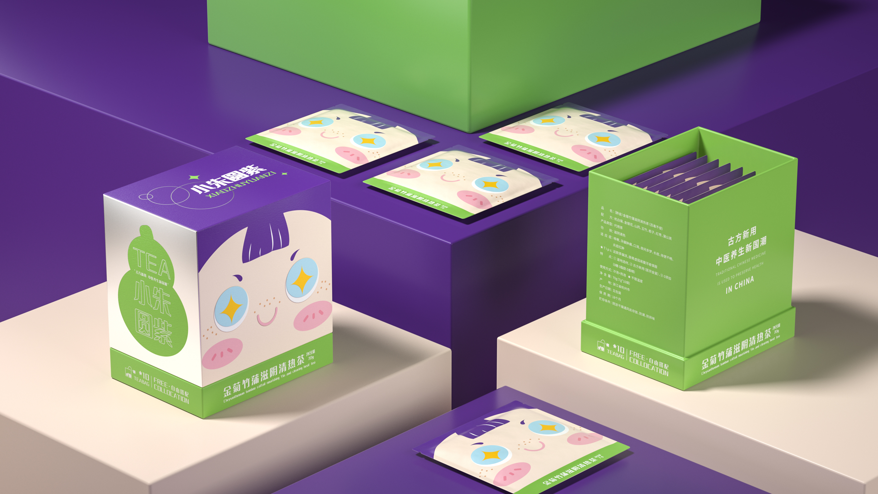
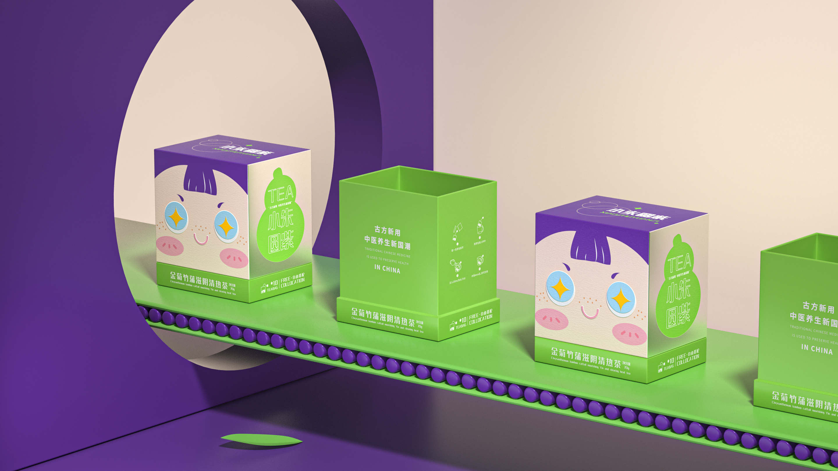
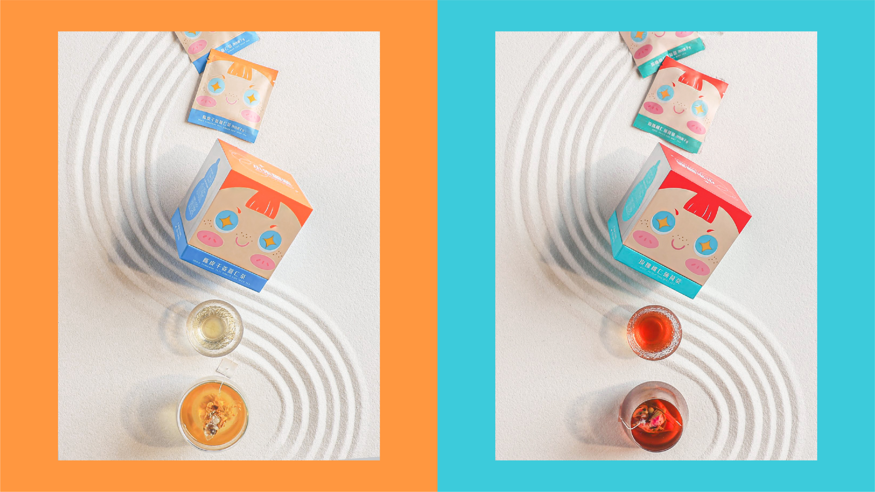
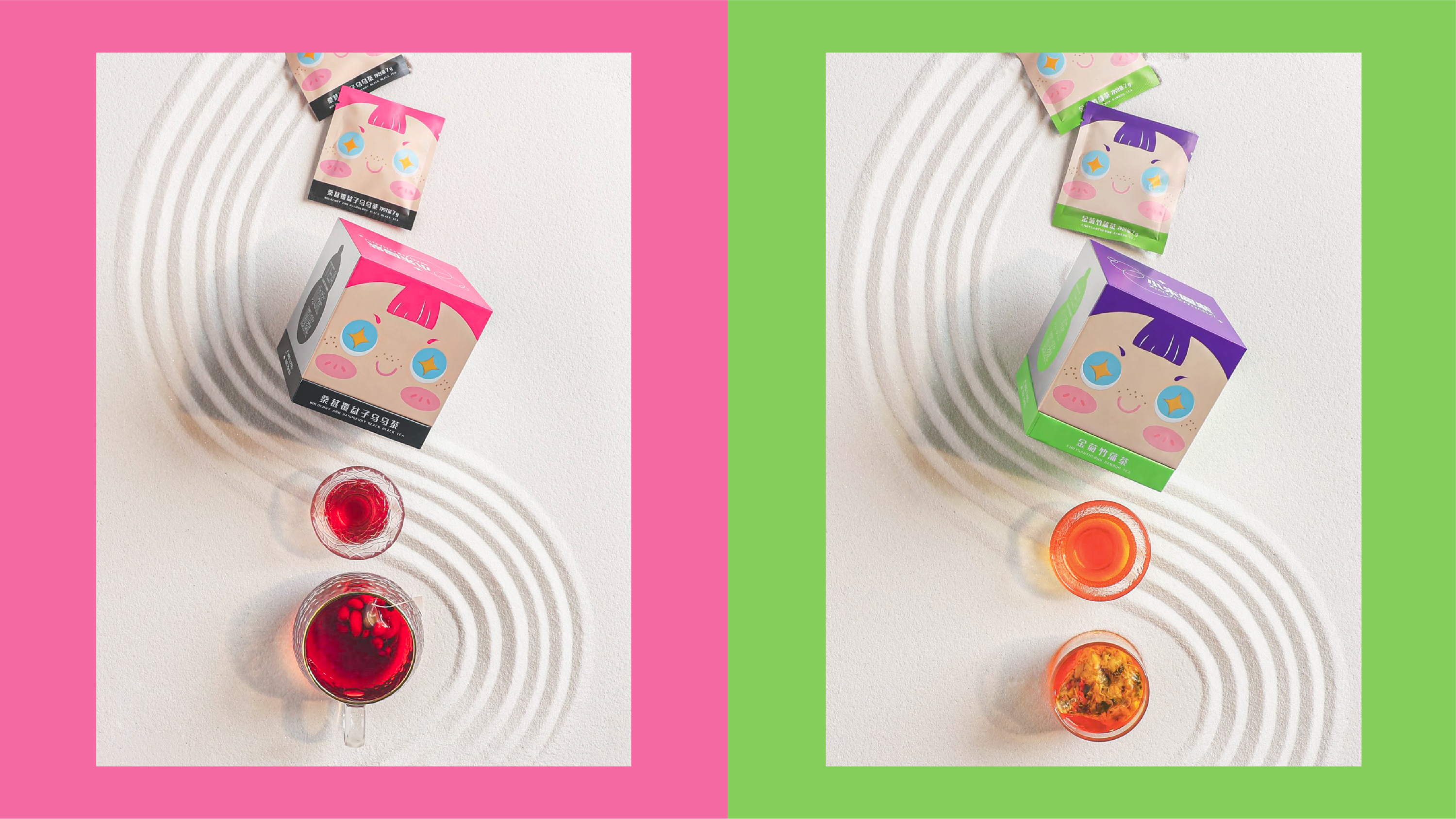
Packaging design is the core breakthrough of this project. We have observed that the packaging of traditional health tea often has a conservative and dull visual style, which is difficult to reach young consumers. Therefore, we boldly cross-border and adopt the box shape commonly used in skincare products, breaking the visual inertia of the health tea category - the box shape of skincare products itself conveys the brand emotions of "delicate skincare" and "self-care", which are highly consistent with Xiao Zhu Yuanzi's brand proposition of "Making health care more scientific", allowing consumers to feel the quality and modernity in the first visual contact.
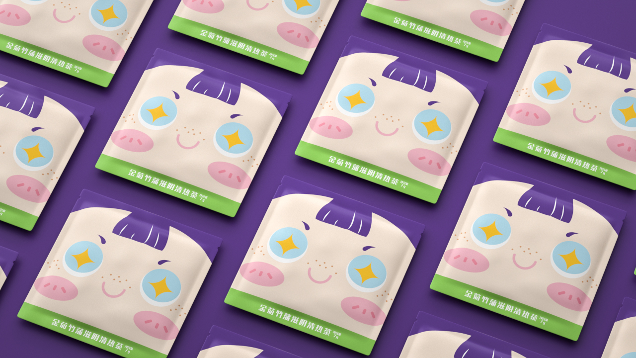
In the visual recognition aspect, the team uses the IP image as the main brand recognition, creatively expressing it corresponding to the brand name "Xiao Zhu Yuanzi". The application of the IP image not only enhances the brand's emotional temperature and memorability, but also makes the brand instantly recognizable in the shelves and e-commerce pages. The overall visual style presents a playful and cute youthful tone, effectively narrowing the distance with young consumers.
Through this brand visual design system that combines category breakthrough, recognition efficiency, and emotional temperature, Xiao Zhu Yuanzi successfully upgraded from a traditional health tea to a pioneering Chinese trend health brand with strong visual recognition, youthful tone, and Chinese trend culture genes.
小朱圆紫通过系统化的品牌视觉与包装设计,成功在“中医养生新国潮”这一新兴赛道中建立起极具辨识度与年轻活力的品牌形象。焕新后的品牌以“古方新用·中医养生新国潮”为核心理念,将中医与现代科研相结合,成功从传统养生茶饮升级为深受年轻消费者青睐的先锋国潮养生品牌,在“药食同源”中式养生茶饮的快速增长赛道中建立了差异化的品牌认知。
小朱圆紫是一个先锋国潮养生品牌,秉承“古方新用·中医养生新国潮”的核心理念。品牌致力于诠释全新茶饮带来的感官体验,把中医与现代科研相结合,传播浅显易懂的养生方式,让养生更科学。品牌产品涵盖玫瑰花茶、金桔竹蒲滋阴清热茶等养生茶饮系列。
本次项目是为小朱圆紫打造品牌视觉与包装设计体系,核心目标是在传统养生茶饮同质化严重的市场环境中,帮助品牌建立年轻化、国潮化、差异化的品牌识别。
包装设计是本次项目的核心突破。我们洞察到,传统养生茶饮的包装往往偏向老派、沉闷的视觉风格,难以触达年轻消费群体。为此大胆跨界采用护肤品常用盒型,打破了养生茶饮品类的视觉惯性——护肤品盒型本身传递出“精致护肤”、“自我关爱”的品牌情绪,与小朱圆紫“让养生更科学”的品牌主张高度契合,让消费者在视觉接触的第一时间即感受到品质感与现代感。
在视觉识别层面,团队以IP形象作为品牌主识别,对应品牌名“小朱圆紫”进行创意表达。IP形象的运用不仅增强了品牌的情感温度与可记忆性,更让品牌在货架与电商页面中拥有一眼即识的视觉锤。整体视觉风格呈现出俏皮可爱的年轻化调性,有效拉近了与年轻消费者之间的距离。
通过这一兼具品类突破性、识别效率与情感温度的品牌视觉设计体系,小朱圆紫成功从一款传统养生茶饮升级为具有强视觉识别、年轻化调性与国潮文化基因的先锋国潮养生品牌。