
黑杉 即饮鲜萃咖啡
BRAND:HEIITHAN 黑杉
PROJECT MANAGER: Kevin、Gary Lau
DESIGNER:CHENG
3D EFFECT:Mega
YEAR:2023
Black Cedar Coffee, with its highly recognizable visual system and innovative packaging language, has received the highest recognition in the international design field - winning the German Red Dot Award. After the brand upgrade, Black Cedar Coffee quickly completed the full-channel layout both online and offline - its products were fully introduced to supermarkets such as Walmart, Hema, China Resources万家, Xianfeng Life, Hejufu, Biushe, Suogou, etc., as well as convenience stores like Roson, FamilyMart, 7eleven, Youke, Tangjiu Convenience, Yike, You, etc., and numerous offline retail terminals of Crown Happiness, Aida Le, Wanli Long, Shanshan Ji, Meili Ji Food, Baige West Point, Yakaaf, etc.; the "Black Cedar" flagship store on Tmall has officially launched and ranked first in the bottled coffee category on Tmall; the product line has expanded from ready-to-drink fresh coffee to tea and coffee new categories, exploring a new track through the innovative integration of Eastern tea and Western coffee. In October 2024, the brand launched a number of new products such as concentrated iced Americano, raw coconut latte, and柚C iced Americano, relying on the "three-degree cold preservation" preservation technology and high-visibility brand visual, Black Cedar is redefining the consumption experience of ready-to-drink fresh coffee.
Black Cedar HEIITHAN is a new coffee brand founded in 2022, with its parent company being Zhejiang Hui Mei Food and Beverage Co., Ltd. The brand aims to create ready-to-drink fresh coffee, hoping to explore through the selection of high-quality raw materials, the exploration of preservation technology, and a strict supply chain system, that high-quality fresh coffee is no longer limited to coffee shops, allowing coffee lovers to enjoy fresh coffee anytime and anywhere. Black Cedar has a cold production filling line, cold chain transportation, and cold preservation system. The brand proposes the concept of "three degrees of cold preservation": the first degree "fresh" - selecting coffee beans of the same variety as freshly ground coffee, strictly controlling the freshness of the roasting; the second degree "fresh" - using 0-6℃ cold water for 20-hour drip extraction to restore the flavor of the coffee beans; the third degree "fresh" - not adding preservatives and using 3℃±3℃ cold chain transportation and cold preservation. "Black Cedar is an attitude" - simplicity and authenticity are the rare and precious qualities. The attitude of Black Cedar is to simply make a bottle of real fresh coffee. The fir tree is upright and resolute, which is the reason for choosing "Black Cedar" as the brand name.
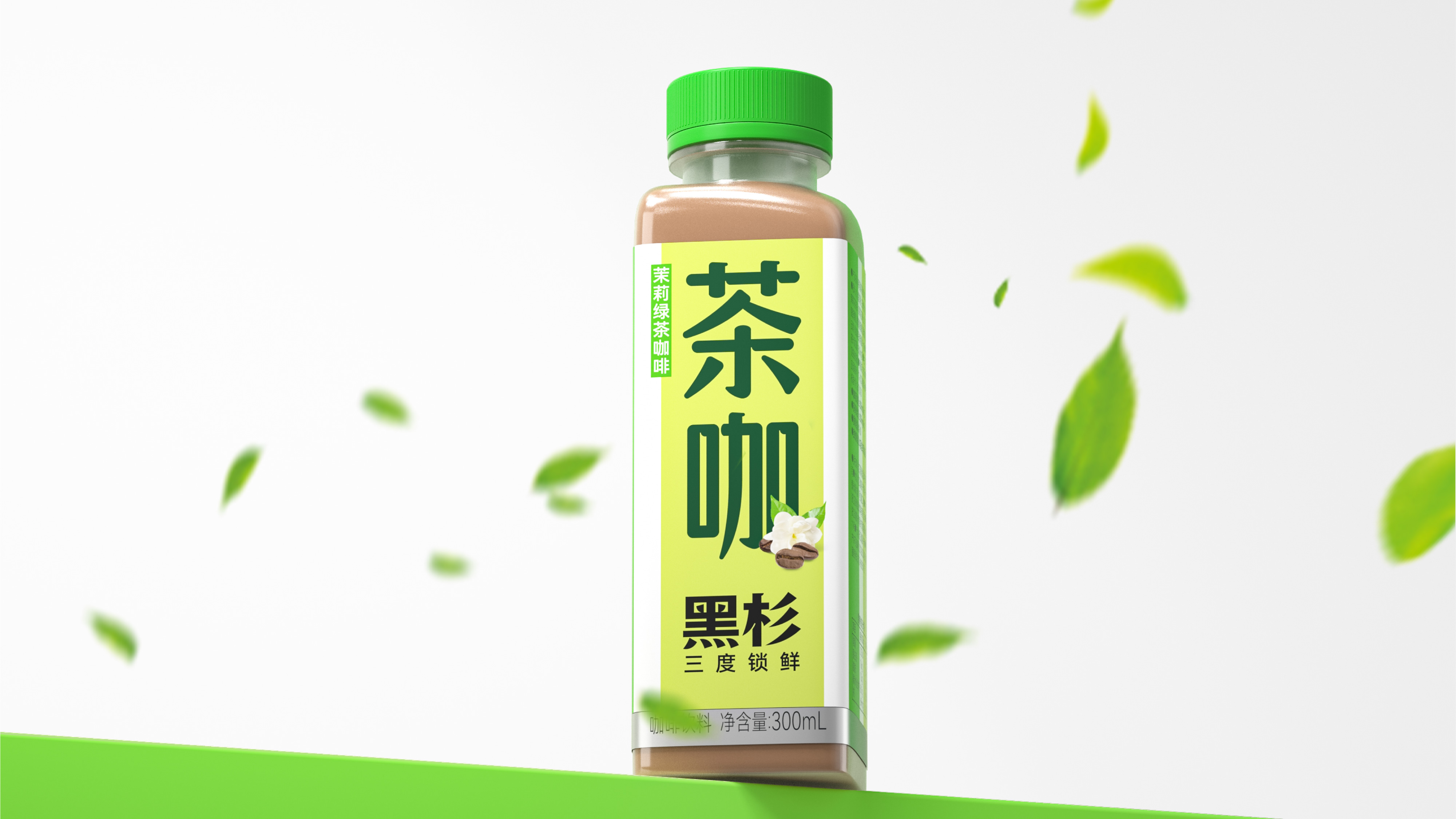
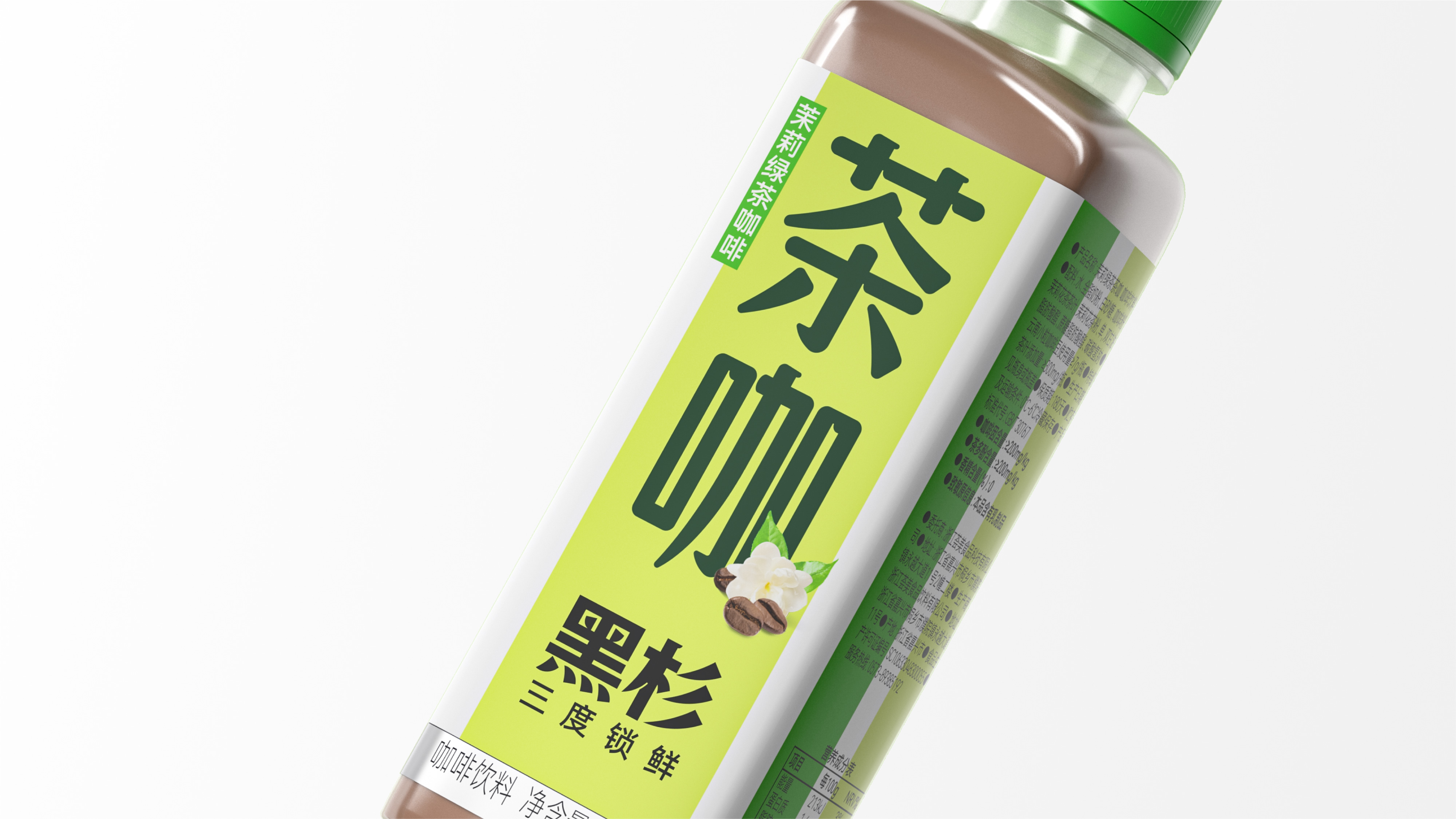
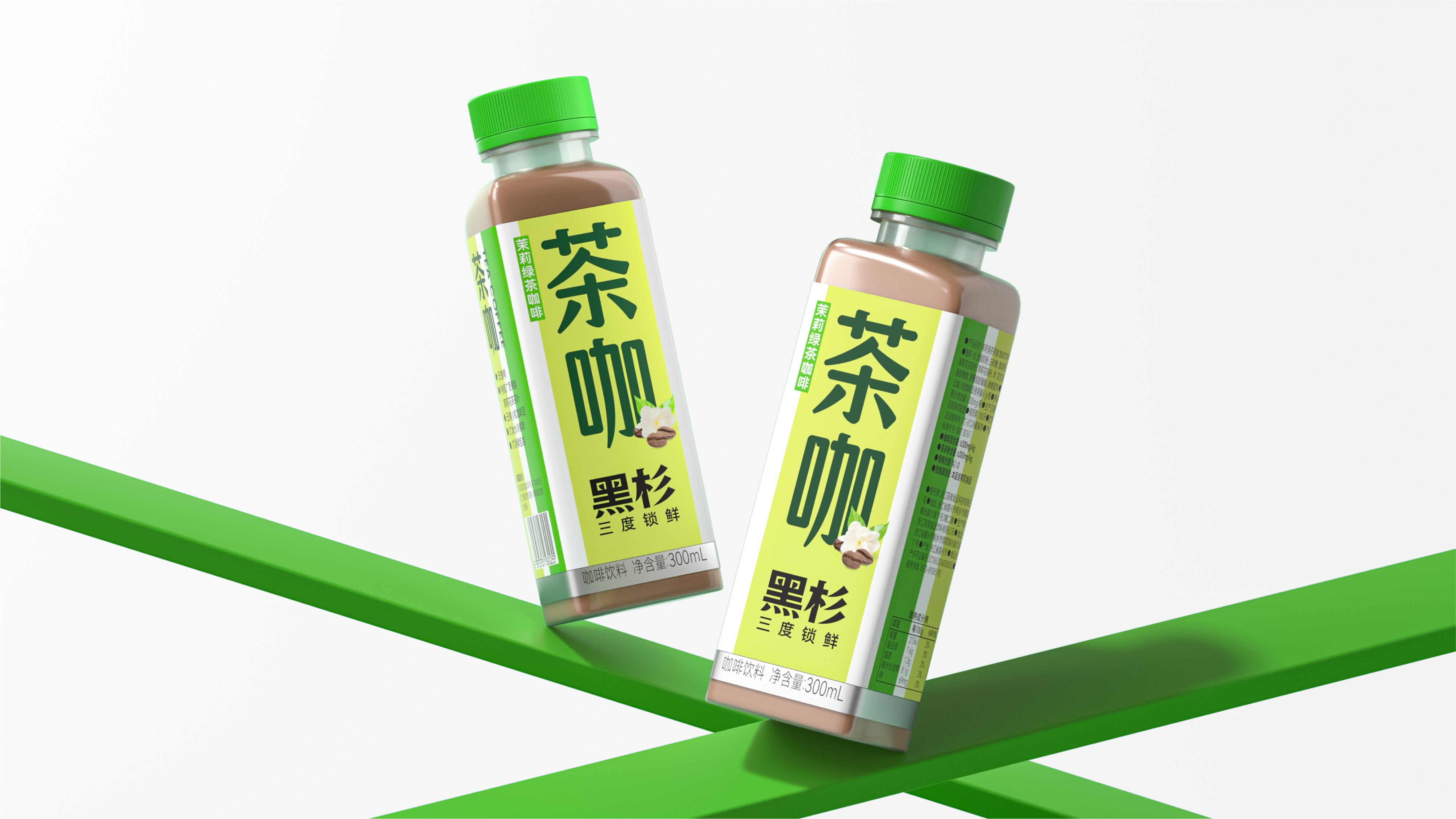
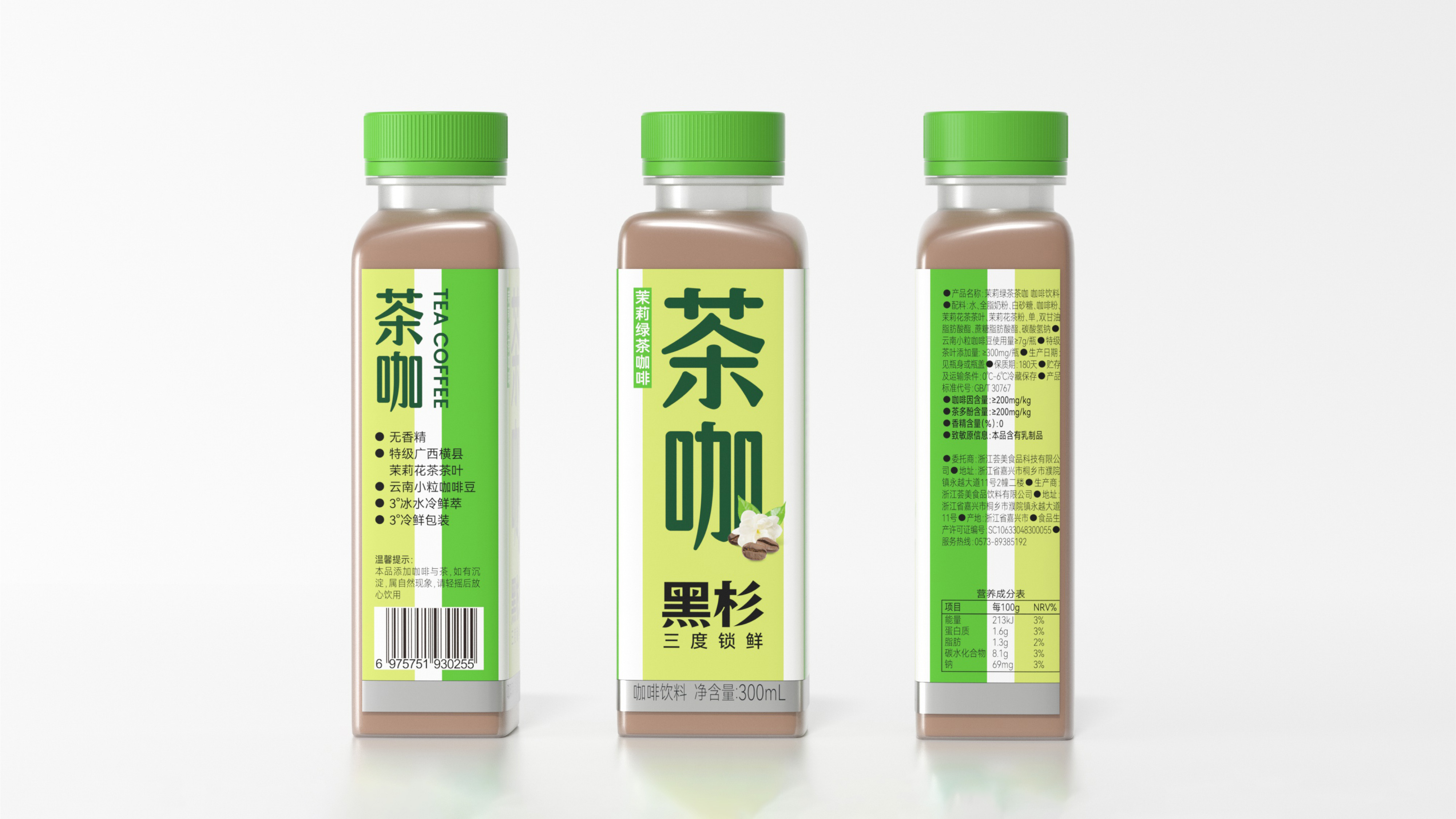
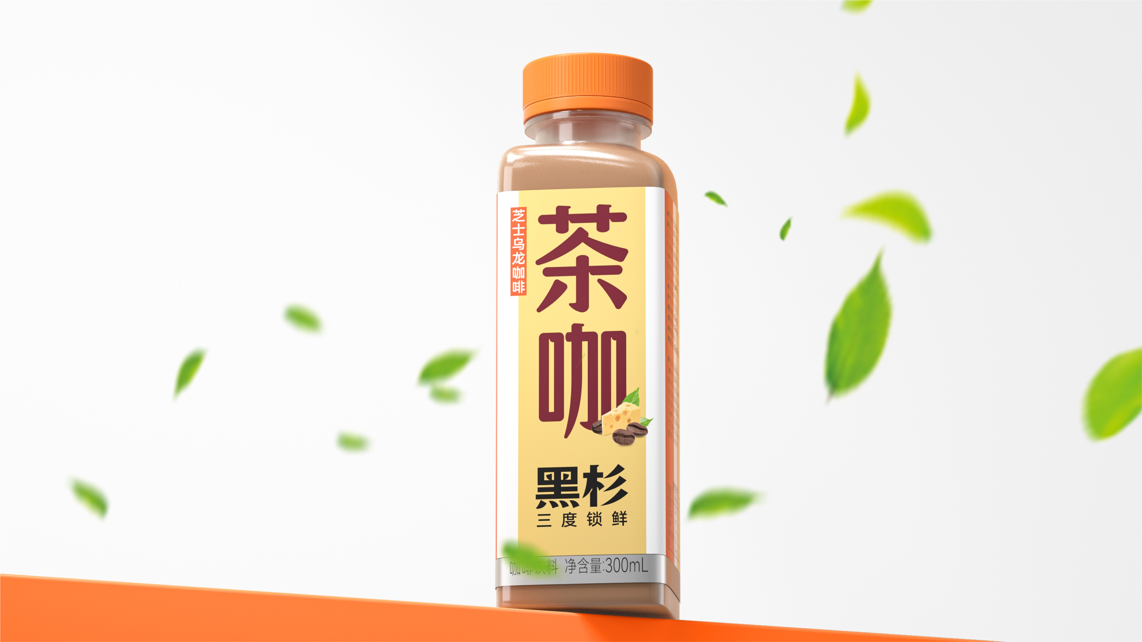
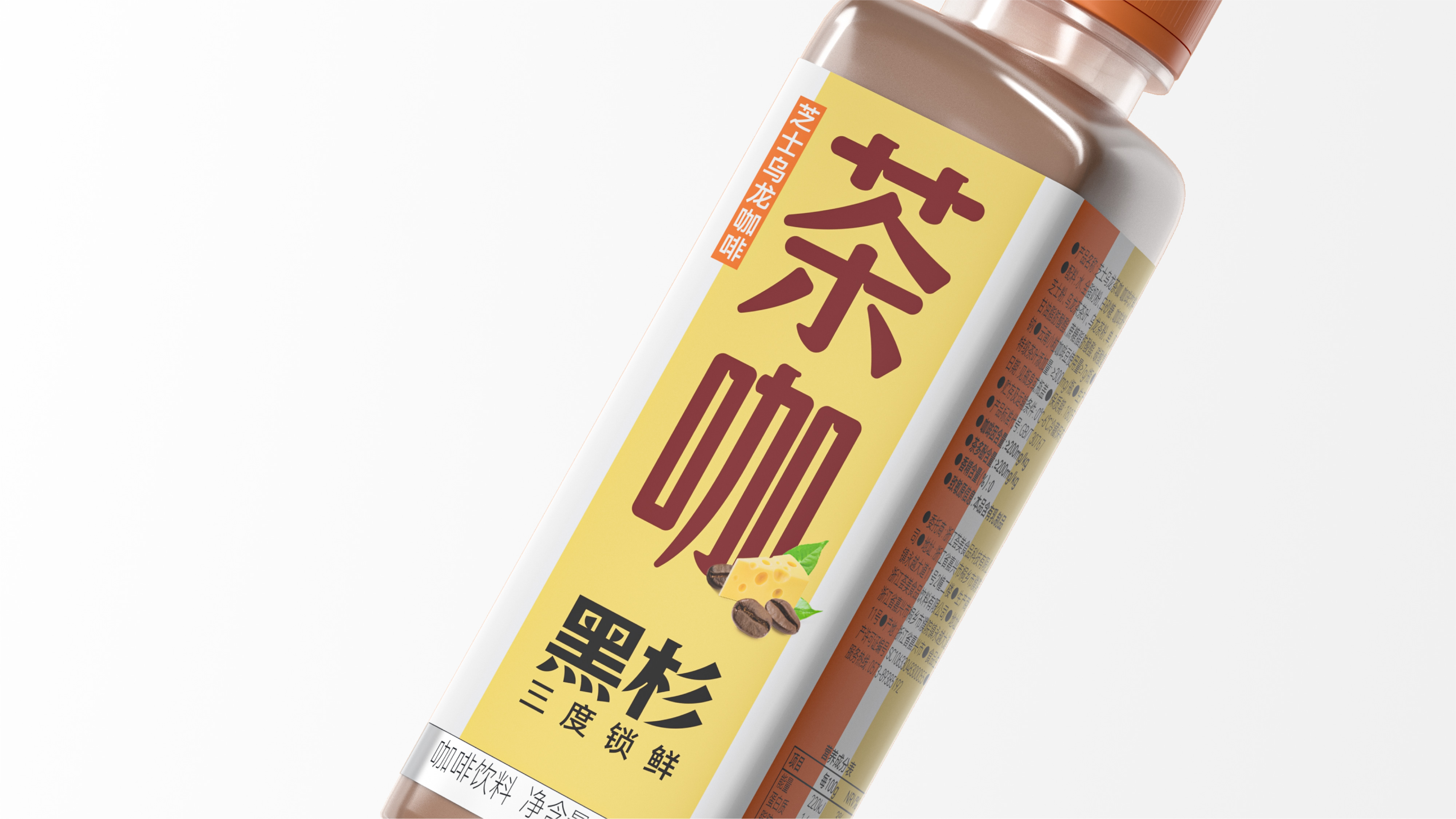
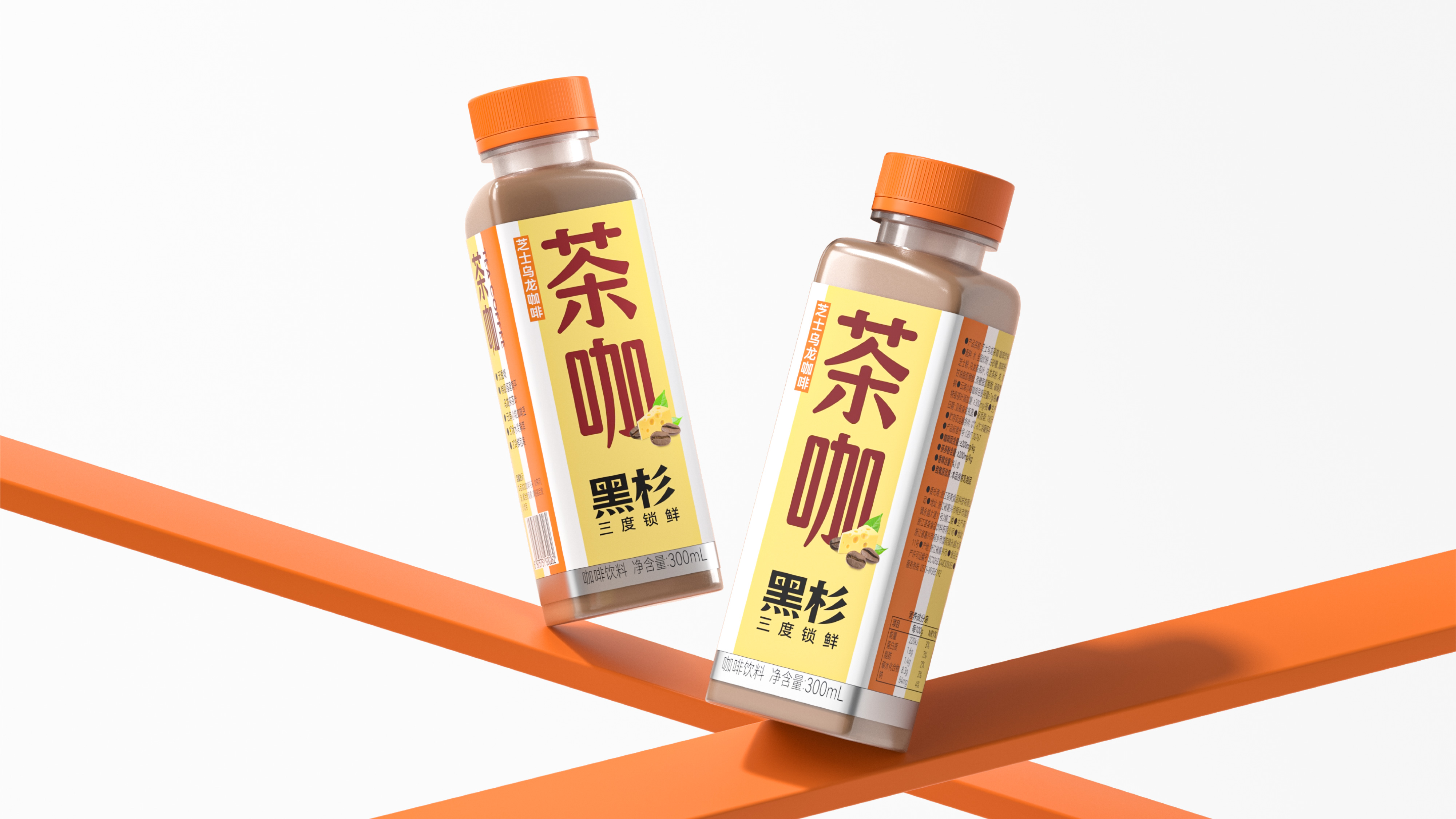
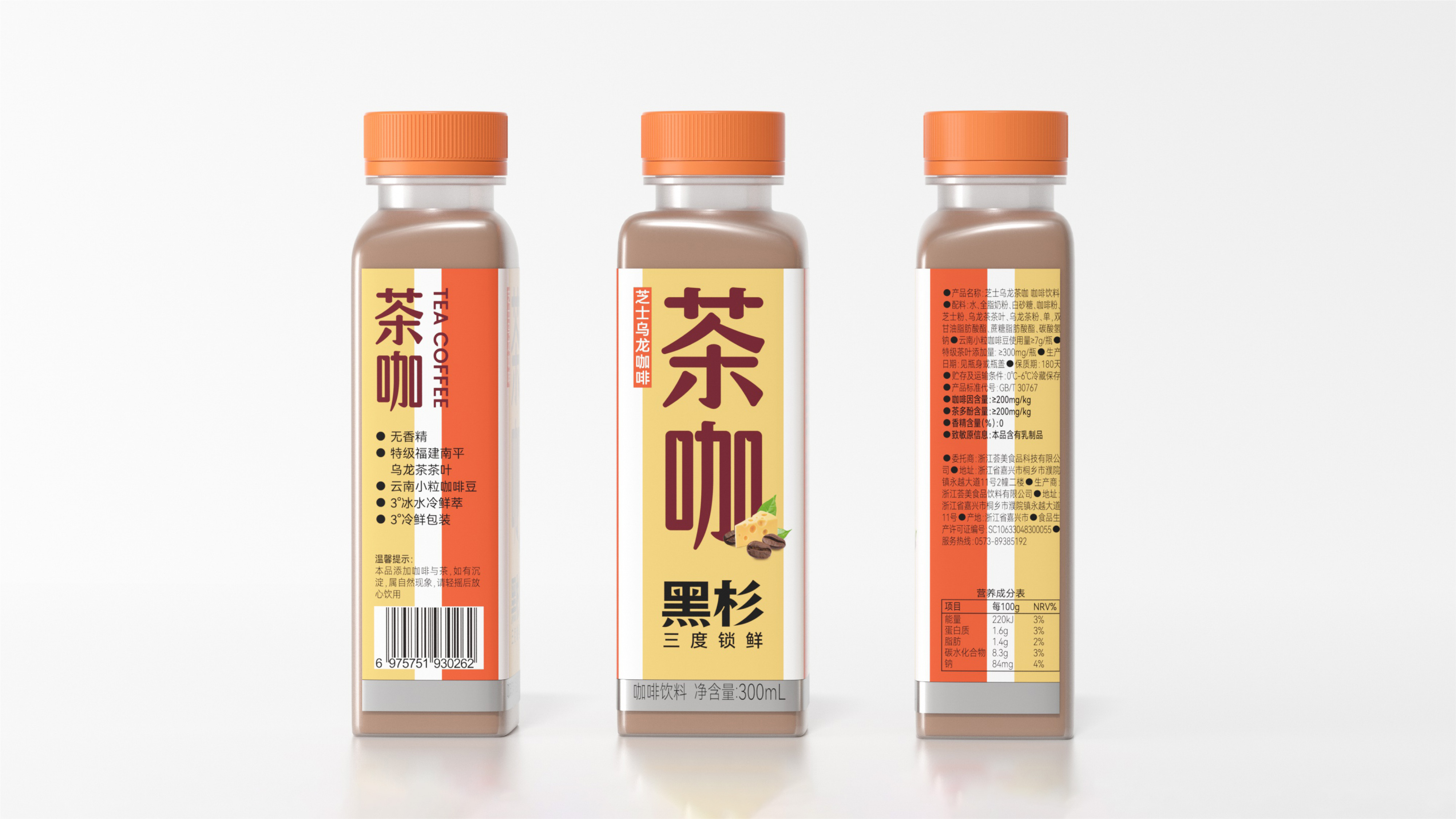
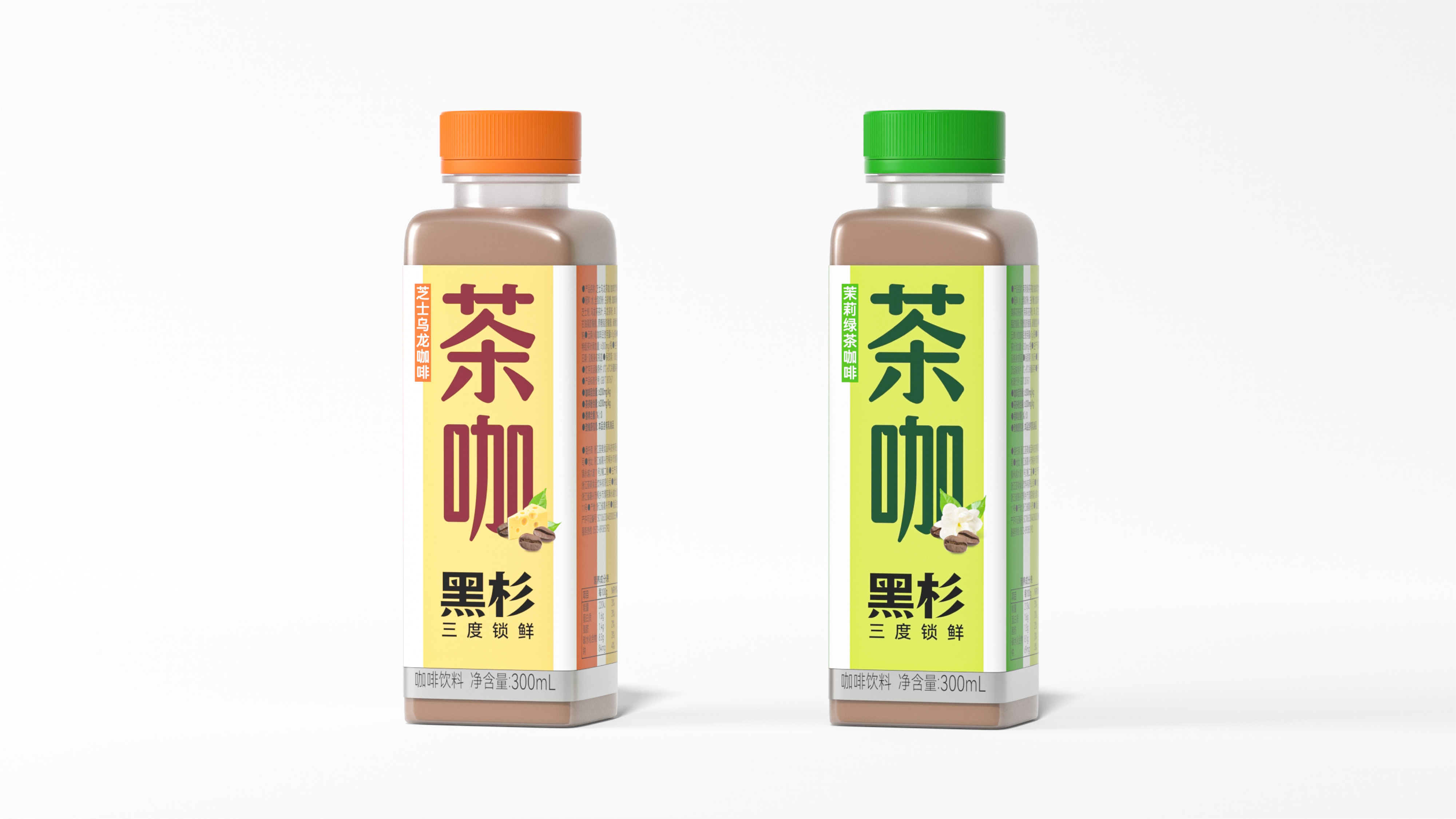
This project is to create a complete brand full-case design for Black Cedar, covering brand strategy, brand design, packaging design, page design, video production, etc. In the early stage of the project, we clearly defined the strong visual and strong fashion design direction - enhancing recognizability through color lines, and being able to be well extended in layout and material application, while strengthening brand name recognition. The brand visual design starts from the "彡" of "Black Cedar", through symbolization processing, evolving into three straight lines, forming a highly recognizable brand visual symbol. To reflect the coldness of ready-to-drink fresh coffee, the team uses green and purple as the main colors of the brand. At the packaging level, the team breaks away from the common round bottle design habit in the bottled coffee industry and replaces it with a more innovative packaging style, breaking the visual homogeneity of the category. The packaging design continues the overall VI visual of the brand, using the form of bar color blocks to present. For different flavors and versions, it distinguishes through colors and bottle bodies - presenting a simple and energetic visual language, which can quickly attract consumers' attention, whether in online display or offline display. In category expansion, the team designed a new "tea and coffee" category packaging for Black Cedar - innovatively integrating Eastern tea and Western coffee to create a new generation of products. While continuing the brand VI system, it strives to create high standards for brand and product visuals, through the new product visuals, helping Black Cedar become the leader of the tea and coffee new category.
黑杉咖啡凭借极具识别度的视觉体系与创新的包材语言,在国际设计领域获得最高认可——荣获德国红点奖。品牌升级后,黑杉咖啡迅速完成线上线下全渠道布局——产品全面进驻沃尔玛、盒马、华润万家、鲜风生活、合家福、比优特、苏果等商超,罗森、全家、7eleven、友客、唐久便利、逸刻、优同等便利店、皇冠幸福里、爱达乐、万利隆、山山家、美丽家食品、包记西点、亚卡芙等烘焙店的众多线下零售终端;天猫“黑杉旗舰店” 已正式上线运营,拿下天猫瓶装咖啡类目TOP1;产品线从即饮鲜萃咖啡拓展至茶咖新品类,以东方茶叶与西方咖啡的创新融合开辟全新赛道。2024年10月,品牌集中推出了加浓冰美式、生椰拿铁、柚C冰美式等多款新品,凭借“三度冷鲜”锁鲜技术与高辨识度的品牌视觉,黑杉正在重新定义即饮鲜咖啡的消费体验。
黑杉HEIITHAN是一个全新的咖啡品牌,成立于2022年,母公司为浙江荟美食品饮料有限公司。品牌致力于打造即饮鲜咖啡,希望通过优质原料的精选、锁鲜技术探索、严苛的供应链体系,让高品质的鲜咖啡不再局限在咖啡店里,让咖啡爱好者随时随地畅享鲜咖。黑杉拥有冷链生产灌装线、冷链物流运输、冷鲜保存体系。品牌提出 “三度冷鲜” 概念:一度“鲜”——精选与现磨咖啡相同品种的咖啡豆,严格把控烘焙新鲜度;二度“鲜”——采用0~6℃低温软水20小时滴滤萃取,还原咖啡豆风味;三度“鲜”——不添加防腐剂,采用3℃±3低温冷链运输,冷鲜储藏。 “黑杉是一种态度” ——简单、真实是朴实而又难得的品质,黑杉态度就是要简单地做一瓶真实的鲜咖啡。杉树挺拔且坚毅,这也是选择“黑杉”作为品牌名的原因。
本次项目是为黑杉打造完整的品牌全案设计,服务涵盖品牌策略、品牌设计、包装设计、页面设计、视频制作等全维度。我们在项目初期明确了强视觉、强时尚的设计方向——以颜色线条的形式增强识别性,在版面及物料应用上均可良好延伸,同时强化品牌名的认知。品牌视觉设计从“黑杉”的“彡”出发,通过符号化处理演变为三条直线,形成极具识别属性的品牌视觉符号。为体现即饮鲜咖啡的冷鲜感,团队采用绿色和紫色两种冷色作为品牌主色。在包材层面,团队跳出瓶装咖啡行业普遍的圆瓶设计惯性,以更新颖的包材样式进行替换,打破品类视觉同质化。包装设计延续品牌整体VI视觉,使用条形色块的形式来呈现。针对不同的口味和版本,通过色彩和瓶体进行区分——整体呈现出简洁而充满能量感的视觉语言,不管是在线上展示还是线下陈列,都能够迅速吸引消费者目光。在品类拓展方面,团队为黑杉设计了全新的 “茶咖”品类包装——将东方茶叶与西方咖啡创新融合,创造出新一代产品。在延续品牌VI体系的同时,力求打造高标准的品牌和产品视觉,通过全新的产品视觉,助力黑杉成为茶咖新品类的领导者。