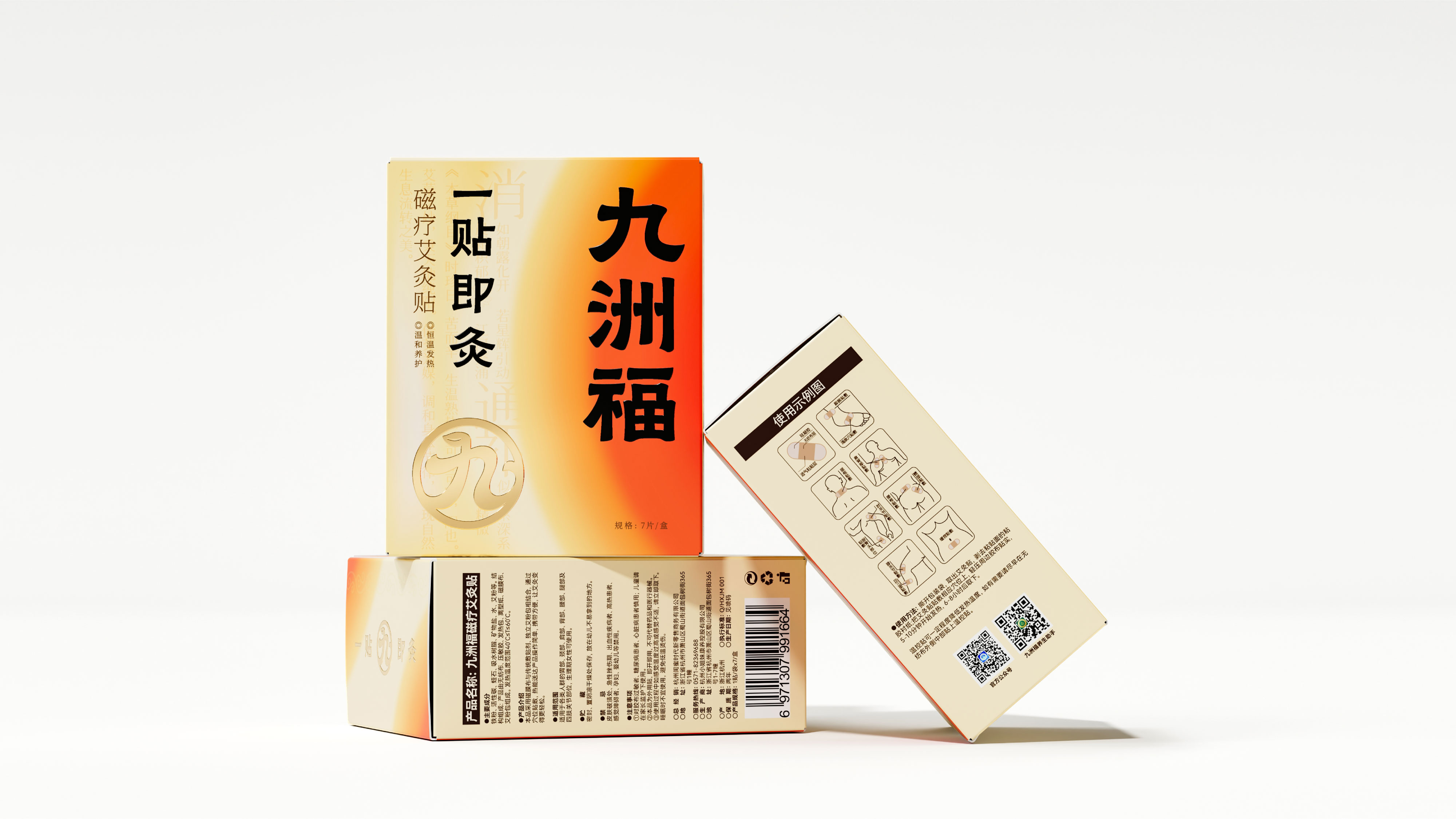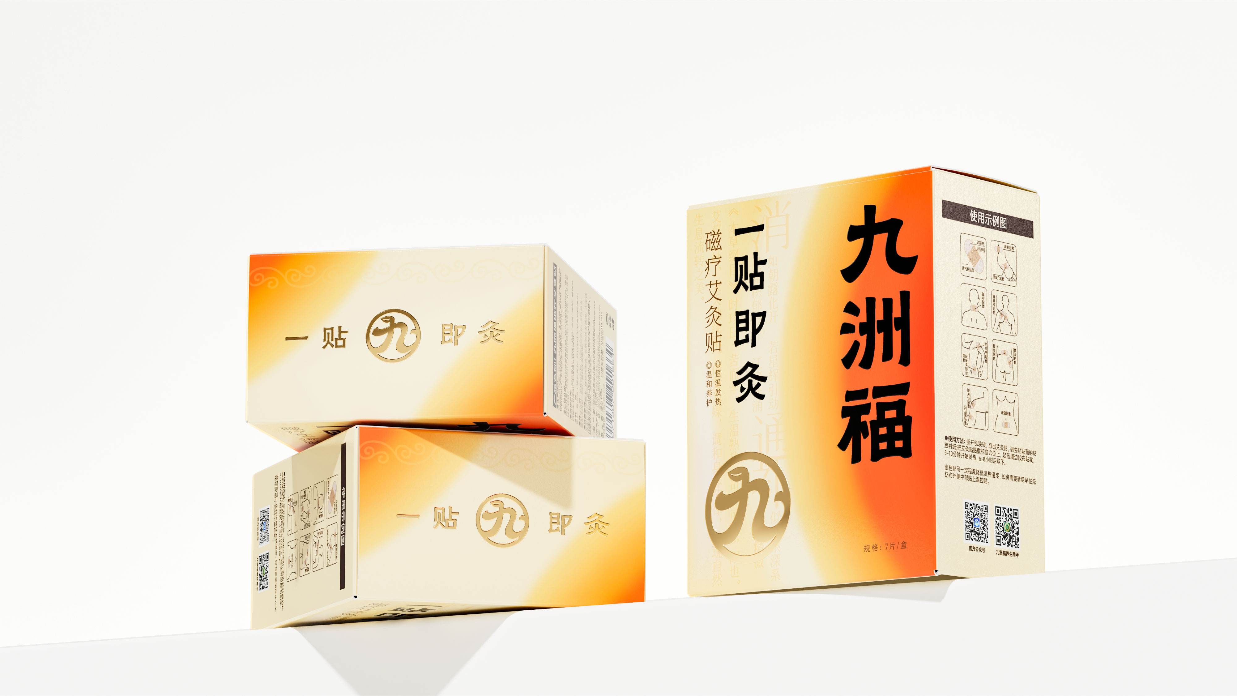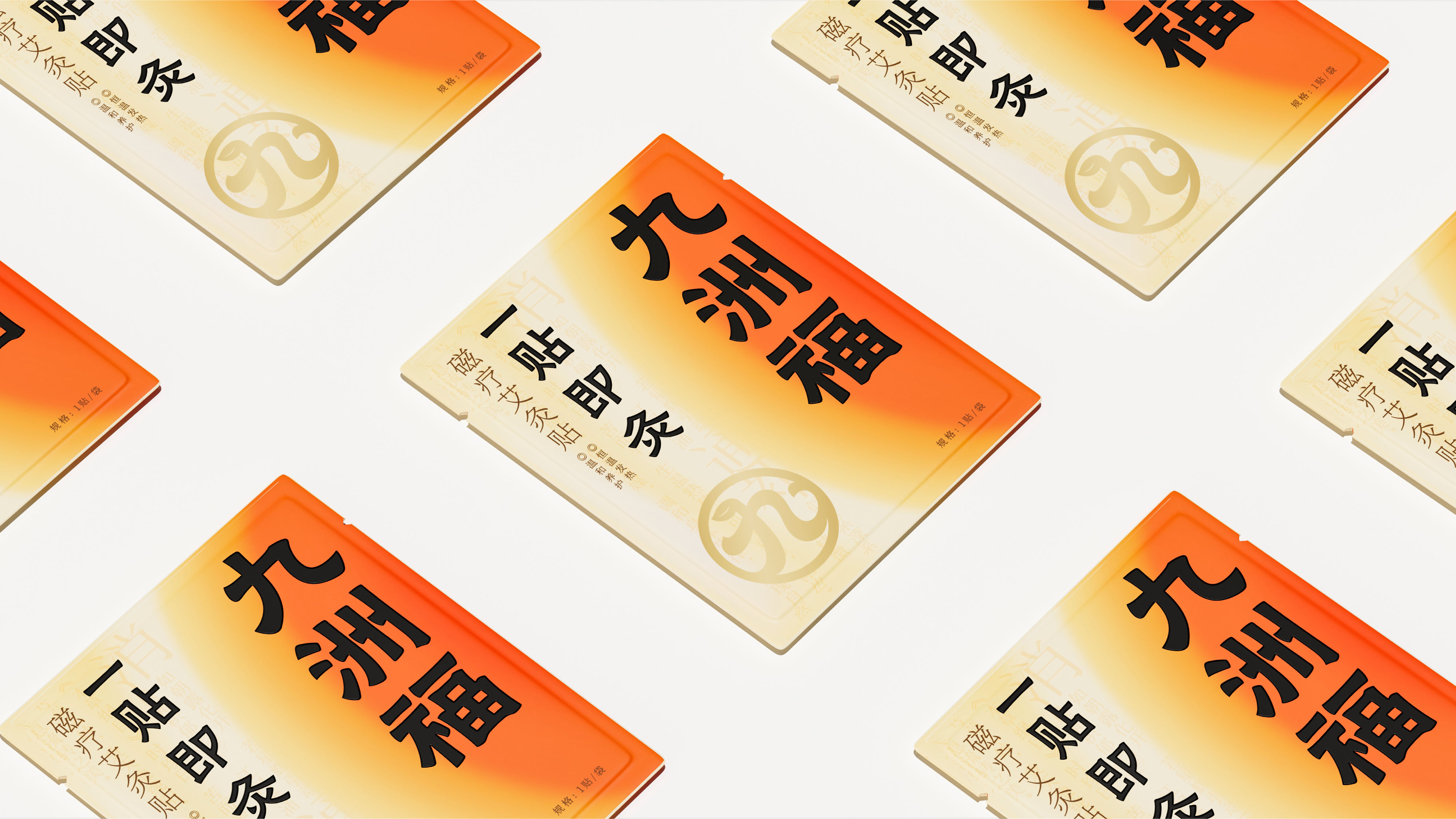
九洲福 磁疗艾灸贴
BRAND:九洲福
PROJECT MANAGER: Kevin、Lin
DESIGNER:CHENG
3D EFFECT:7%
YEAR:2025.3
Jiuzhoufu was formerly a leading company in the private domain health category, located in Xiaoshan, Hangzhou. It has numerous brands covering a wide range of products for the middle-aged consumer group. At present, due to business strategy adjustments, it has entered the video account sector.
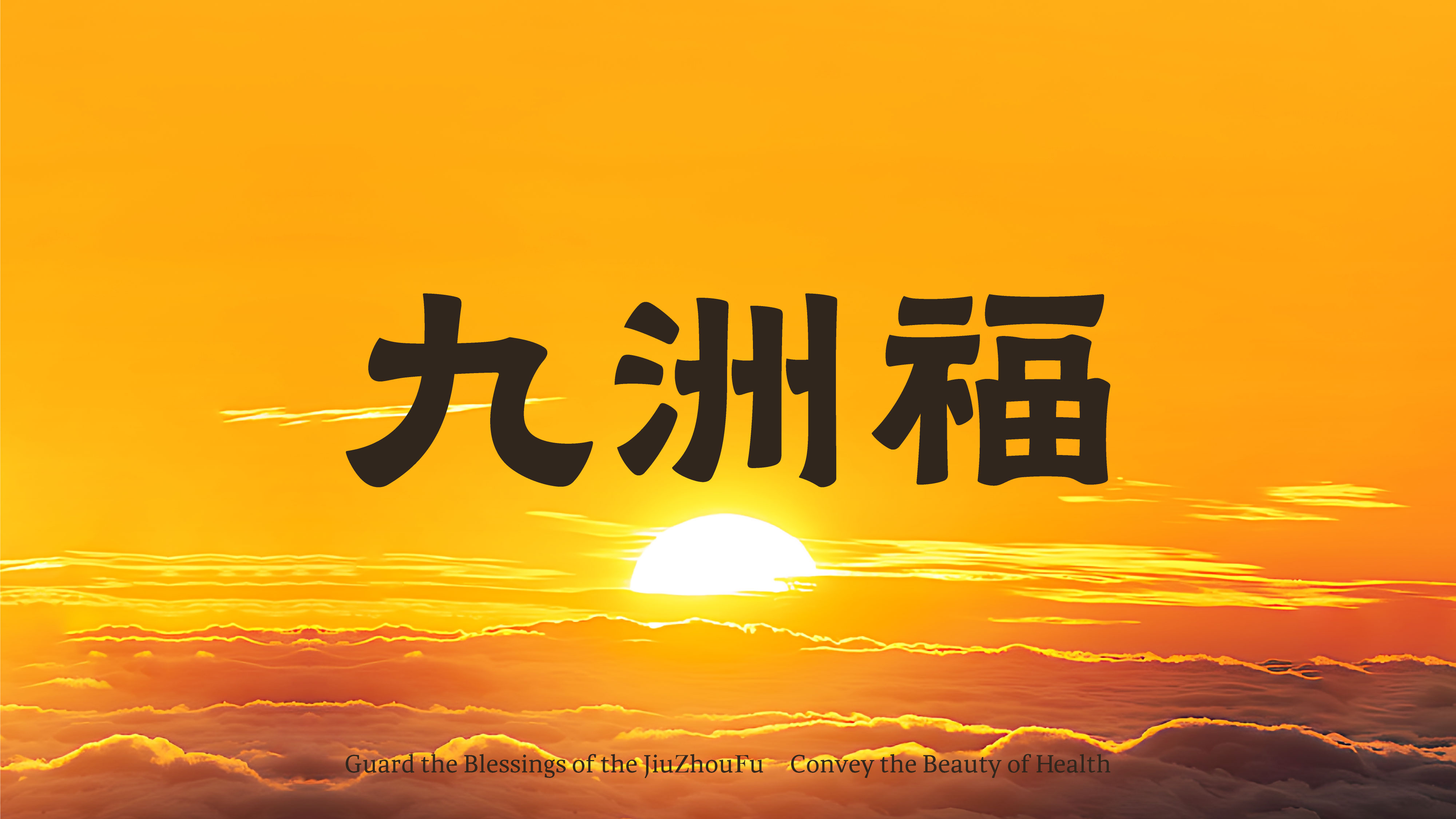
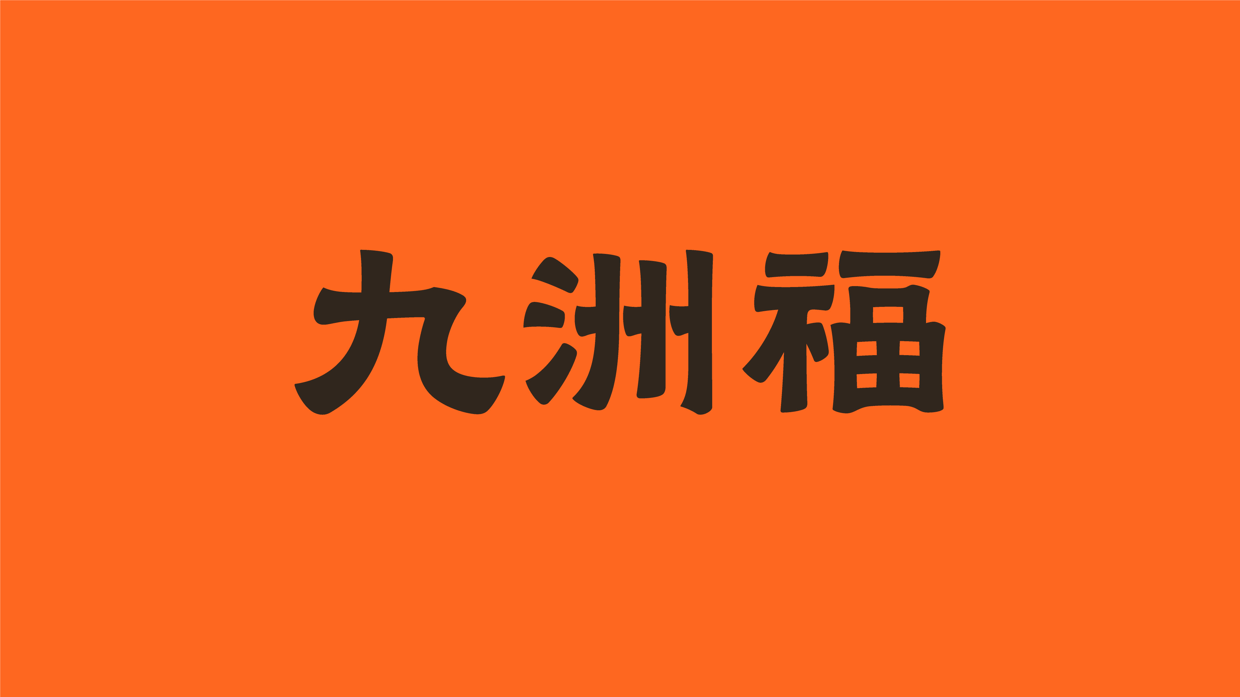
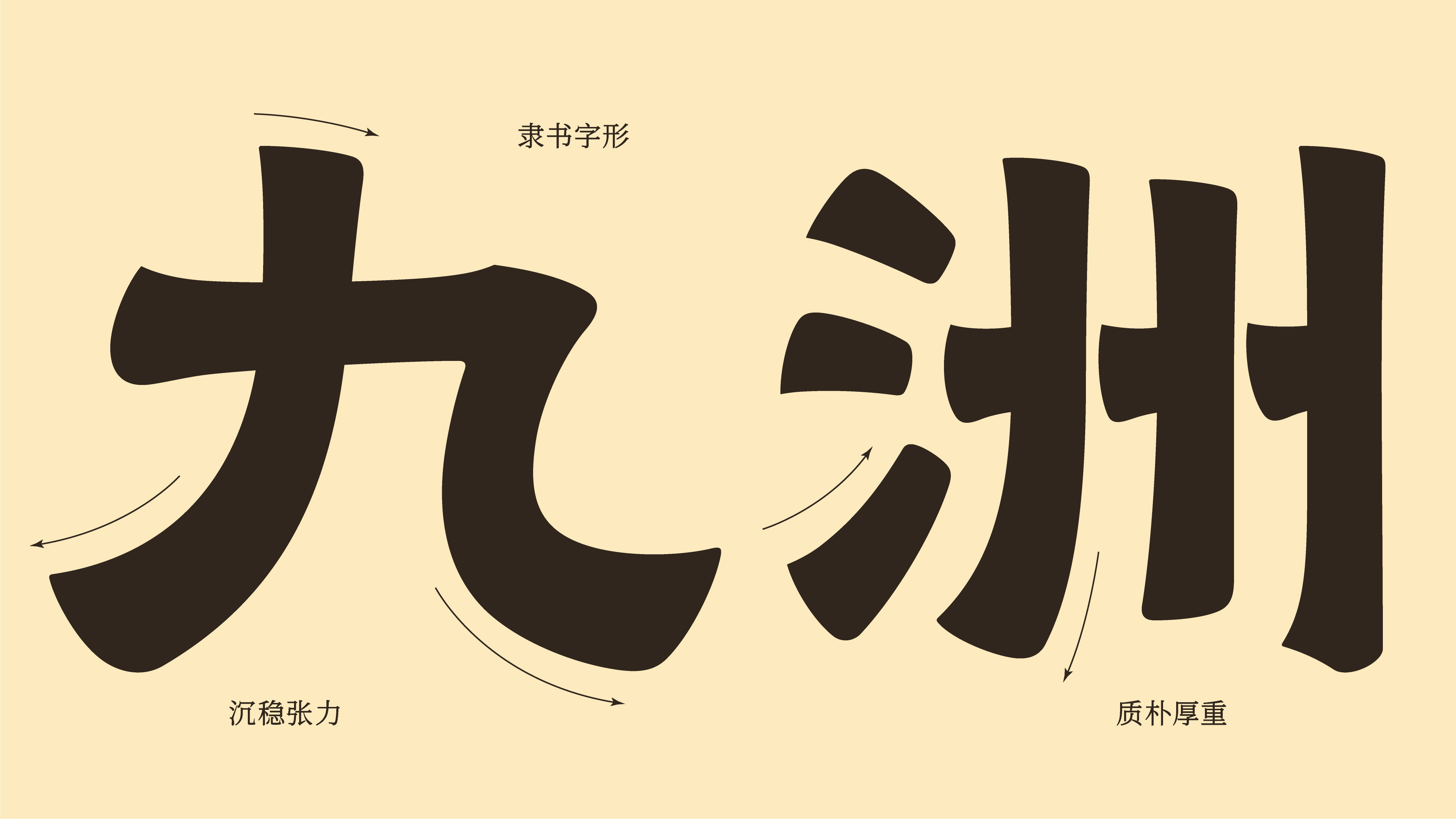
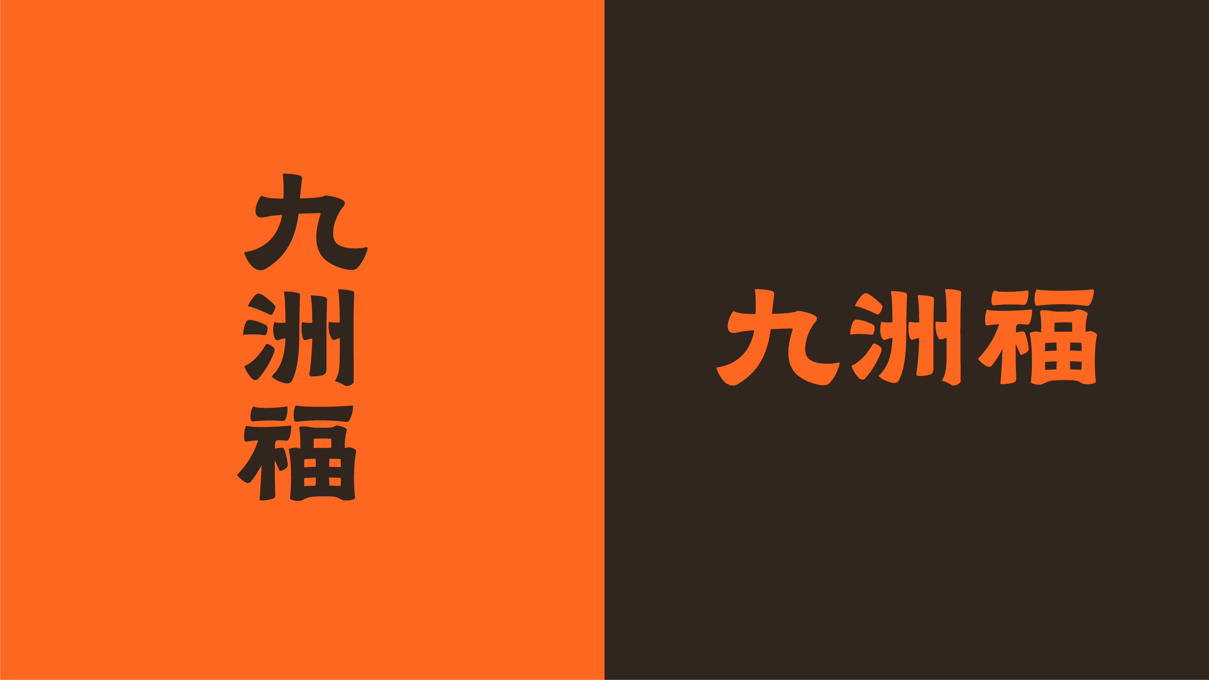
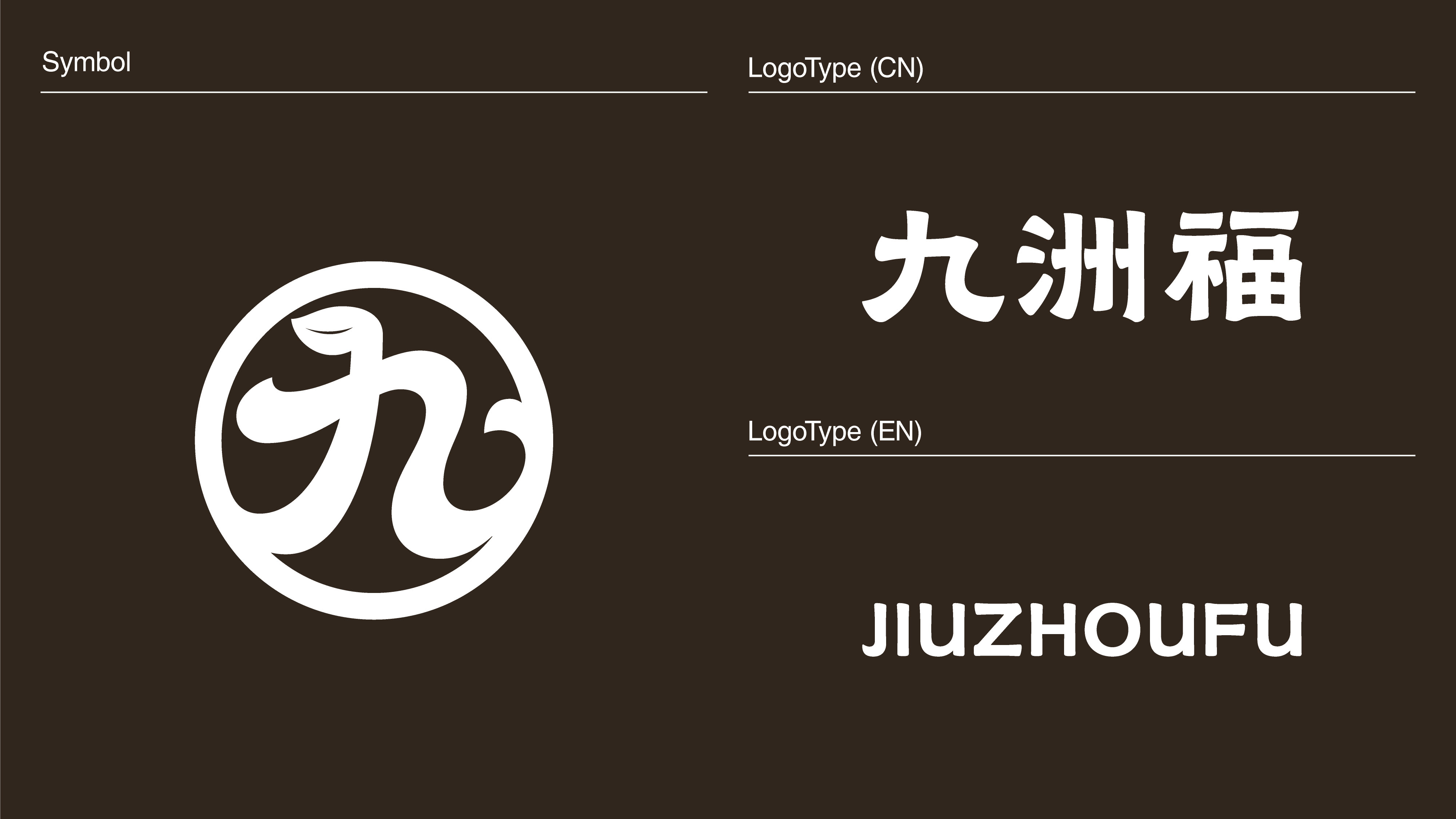
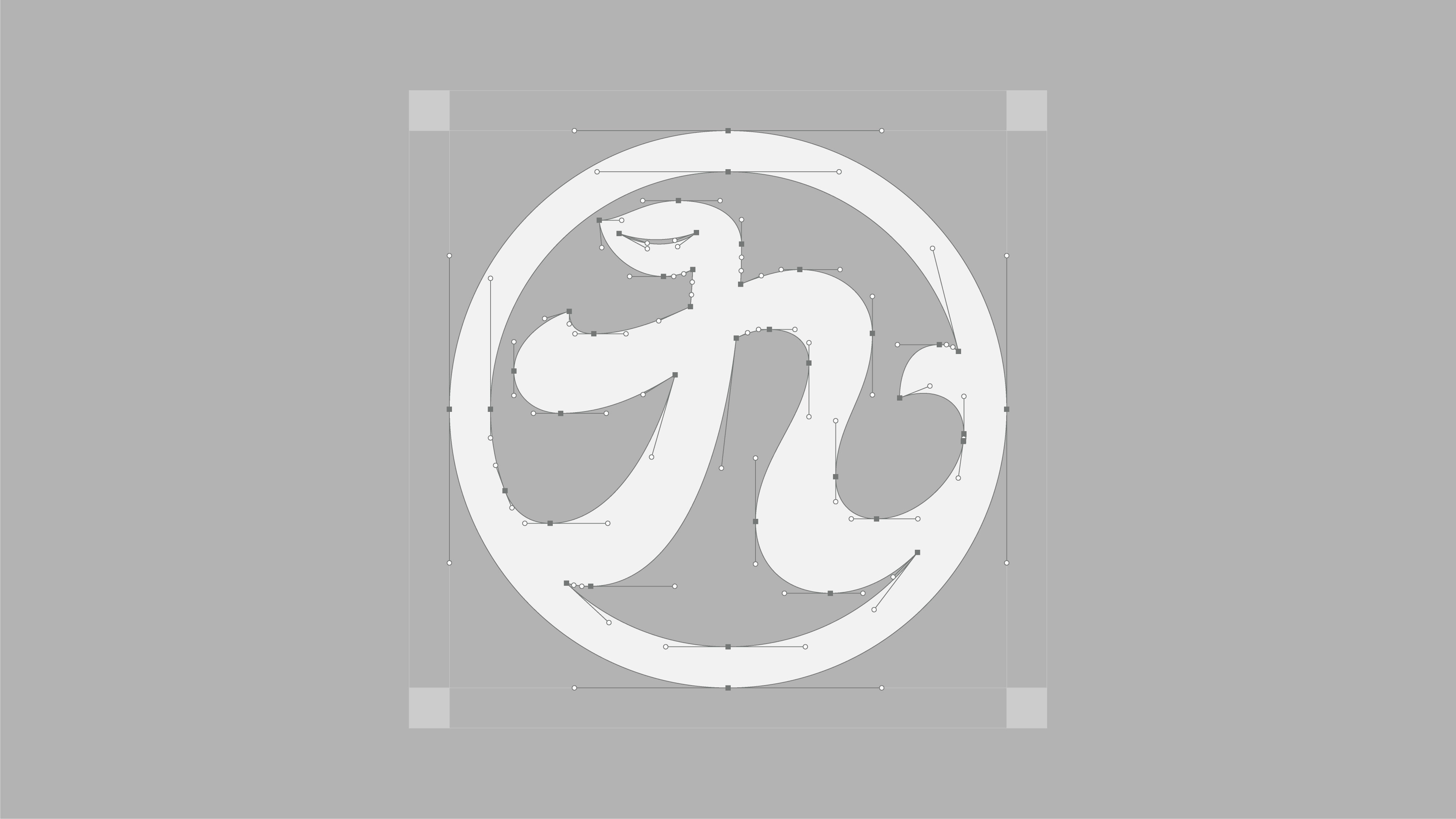
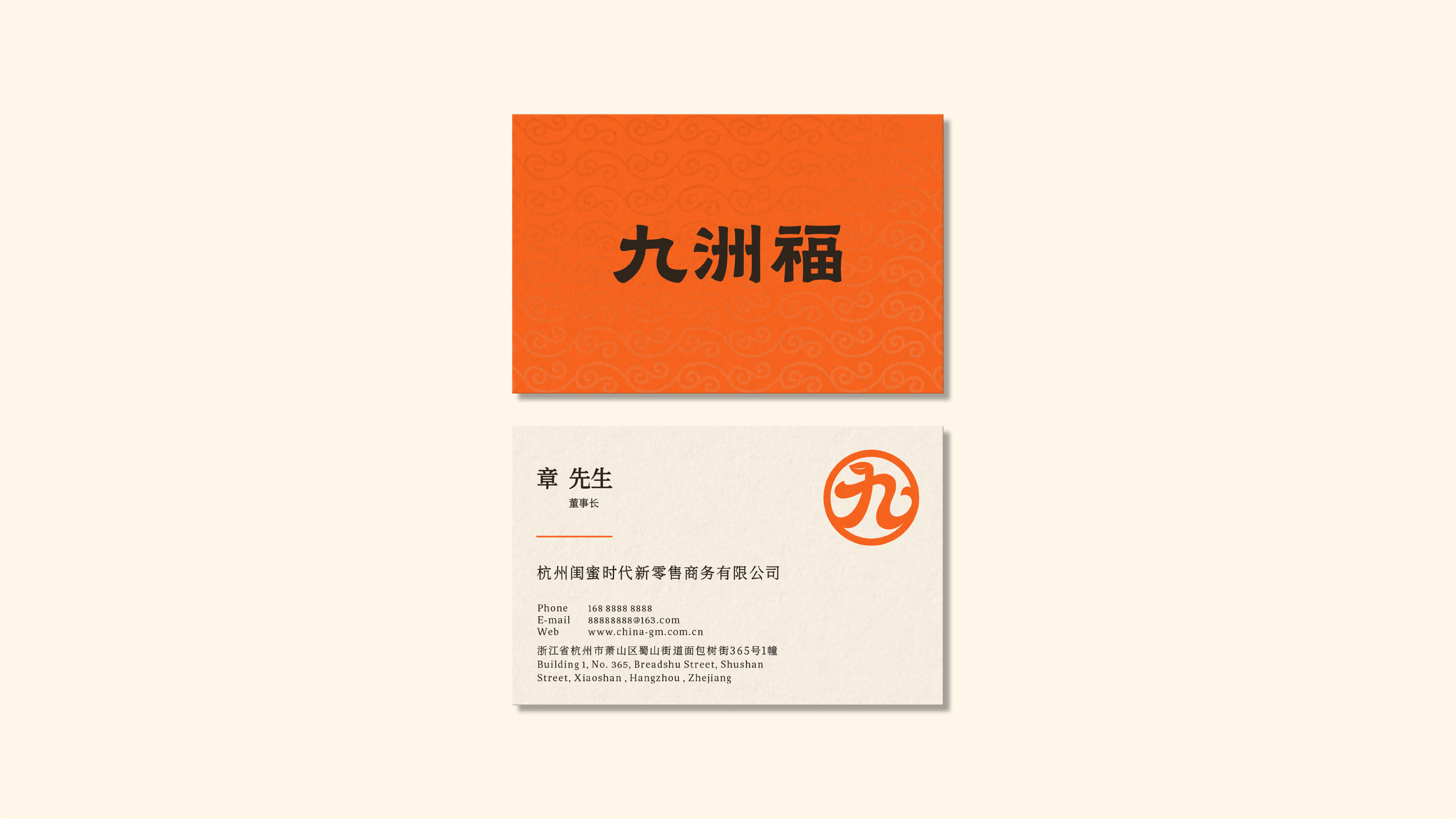
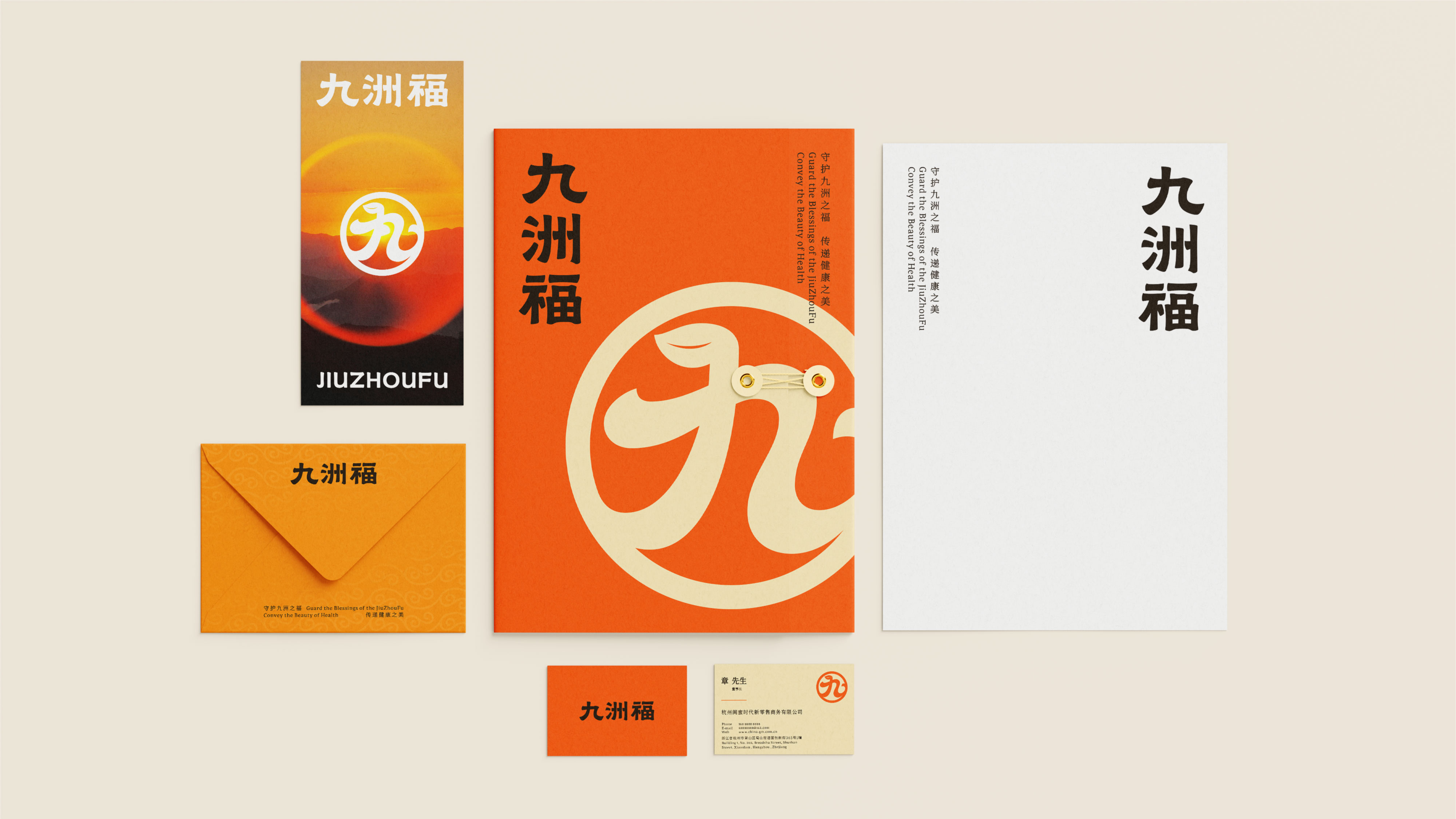
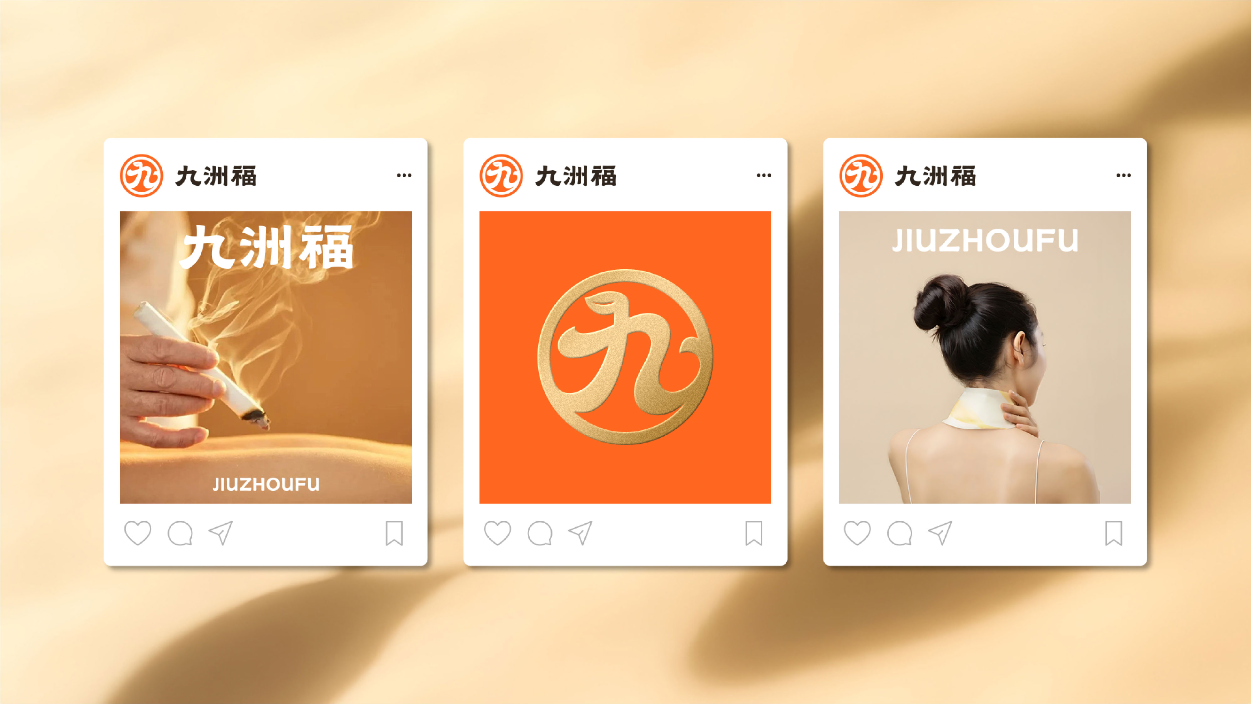
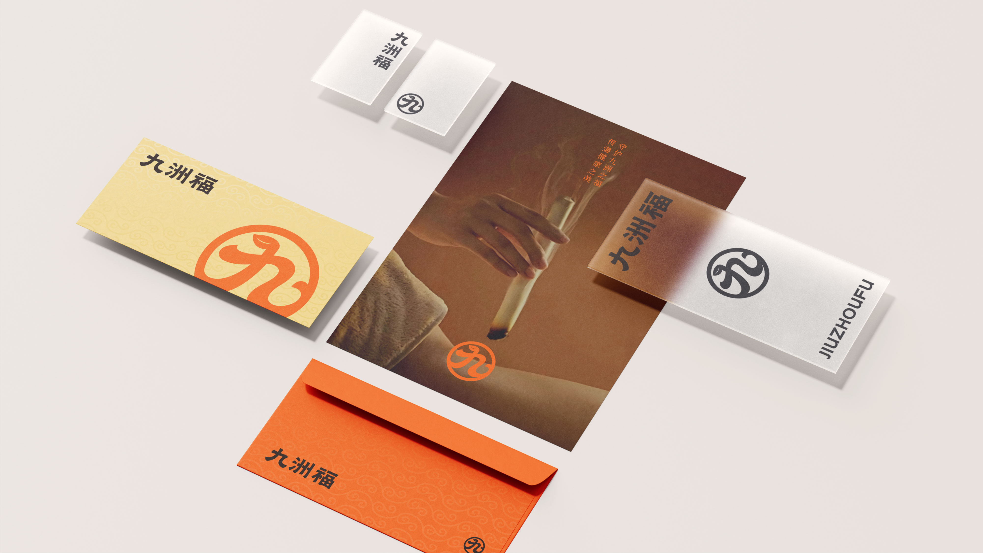
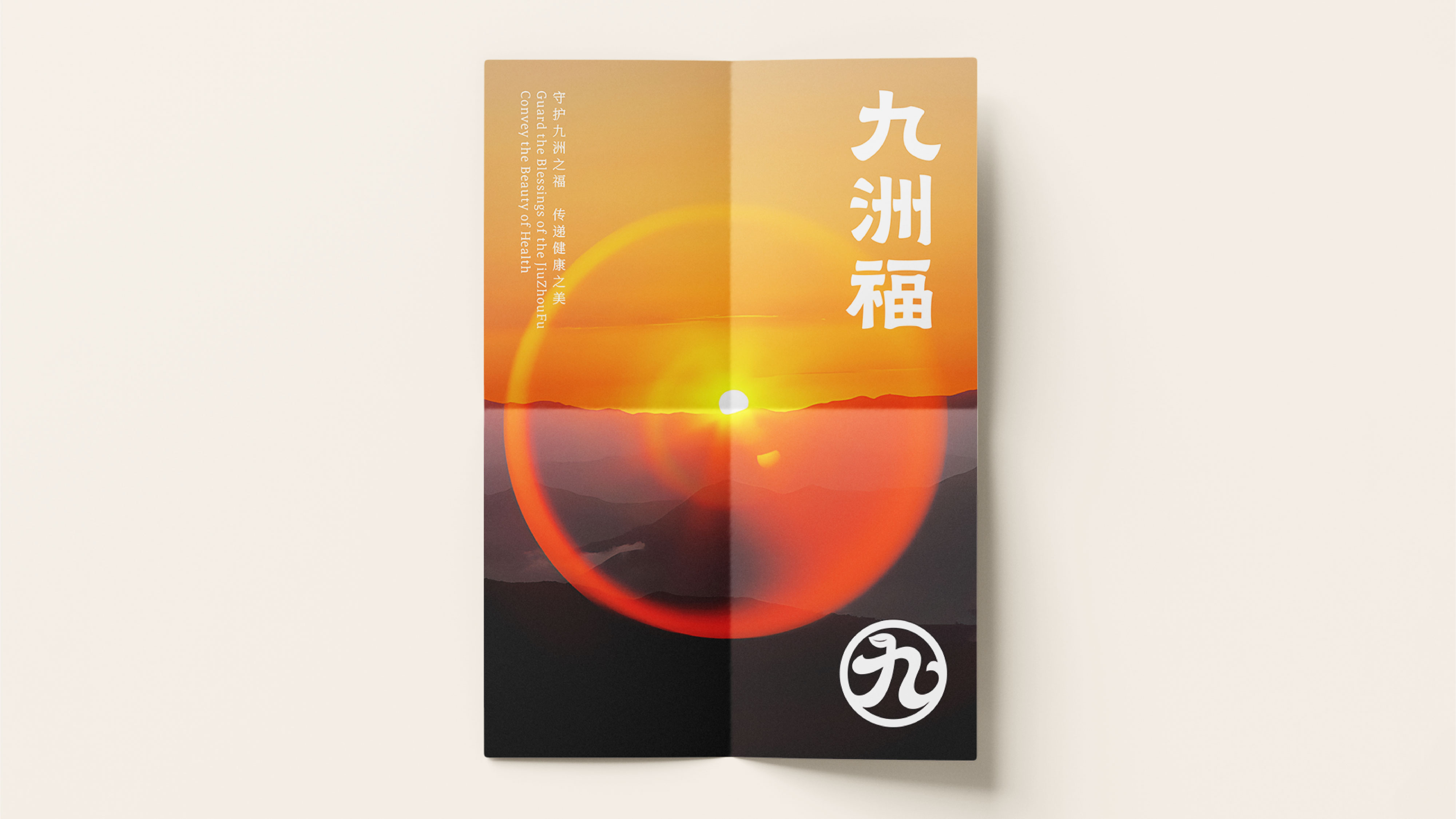
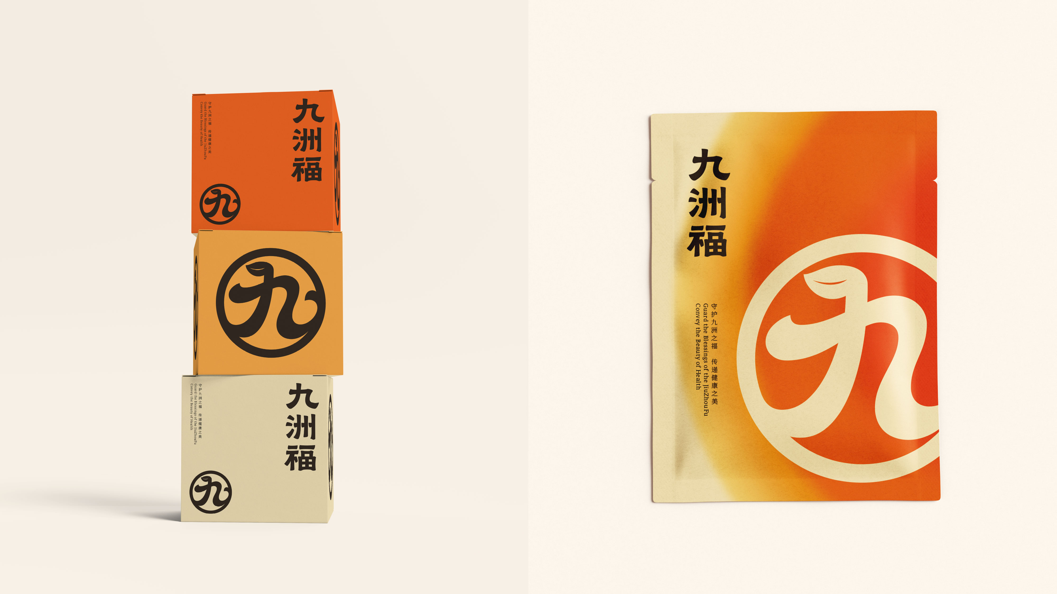
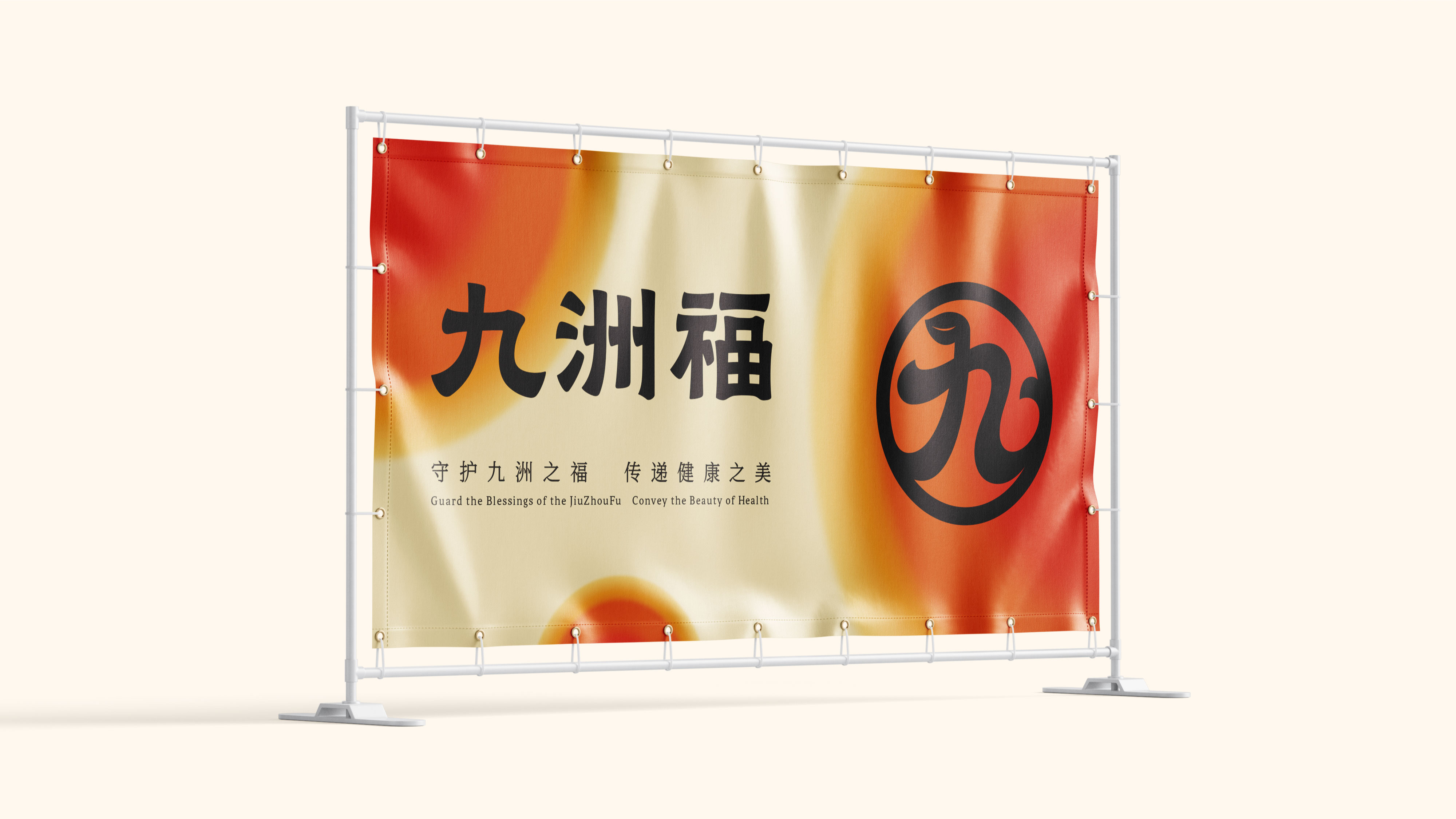
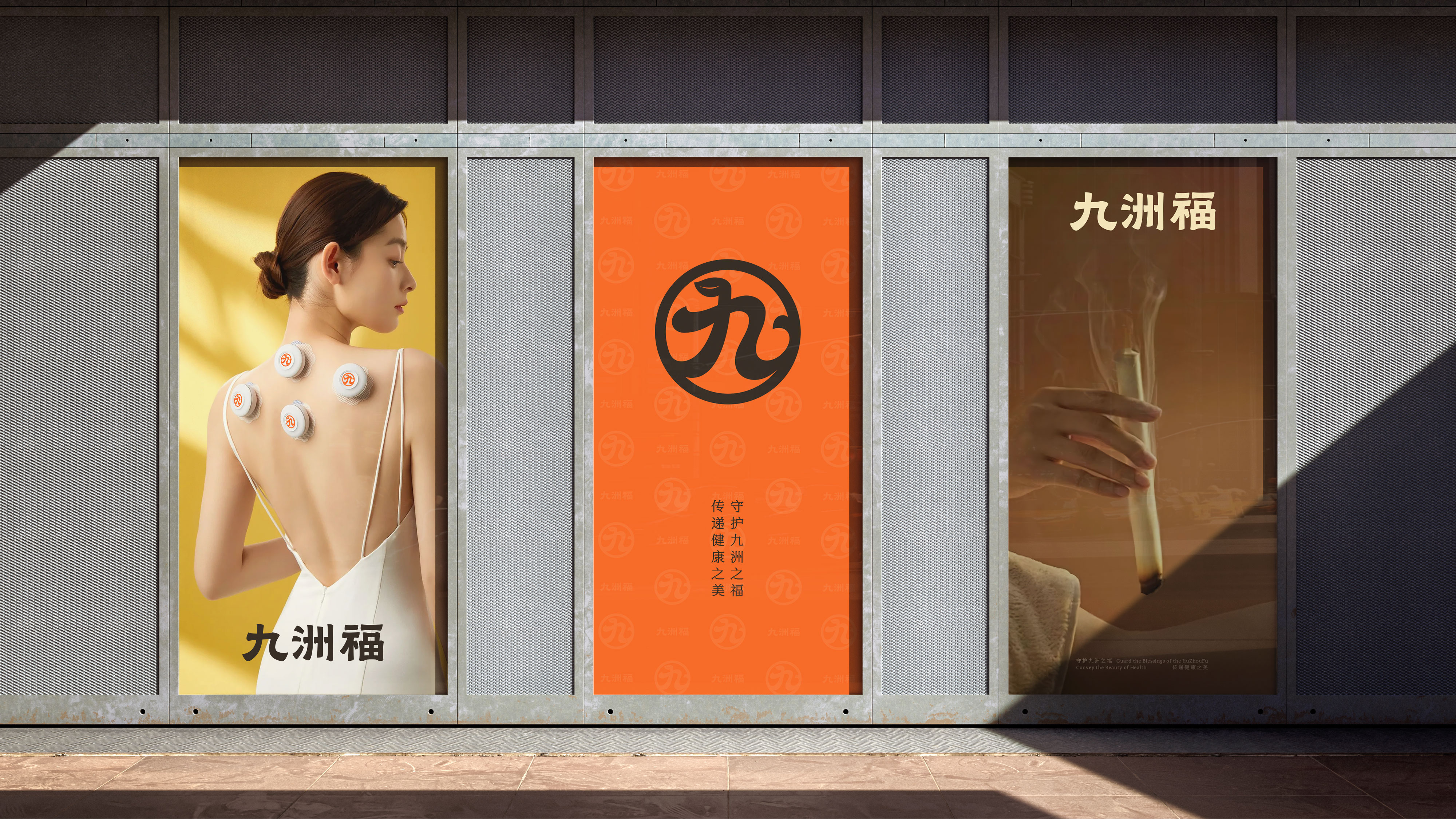
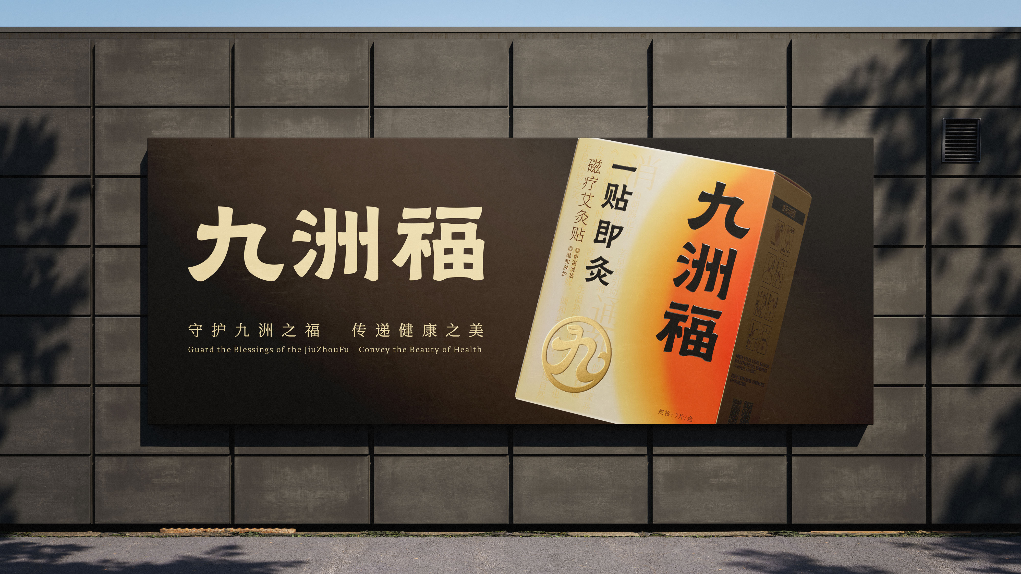
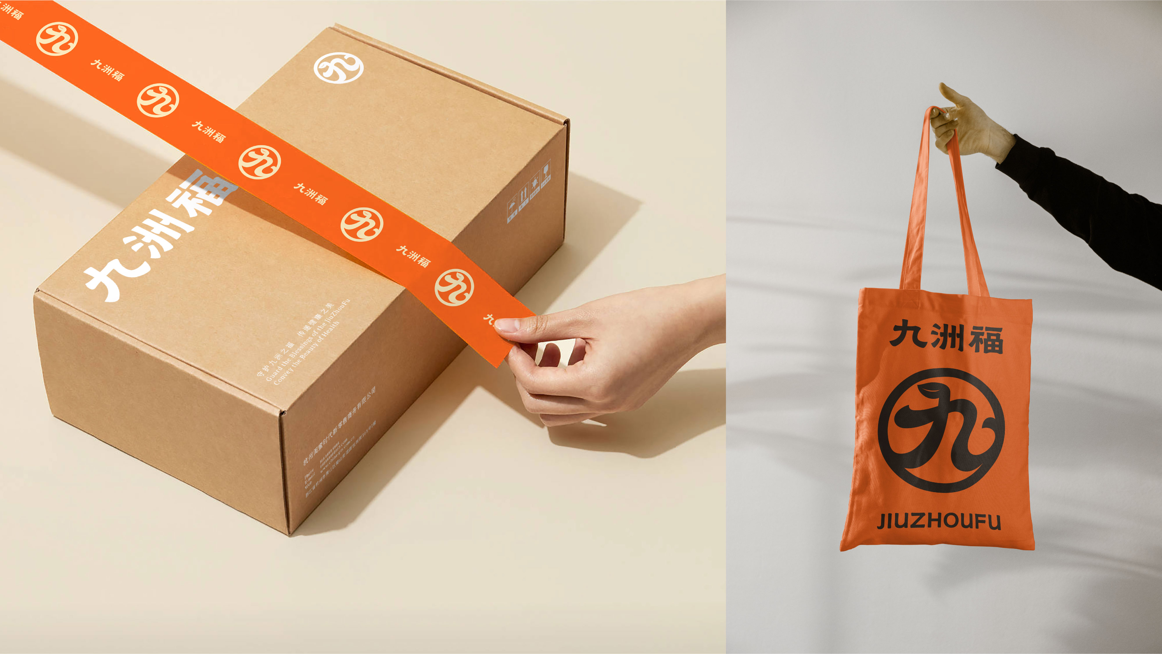
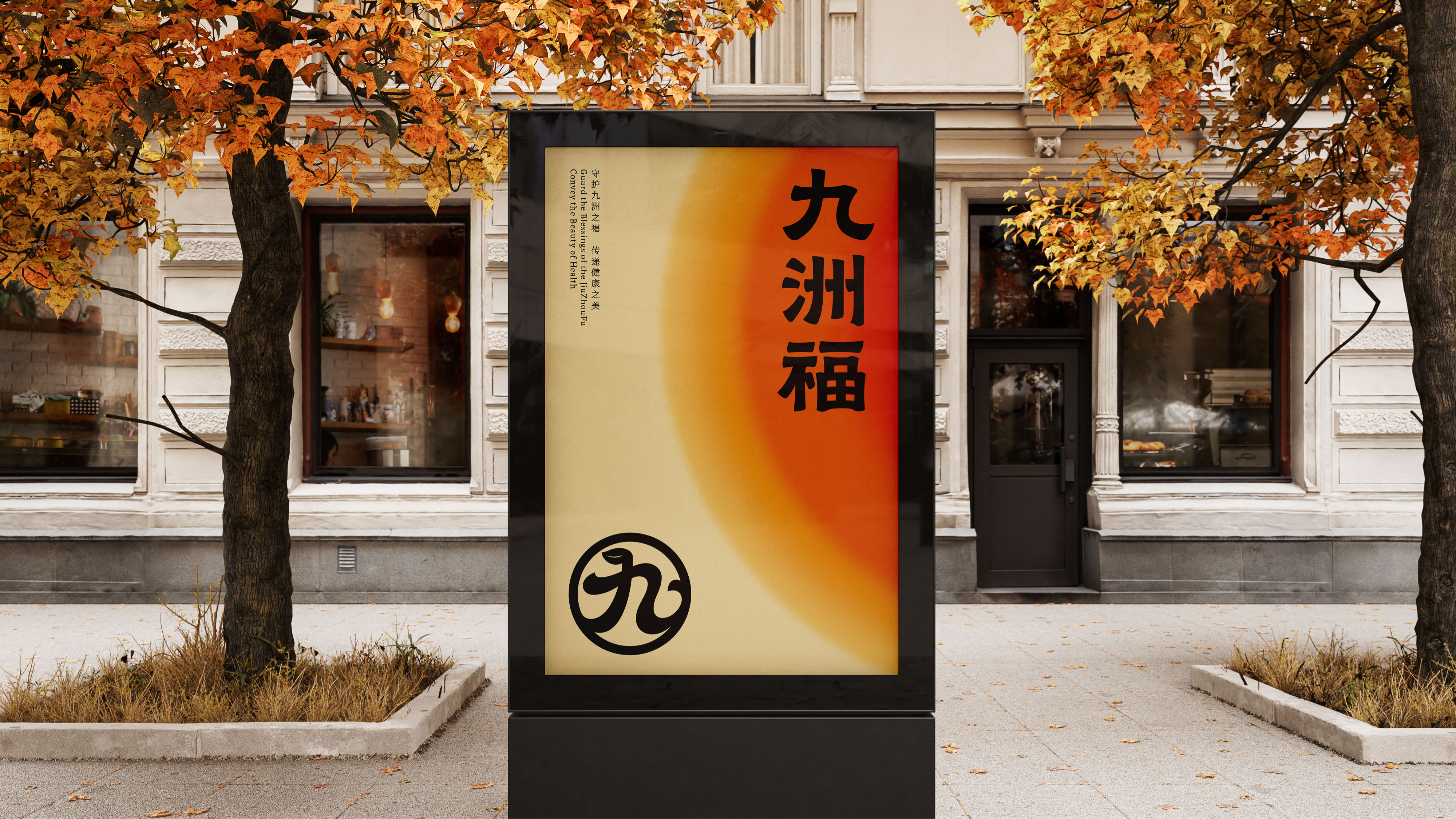
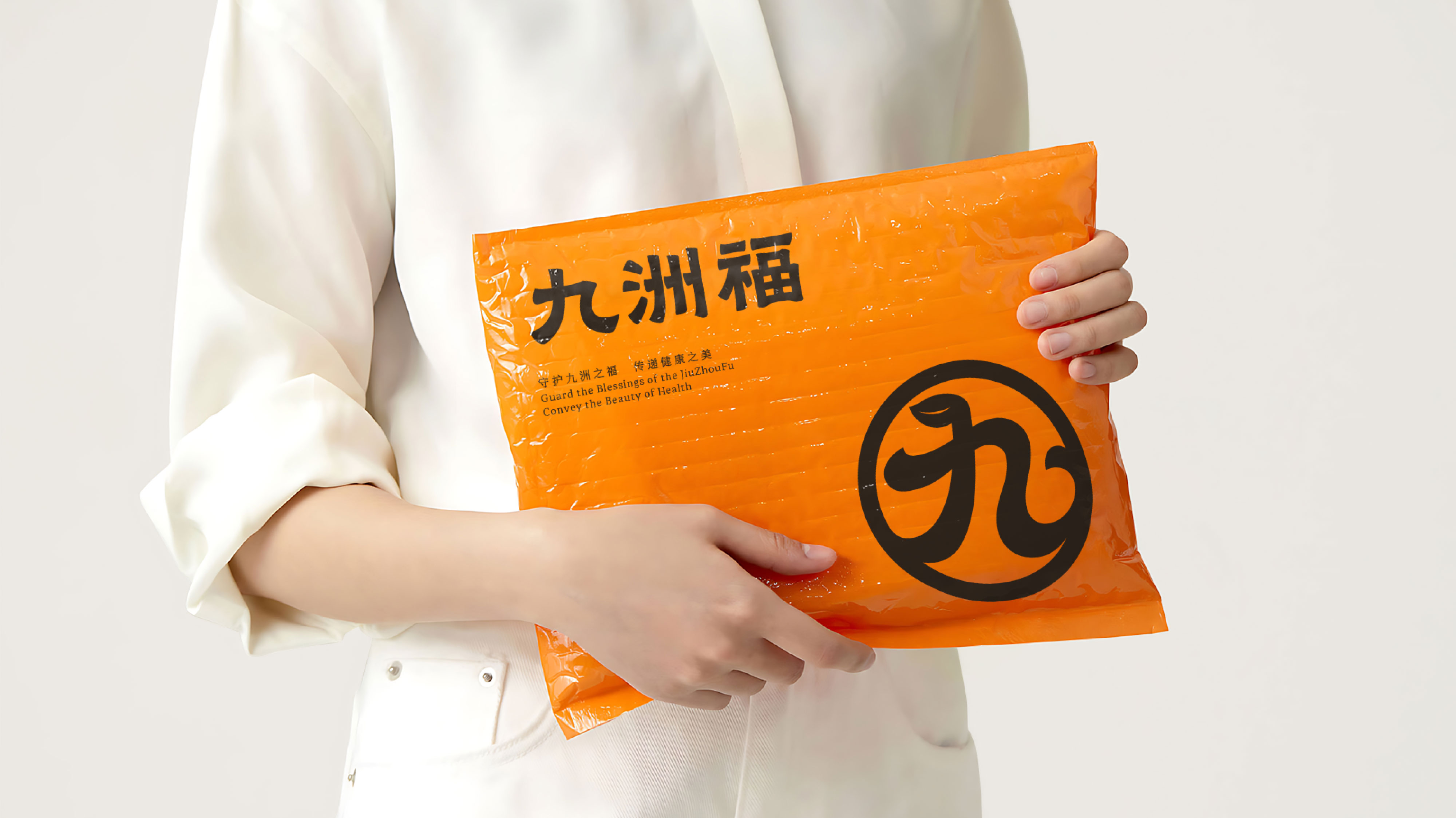
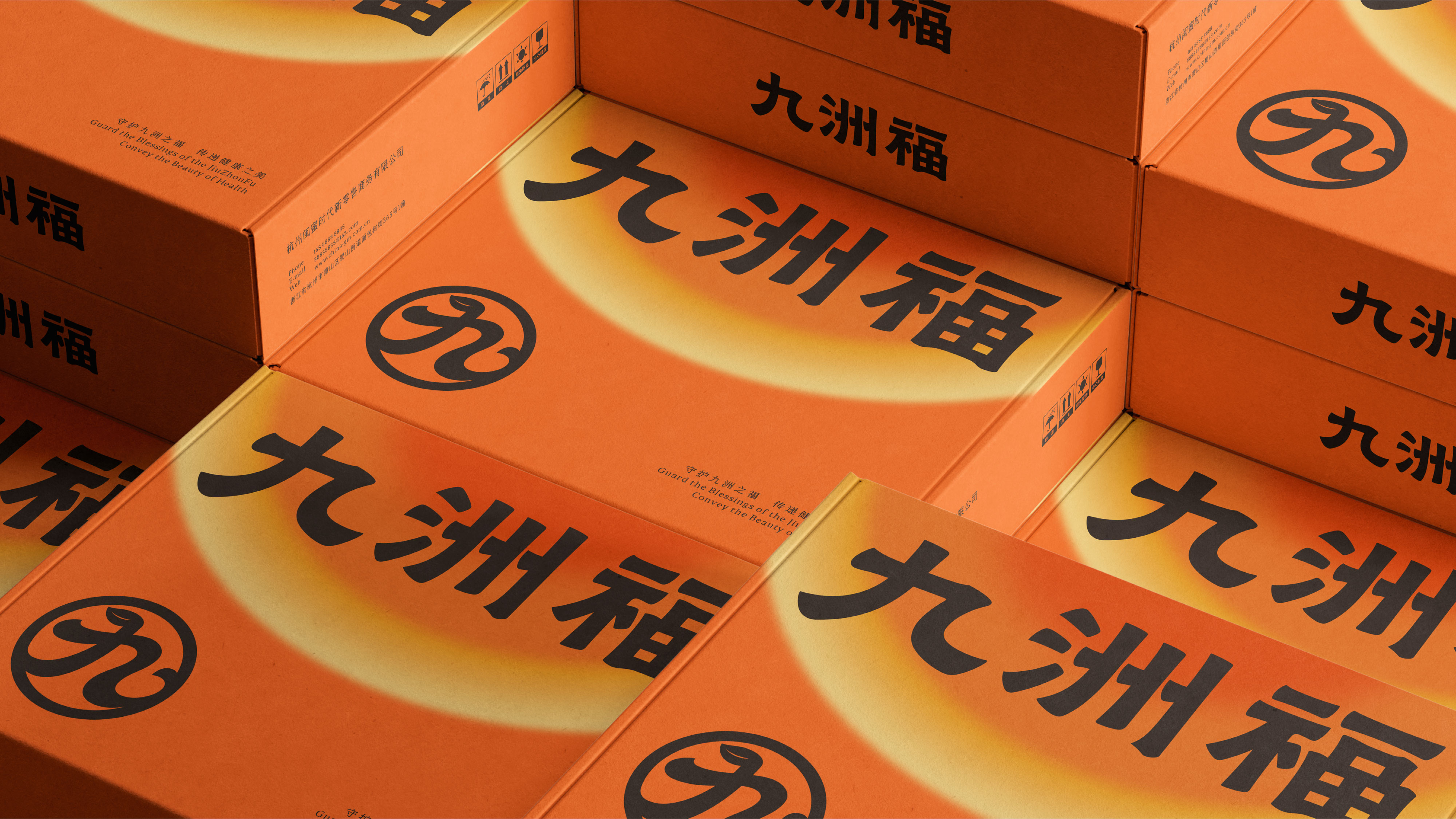
The brand color chosen for this project is orange, which gives a warm feeling like the sun, aiming to indicate that this moxibustion patch product brings consumers a warm sensation. The design of the auxiliary graphics takes the character "九" in the brand name as the visual carrier, integrating the form of the immortal herb (mugwort) to convey the traditional Chinese medicine philosophy of harmony and unity, symbolizing the brand concept that moxibustion patches regulate the body and mind through the natural energy cycle. The structure of the character "九" uses smooth curves to interpret "九", maintaining the recognizability of the Chinese character while forming a closed loop, symbolizing an endless cycle and universal benefits across the nine continents. The design of the top Crown fairy grass (mugwort) symbolizes the harmony of heaven, earth and man, corresponding to the holistic view of traditional Chinese medicine. The minimalist flame line implies the warming and unblocking characteristics of moxibustion, imitating the left-growing posture of mugwort to enhance its natural herbal attributes.
九洲福前身是做私域大健康类目的头部公司,坐落在杭州萧山,旗下众多品牌涵盖中年消费群体的多种产品,现阶段由于业务战略调整,进军视频号板块。
本次项目品牌色选择与太阳一样具有温热感的橘色,意在表明该艾灸贴产品带给消费者温热的感觉。辅助图形的设计上以品牌名中的“九”字为视觉载体,融入仙草(艾草)形态,传递九九归一的中医养生哲学,象征艾灸贴通过自然能量循环调理身心的品牌理念。“九”字结构采用流畅曲线演绎“九”,保留汉字识别度,又形成闭合环状,暗喻循环不息、九洲普惠。顶冠仙草(艾草)形态设计上象征天地人三才和谐,对应中医整体观,极简火苗线条暗喻艾灸温通特性,模仿艾草向左生长姿态,强化天然草本属性。