
魔力泡 植萃泡沫清洗剂


BRAND:固特威 魔力泡
PROJECT MANAGER:Kevin
DESIGNER:CHENG
3D EFFECT:Mega
YEAR:2024.01

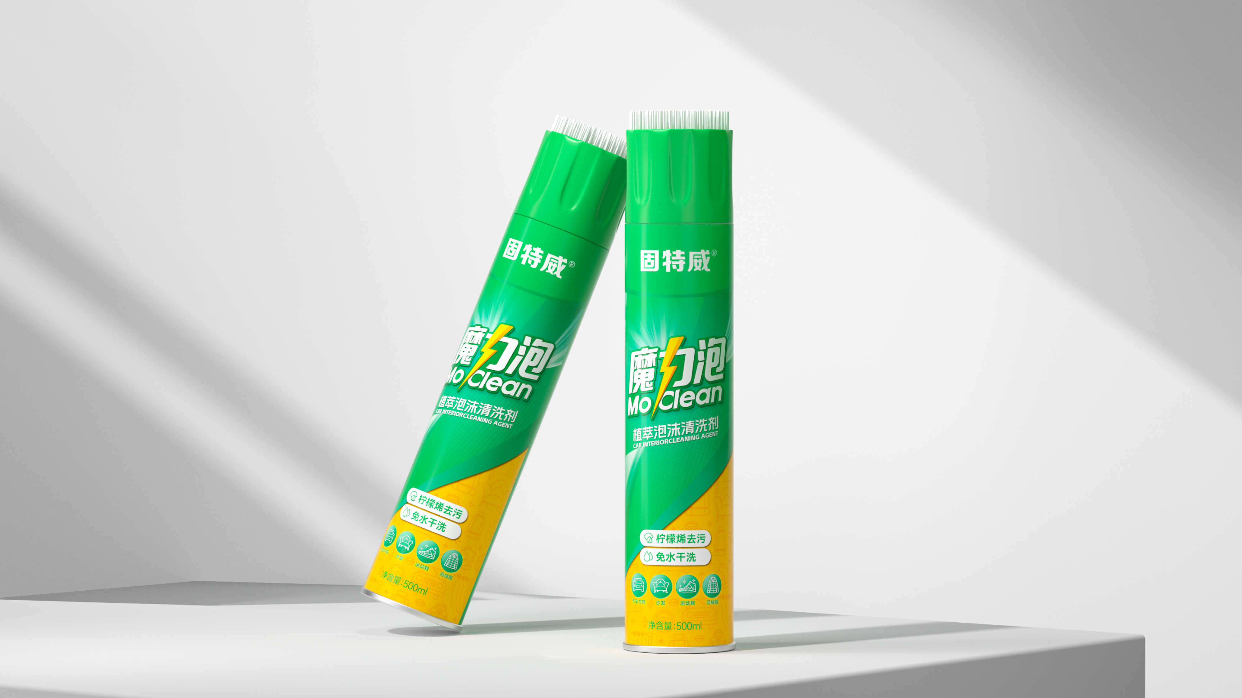
The Magic Bubble Essence Foam Cleaning Agent has successfully established a differentiated brand image in the automotive interior cleaning market through systematic brand visual and packaging design upgrades, combining a sense of speed with quality. Against the backdrop of the continuous expansion of the automotive beauty and maintenance market, car owners' demand for interior cleaning products is upgrading from "functionality" to "experience". Magic Bubble has precisely entered this growth sector with its dual positioning of "rapid decontamination" and "plant-based mildness". The refreshed brand visual system uses the lightning element as the core identification symbol, conveying the product characteristics of "speed" and "magic", effectively strengthening the brand's memory points and recognition in consumers' minds, and establishing a differentiated visual perception for the brand in the highly competitive automotive cleaning products market.

Magic Bubble is a sub-brand of Korper Besonders, focusing on automotive interior cleaning. Korper Besonders was founded in 2008 and is affiliated with Hangzhou Weike Tai Mei Brand Management Co., Ltd. It is a national brand specializing in automotive beauty and maintenance products. The product function of Magic Bubble is rapid decontamination, and it is dedicated to providing car owners with a more comfortable interior cleaning experience.

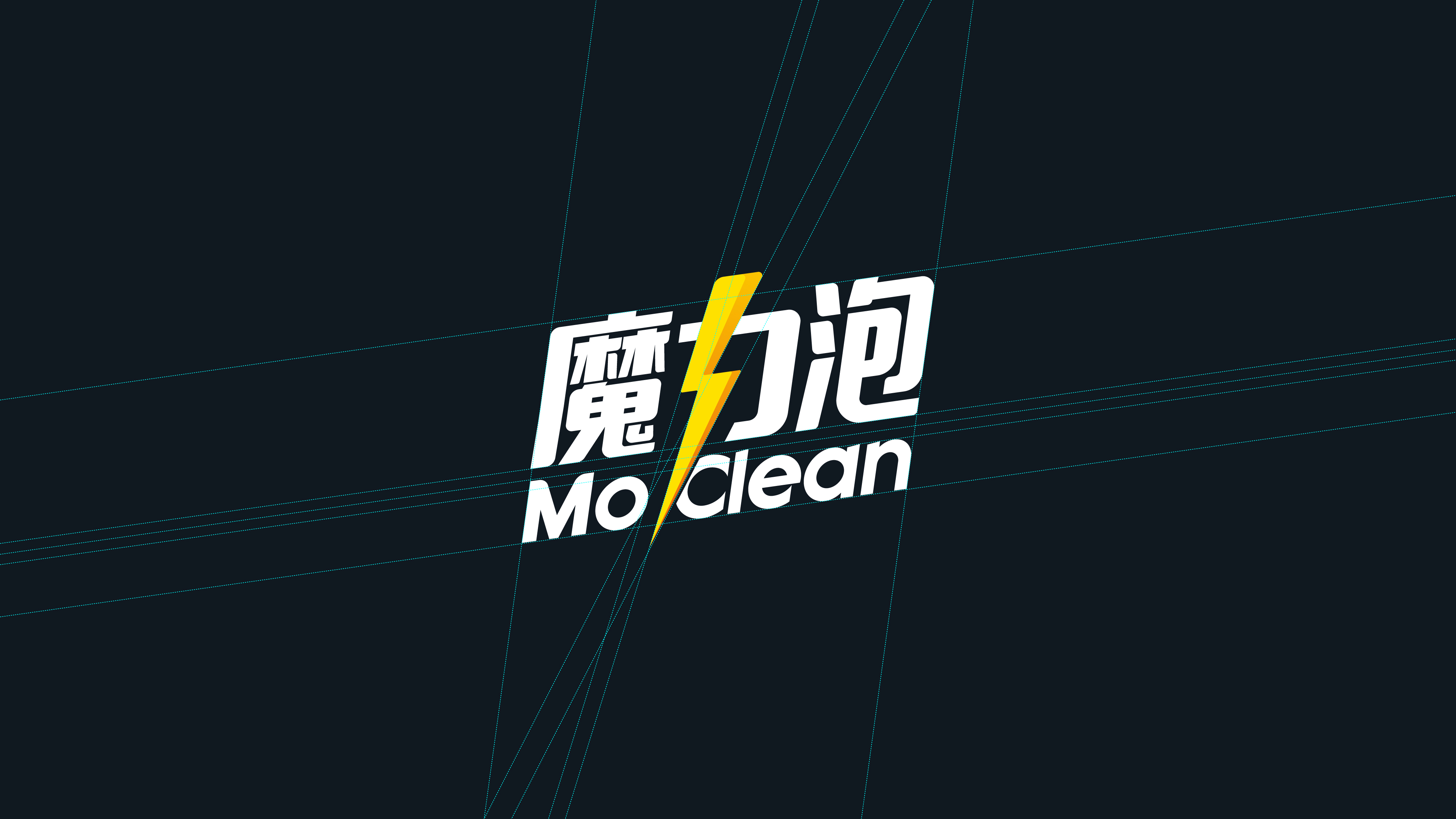
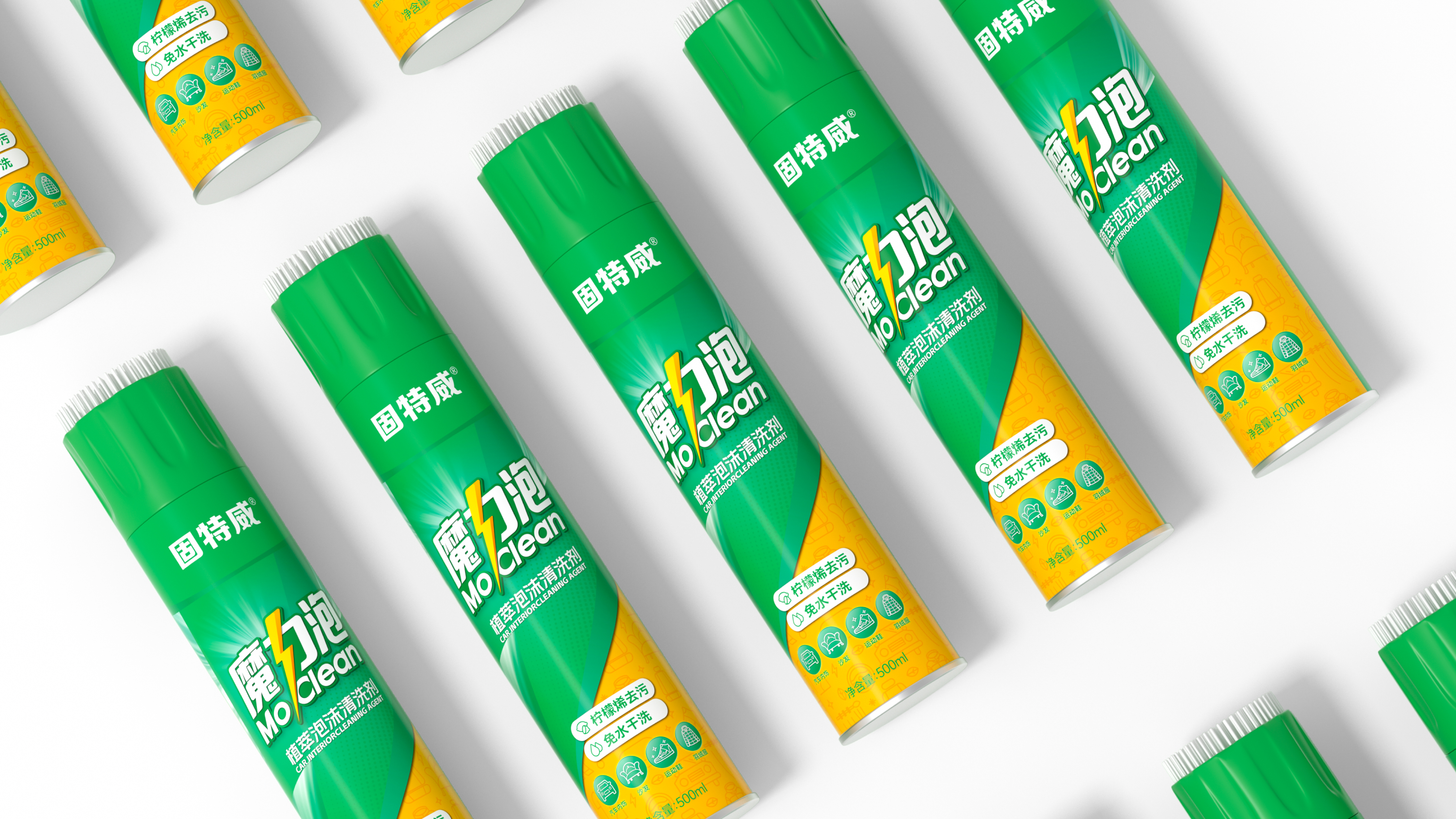
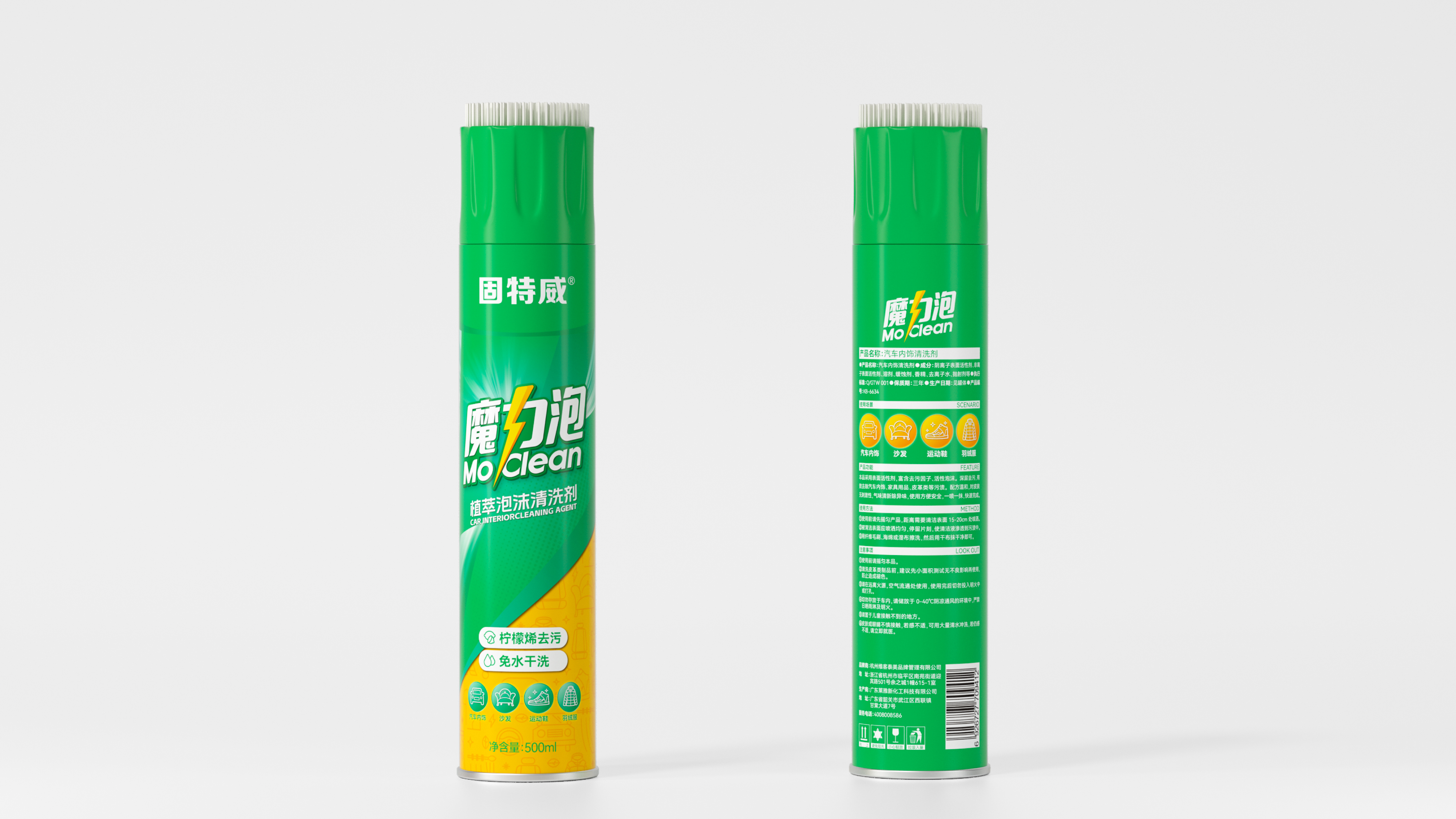
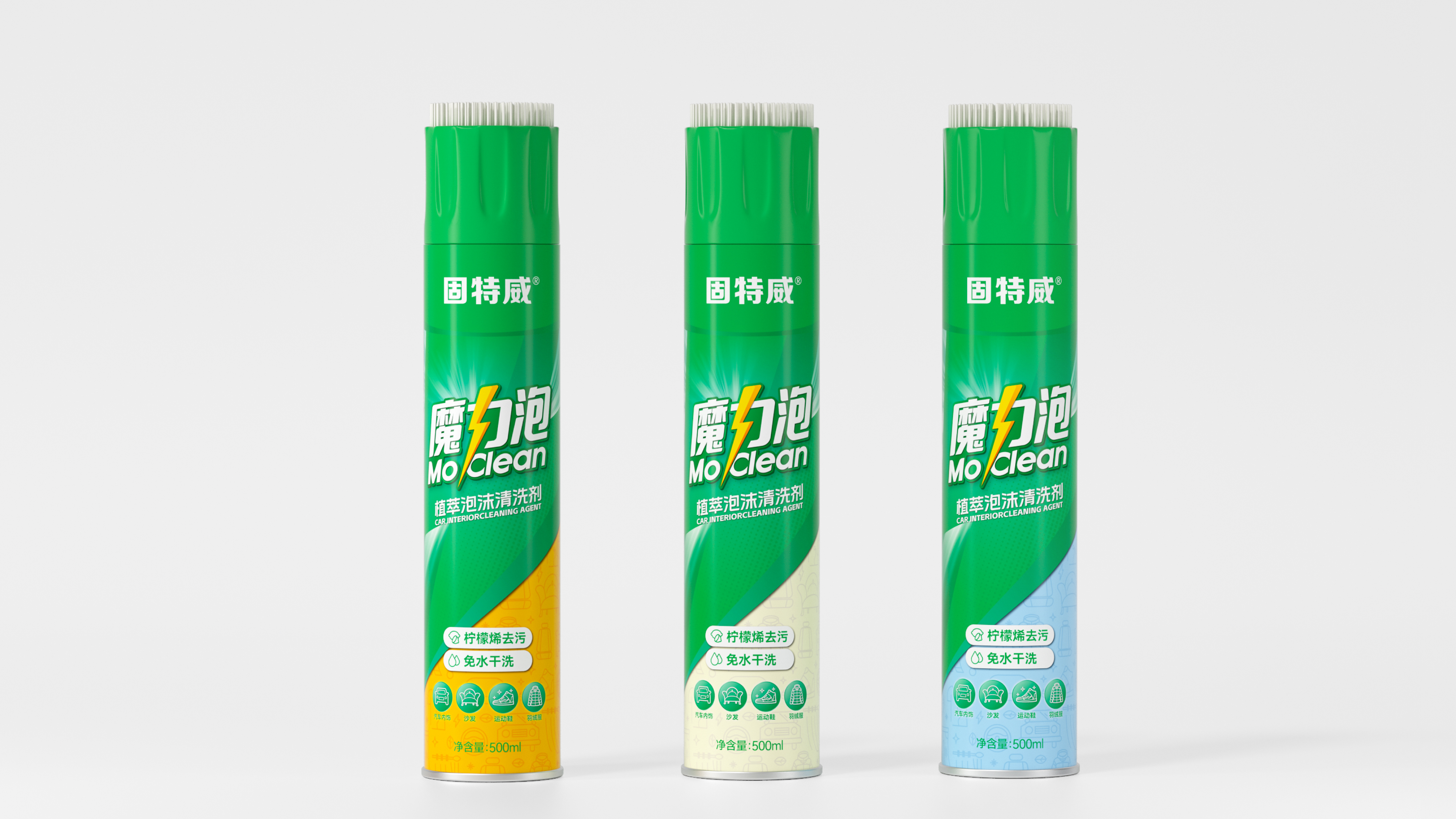
This project is to create the brand font and visual recognition system for Magic Bubble Essence Foam Cleaning Agent. The core goal is to help the brand establish a differentiated visual recognition and brand memory in a market environment where automotive cleaning products are highly homogeneous. The font design is the core breakthrough of this project. In the font design of "Magic Bubble", we combined the "force" character with the lightning element, aiming to convey a visual sensation of "speed" and "magic", which not only echoes the product's "rapid decontamination" functional characteristics but also gives the brand name a dynamic energy sense. At the same time, this design approach also makes the stroke structure of the three characters more balanced and unified. In terms of auxiliary graphics, the team used a bottom slanted cut as an auxiliary graphic, further strengthening the brand's visual memory points, allowing "Magic Bubble" to have a recognizable brand symbol on shelves and e-commerce pages. Through this design system that combines recognition efficiency, function communication, and brand memory, Magic Bubble has successfully upgraded from a functional cleaning product to a strong visual recognition and clear brand positioning automotive interior cleaning brand symbol.

魔力泡植萃泡沫清洗剂通过系统化的品牌视觉与包装设计升级,成功在汽车内饰清洁这一细分市场中建立起兼具速度感与品质感的差异化品牌形象。在汽车美容养护市场持续扩容的背景下,车主对内饰清洁产品的需求正从“功能性”向“体验感”升级,魔力泡凭借“快速去污、植萃温和”的双重定位,精准切入了这一增长赛道。焕新后的品牌视觉体系以闪电元素为核心识别符号,传递“快速、魔力”的产品特质,有效强化了品牌在消费者心智中的记忆点与识别度,为品牌在竞争激烈的汽车清洁用品市场中建立了差异化的视觉认知。


魔力泡是固特威(Korper Besonders) 旗下专注于汽车内饰清洁的子品牌。固特威始创于2008年,隶属于杭州维客泰美品牌管理有限公司,是一家以汽车美容养护用品为主营产品的民族品牌。魔力泡产品功能为快速去污,致力于为车主提供更舒适的内饰清洁体验。


本次项目是为魔力泡植萃泡沫清洗剂打造品牌字体与视觉识别体系,核心目标是在汽车清洁用品同质化严重的市场环境中,帮助品牌建立差异化的视觉识别与品牌记忆。字体设计是本次项目的核心突破,我们在“魔力泡”三字的字体设计上,将 “力”字结合闪电元素,意在传达快速、魔力的视觉感受,既呼应了产品“快速去污”的功能特性,又赋予了品牌名称以动态的能量感。同时,这一设计手法也使三个字的笔画结构更加均衡统一。辅助图形方面,团队以底部斜切作为辅助图形,进一步强化品牌的视觉记忆点,让“魔力泡”在货架与电商页面中拥有一眼即识的品牌符号。通过这一兼具识别效率、功能传达与品牌记忆的设计体系,魔力泡成功从一款功能性清洁产品升级为具有强视觉识别、清晰品牌调性的汽车内饰清洁品牌符号。


©® 2017-2026 MARVELLAND DESIGN & BASE IN HANGZHOU

美域盛华简介&联系我们 新闻 全部