
美丽赞 富勒烯紧致抗皱嫩肤霜
BRAND:美丽赞
PROJECT MANAGER:Kevin
DESIGNER:珈百
3D EFFECT:Mega
YEAR:2023.09
Through systematic brand visual and product design upgrades, Meilijian successfully established a professional, scientific, and trustworthy brand image in the highly competitive anti-aging skincare market. The brand's founder has over 2 million fans across the internet, and the brand adopts a live-streaming matrix approach for global sales, achieving rapid growth and market penetration. Among users, the product has received a large number of genuine positive reviews. Consumers commented that it has "a light texture", is "super friendly for yellow skin", "contains no fragrances or alcohols, and is also gentle for sensitive skin"; some users even called it "the 'life-saving cream' for yellow-skinned sisters". With differentiated brand visuals and outstanding product efficacy, Meilijian successfully grew from a start-up brand to a highly favored efficacy skincare brand among 30-40-year-old female consumers.
The parent company of Meilijian is located in Ningbo, Zhejiang Province, and was established in 2022. The product ingredients mainly consist of hyaluronic acid and plant extract essences, targeting the skincare consumption group of 30-40-year-old women. The brand is committed to empowering skincare products with modern biotechnology, providing scientific and effective anti-aging solutions for urban women.
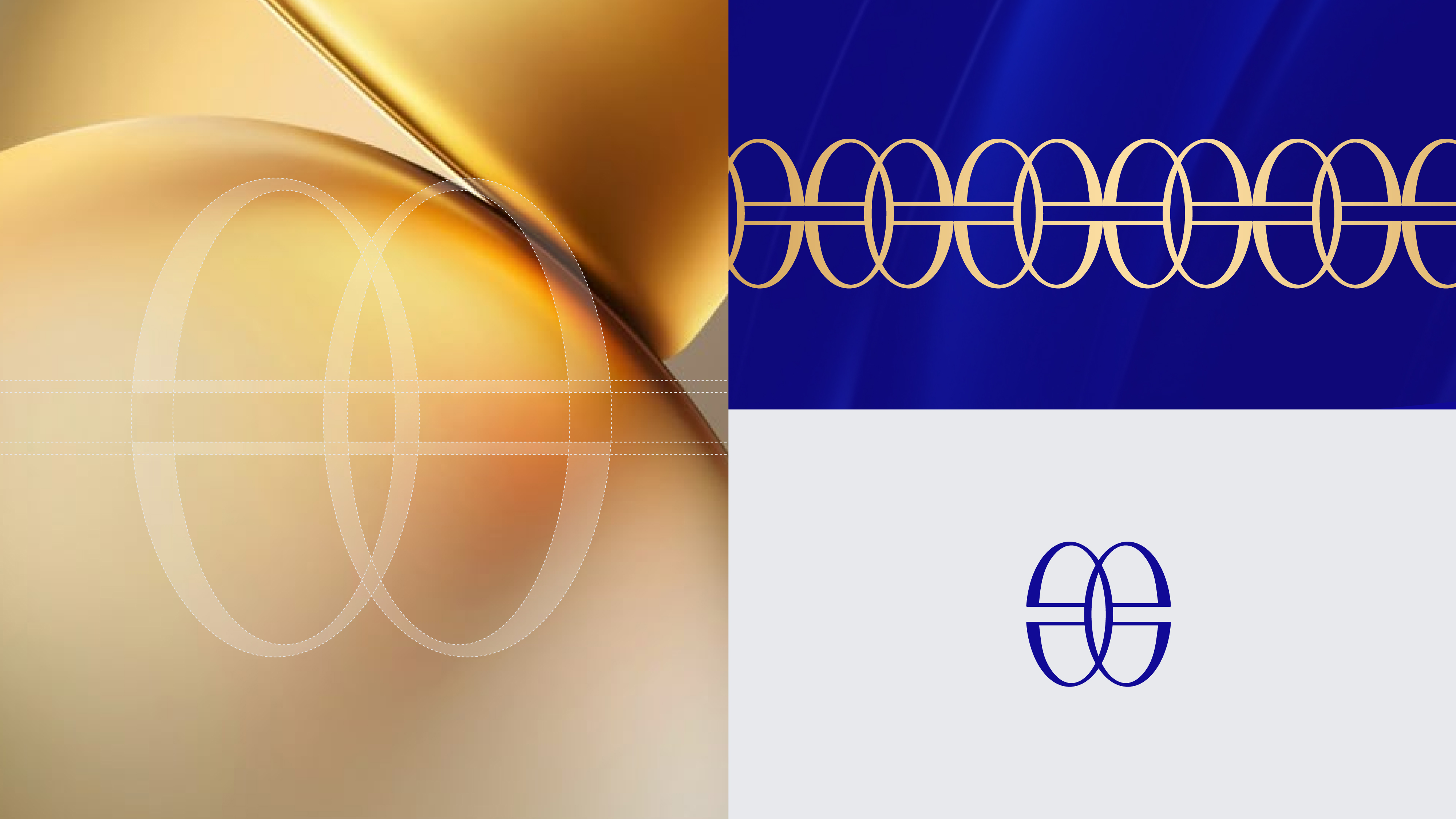
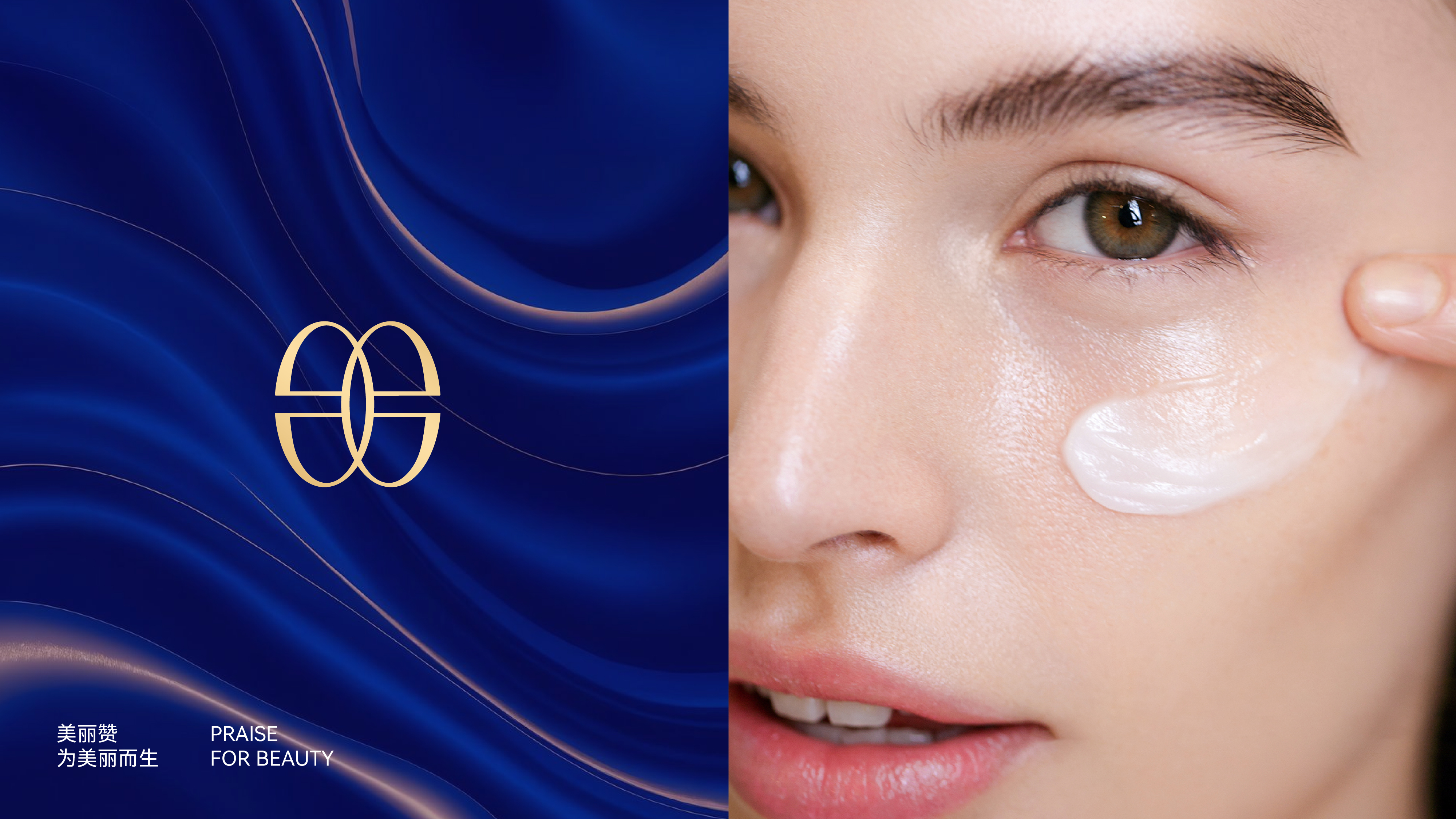
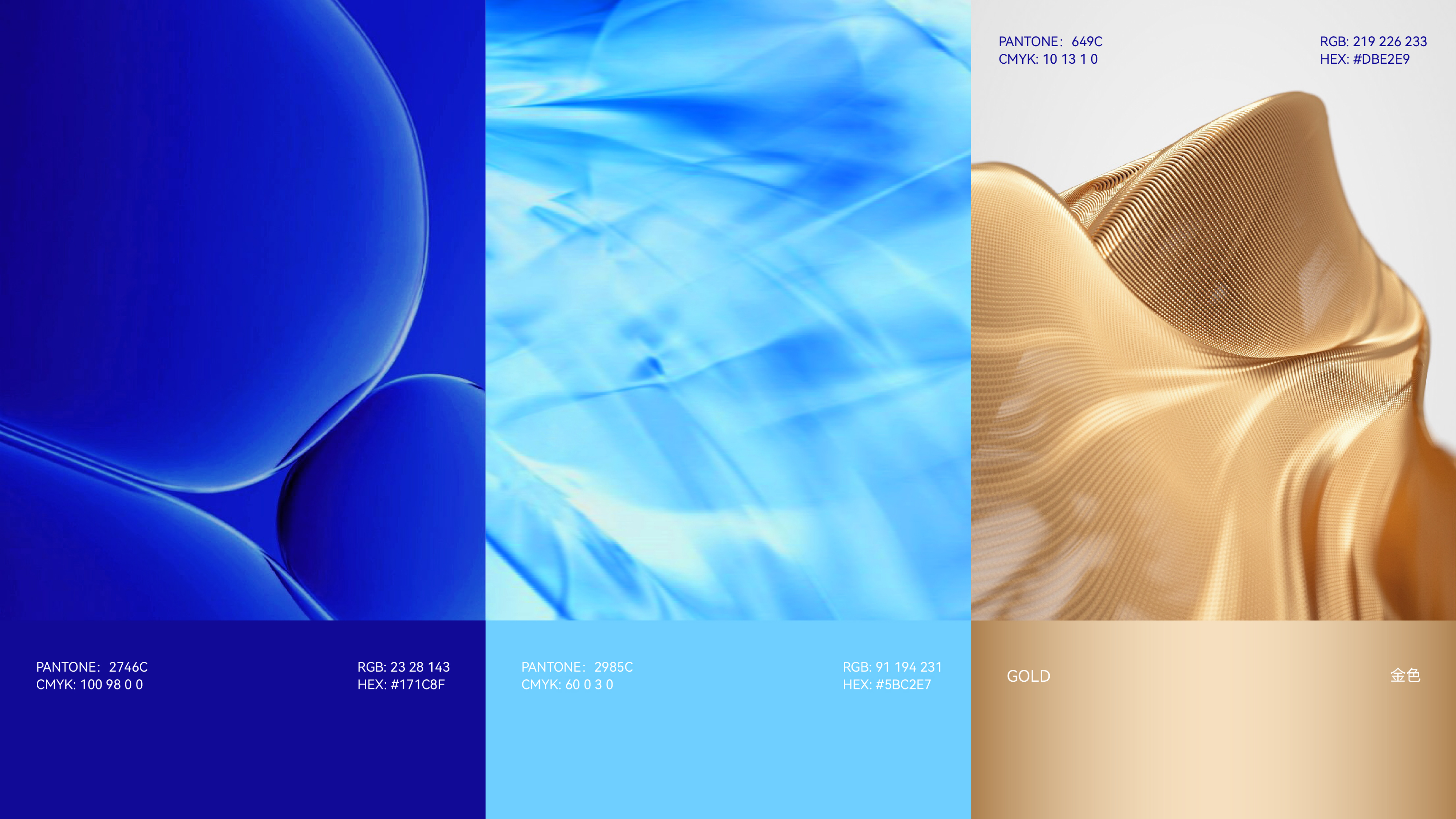
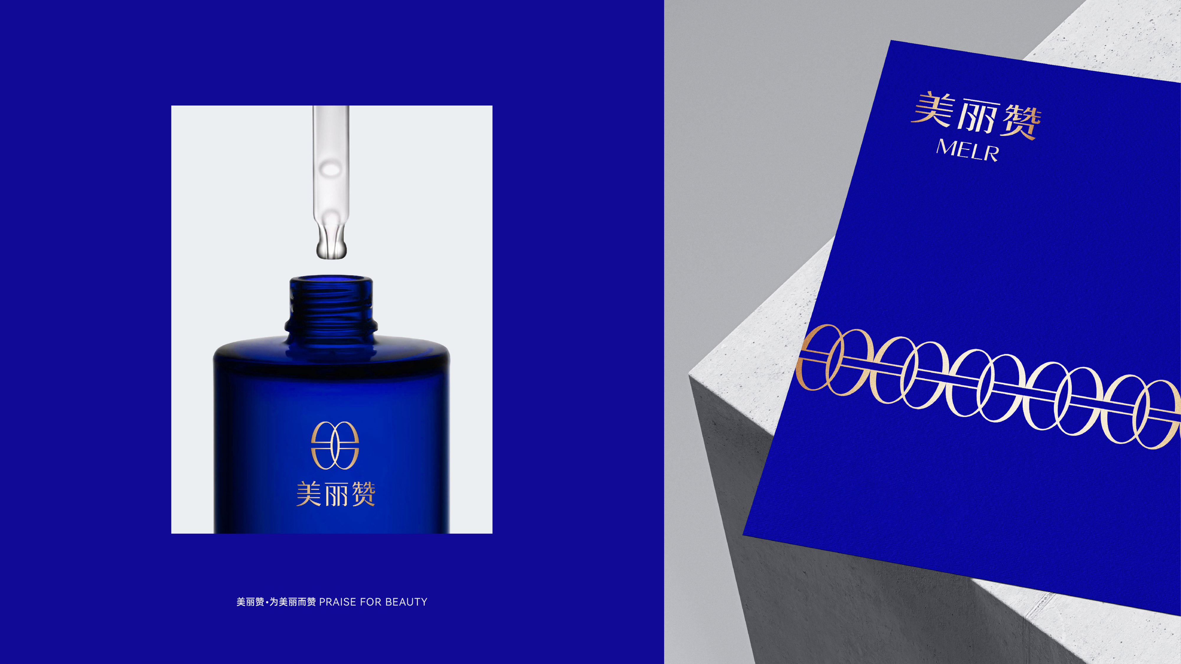
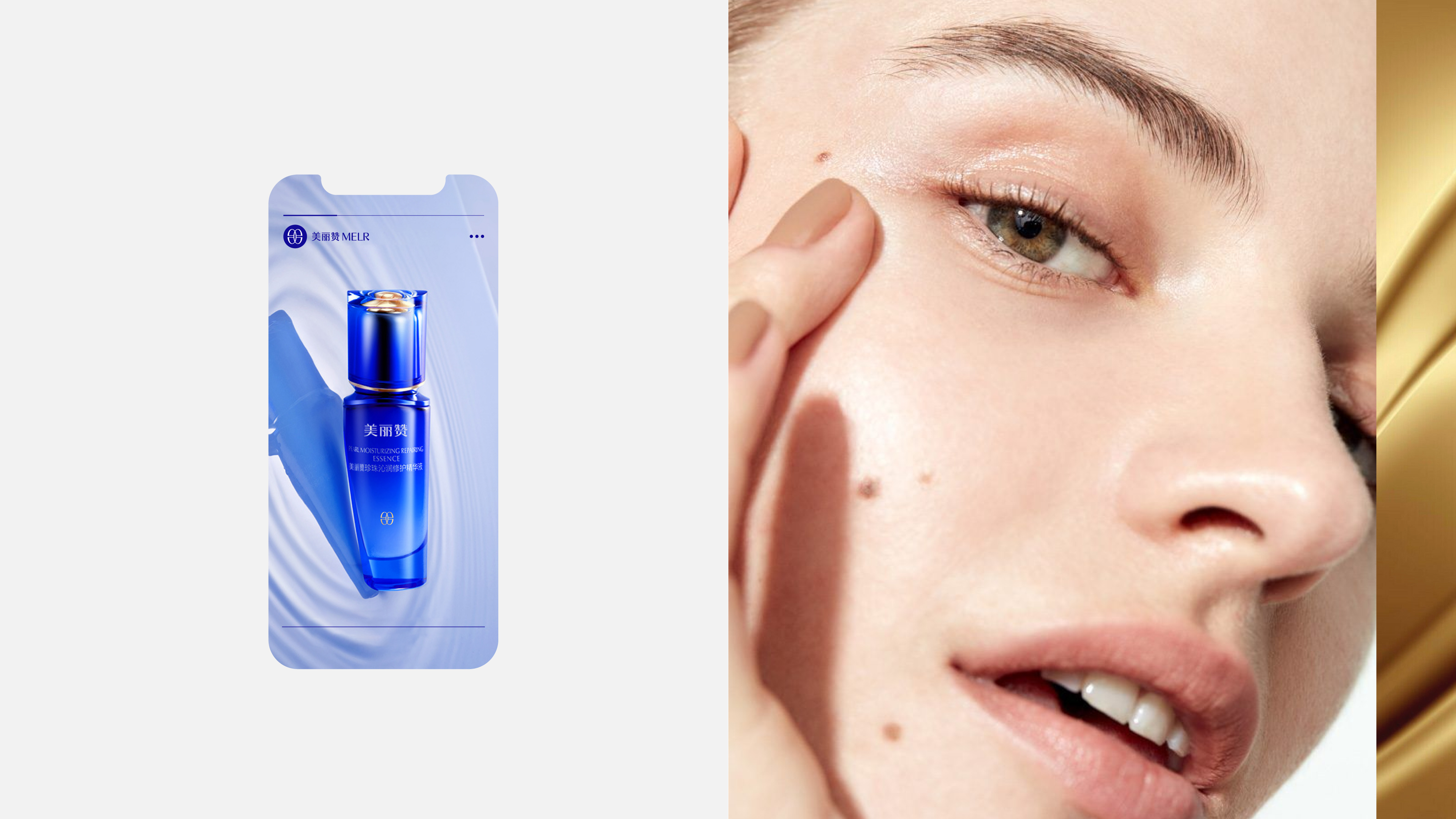
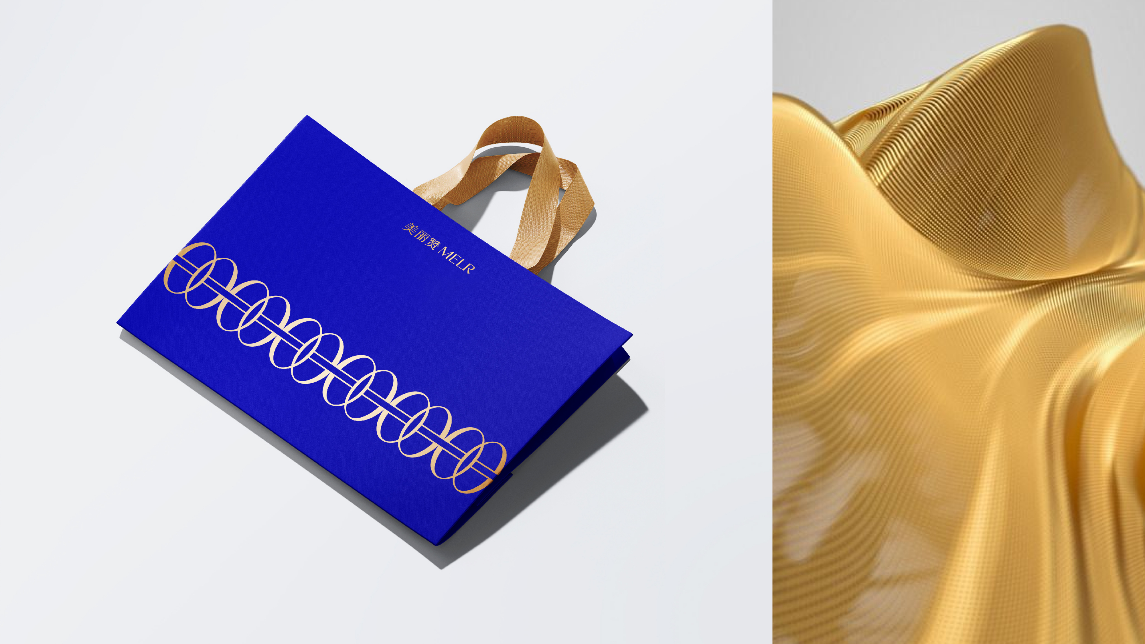
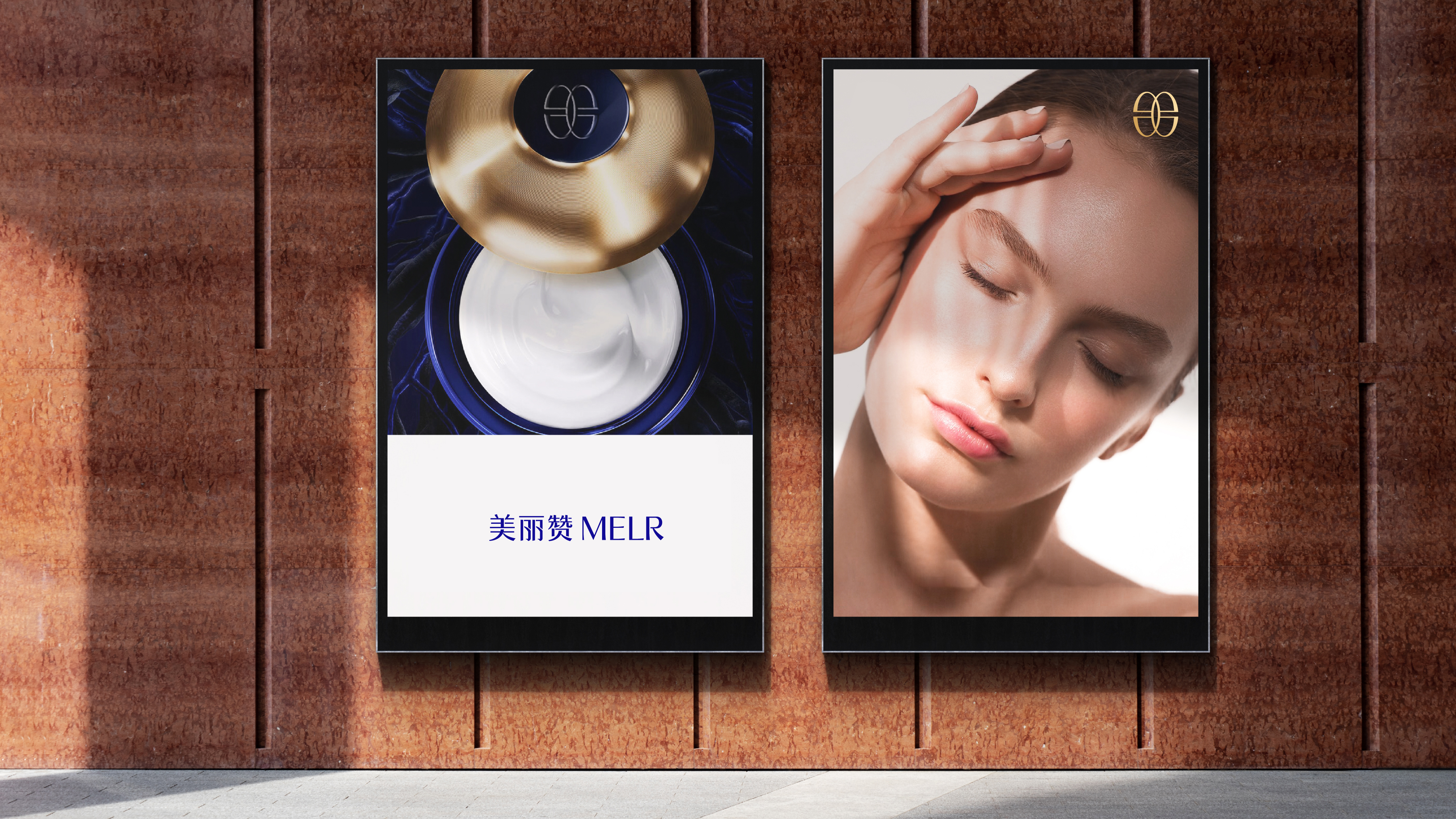
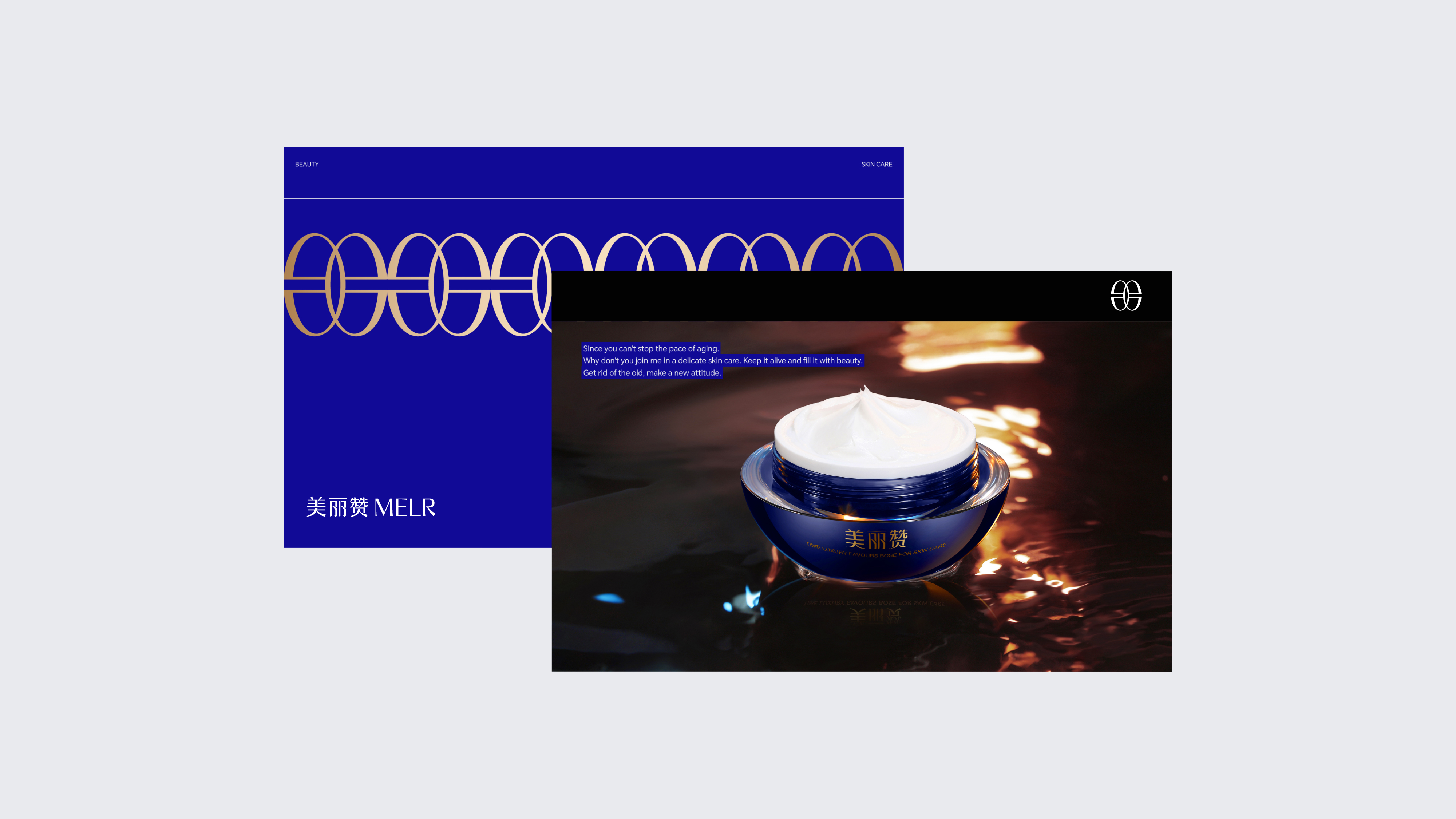
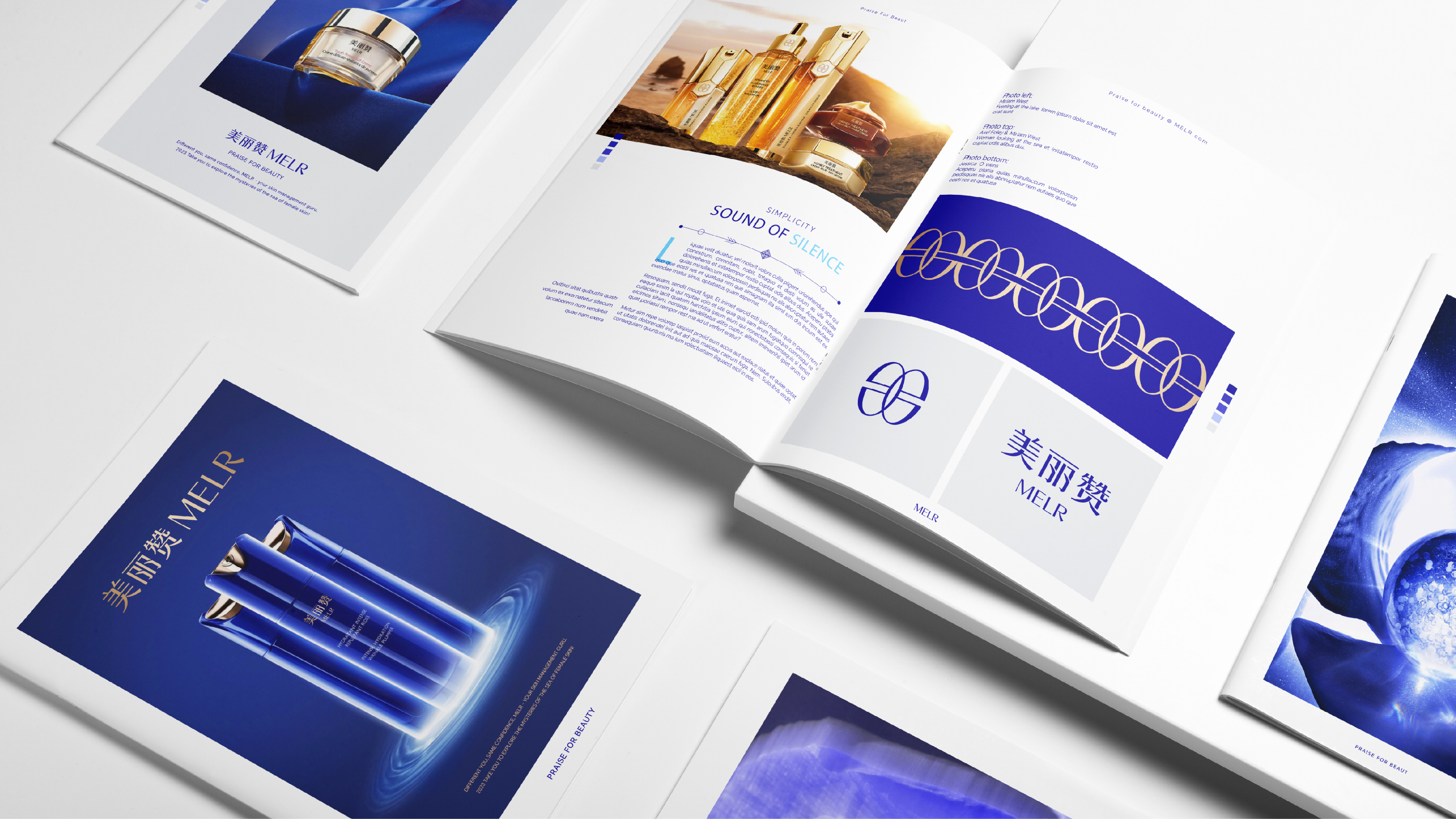
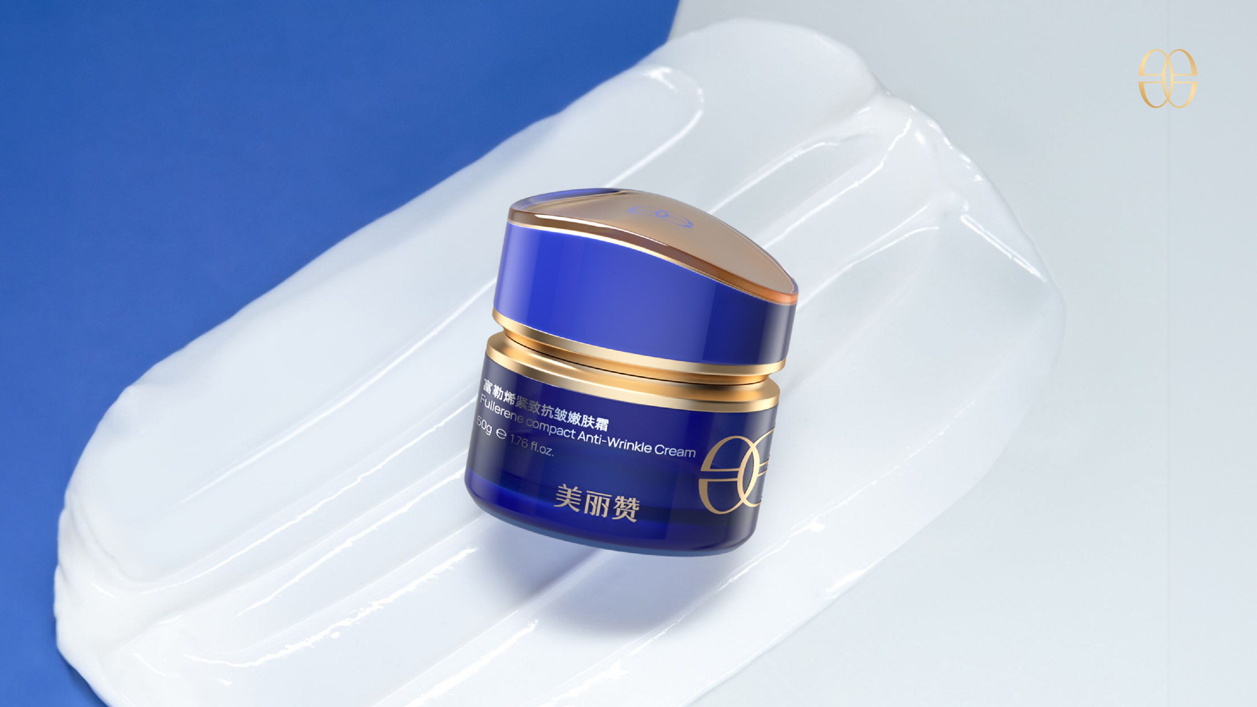
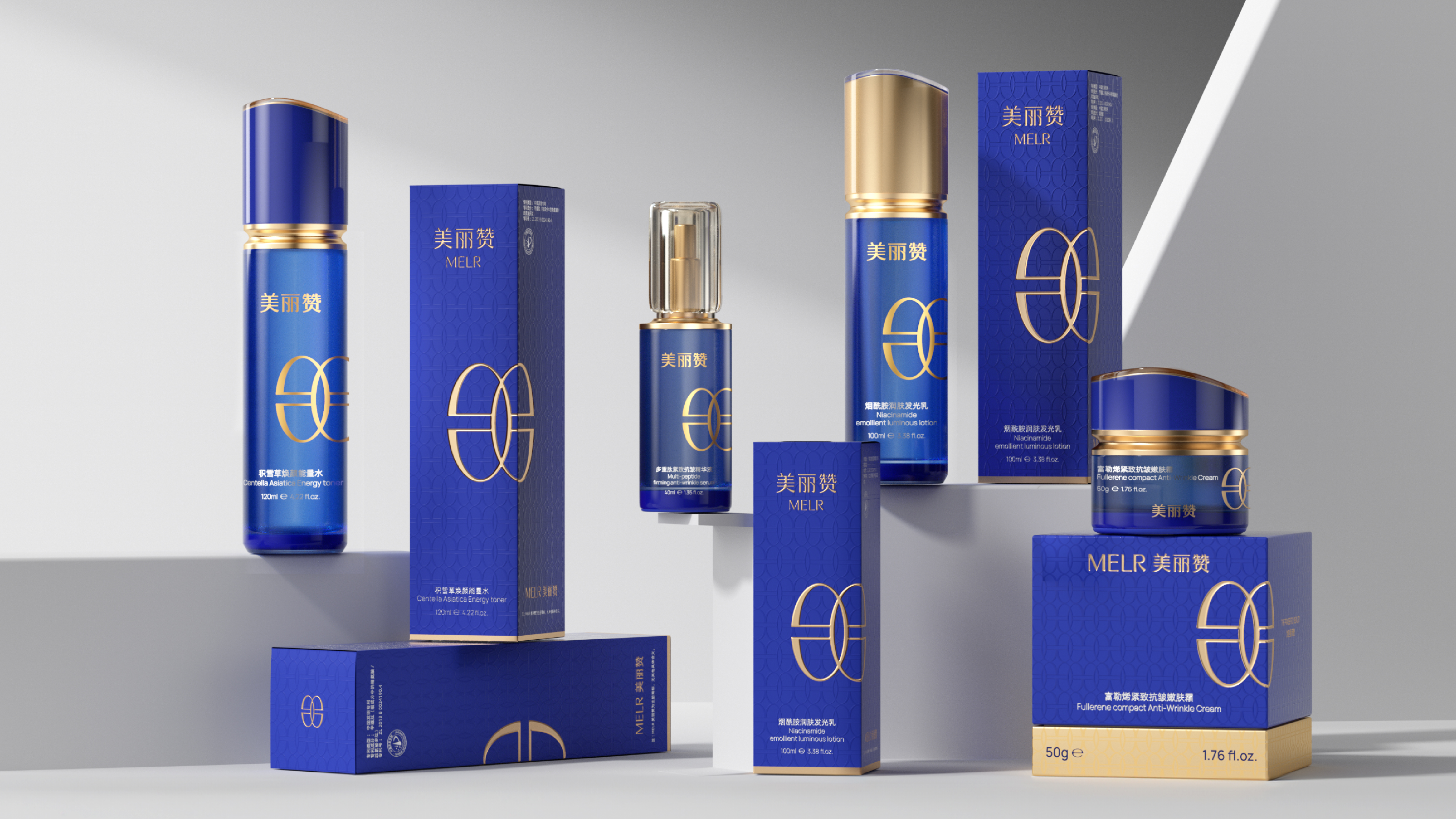
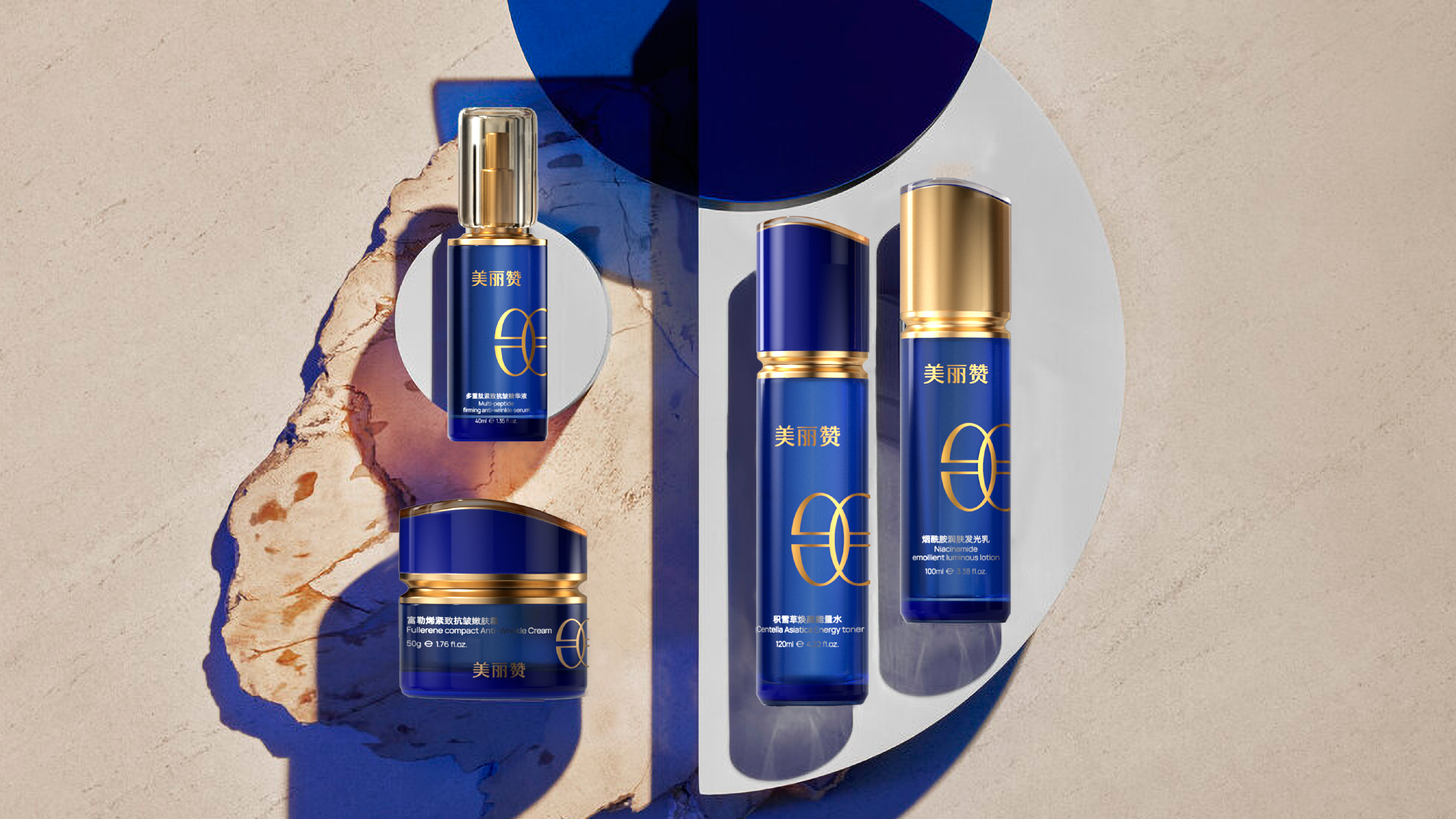
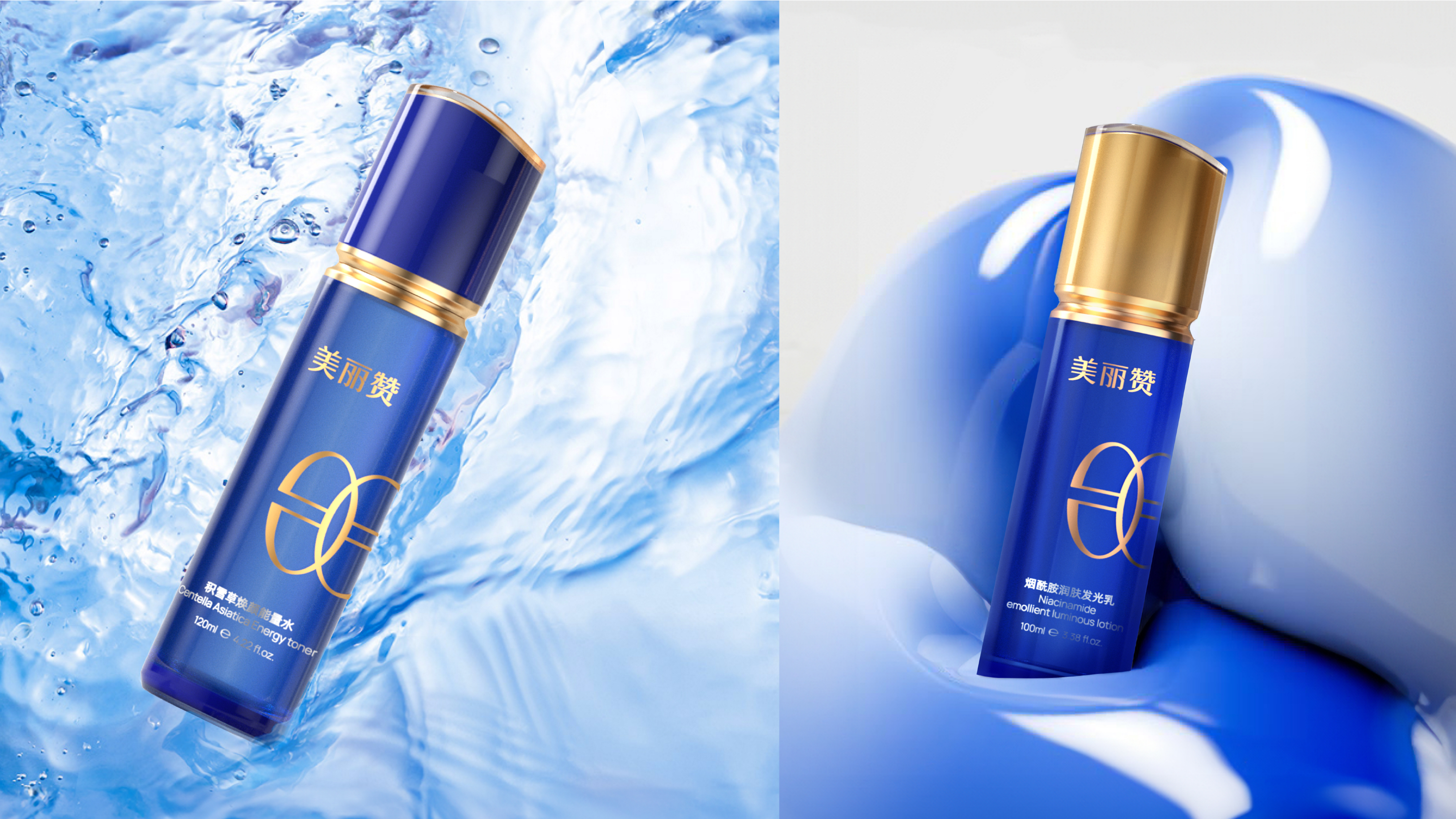
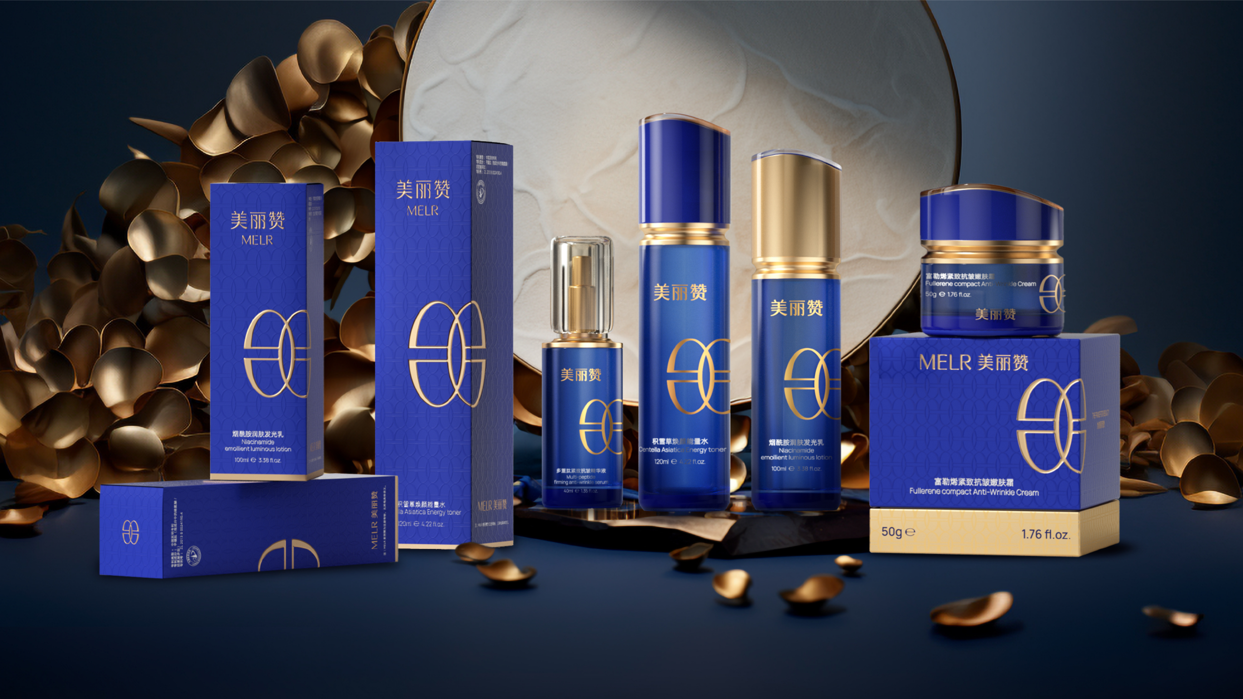
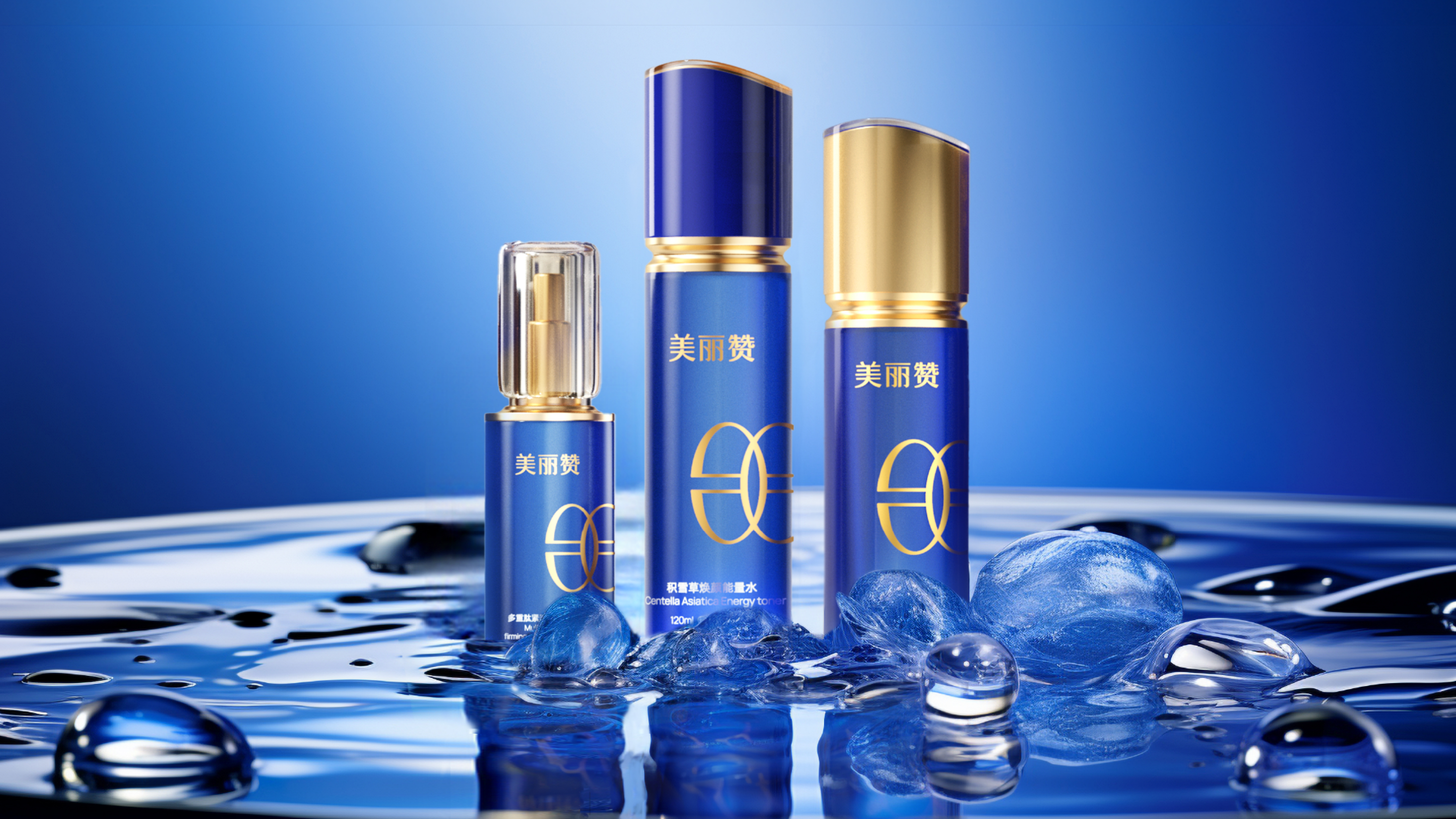
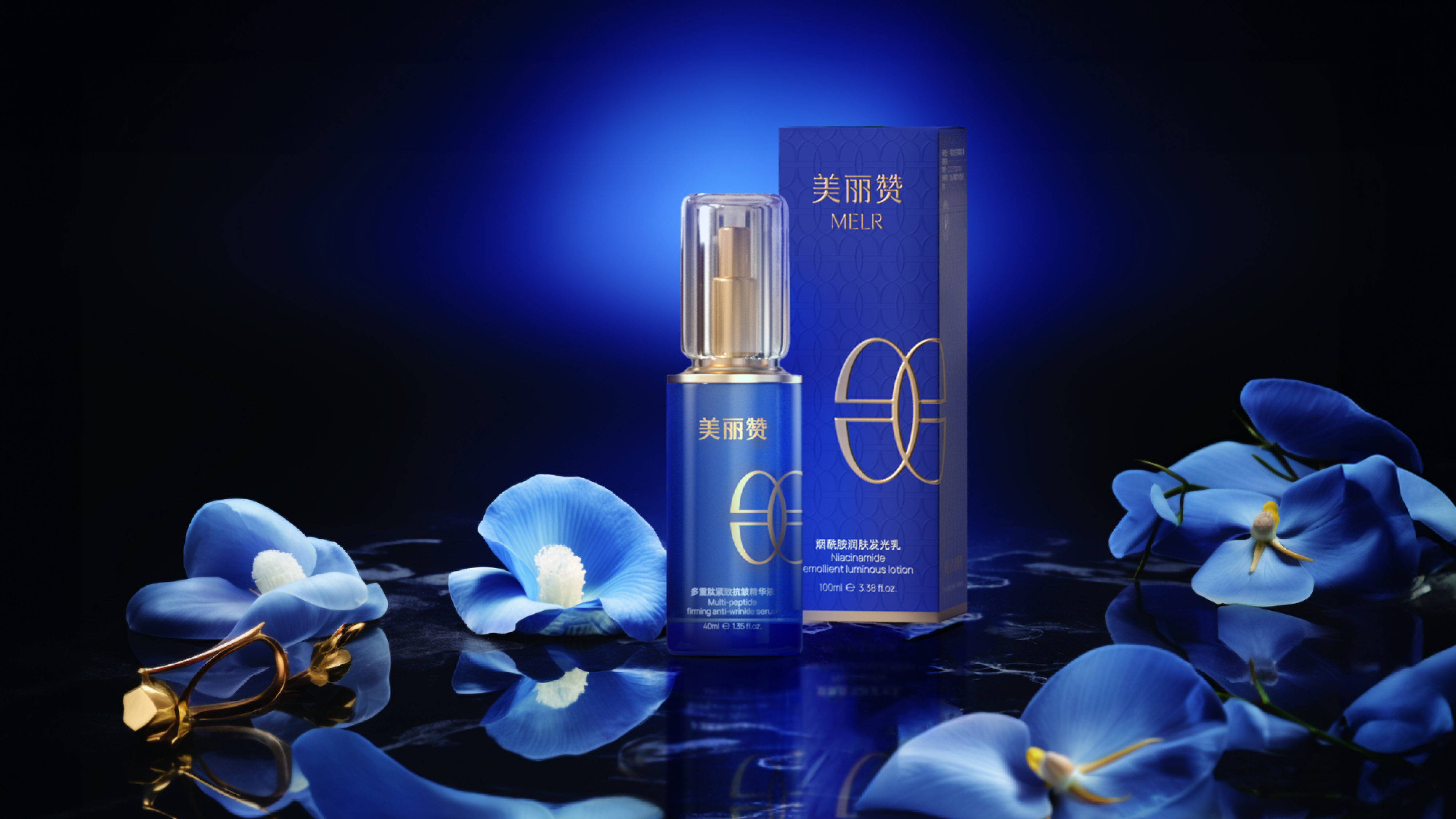
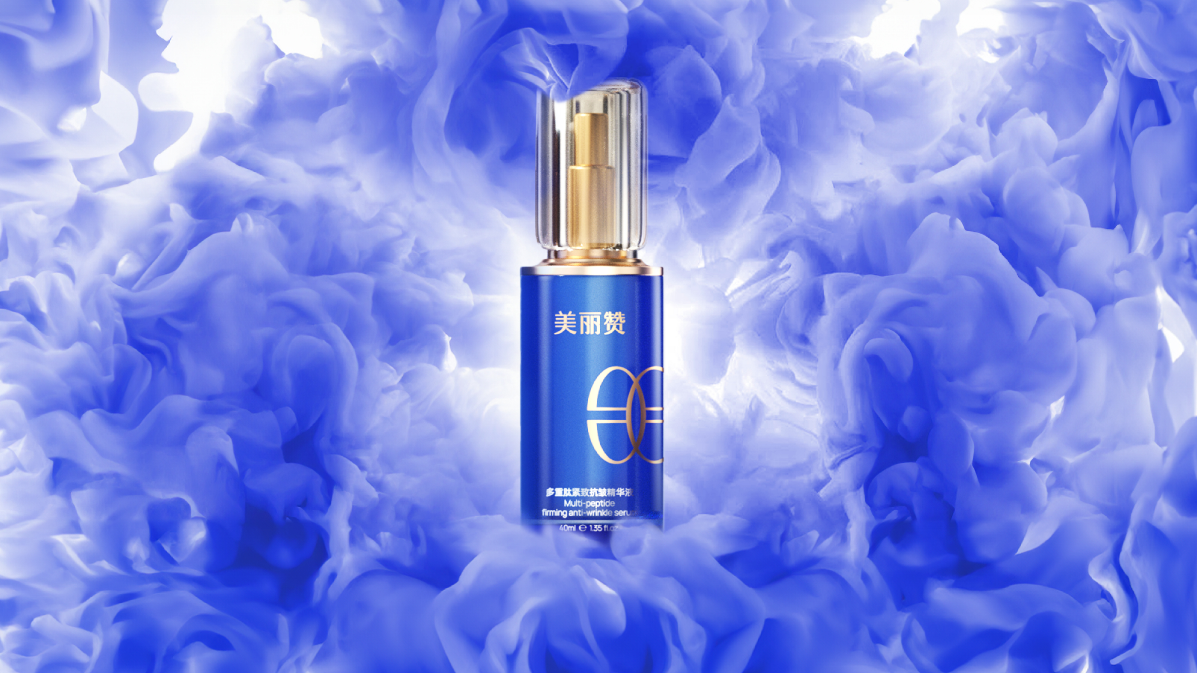
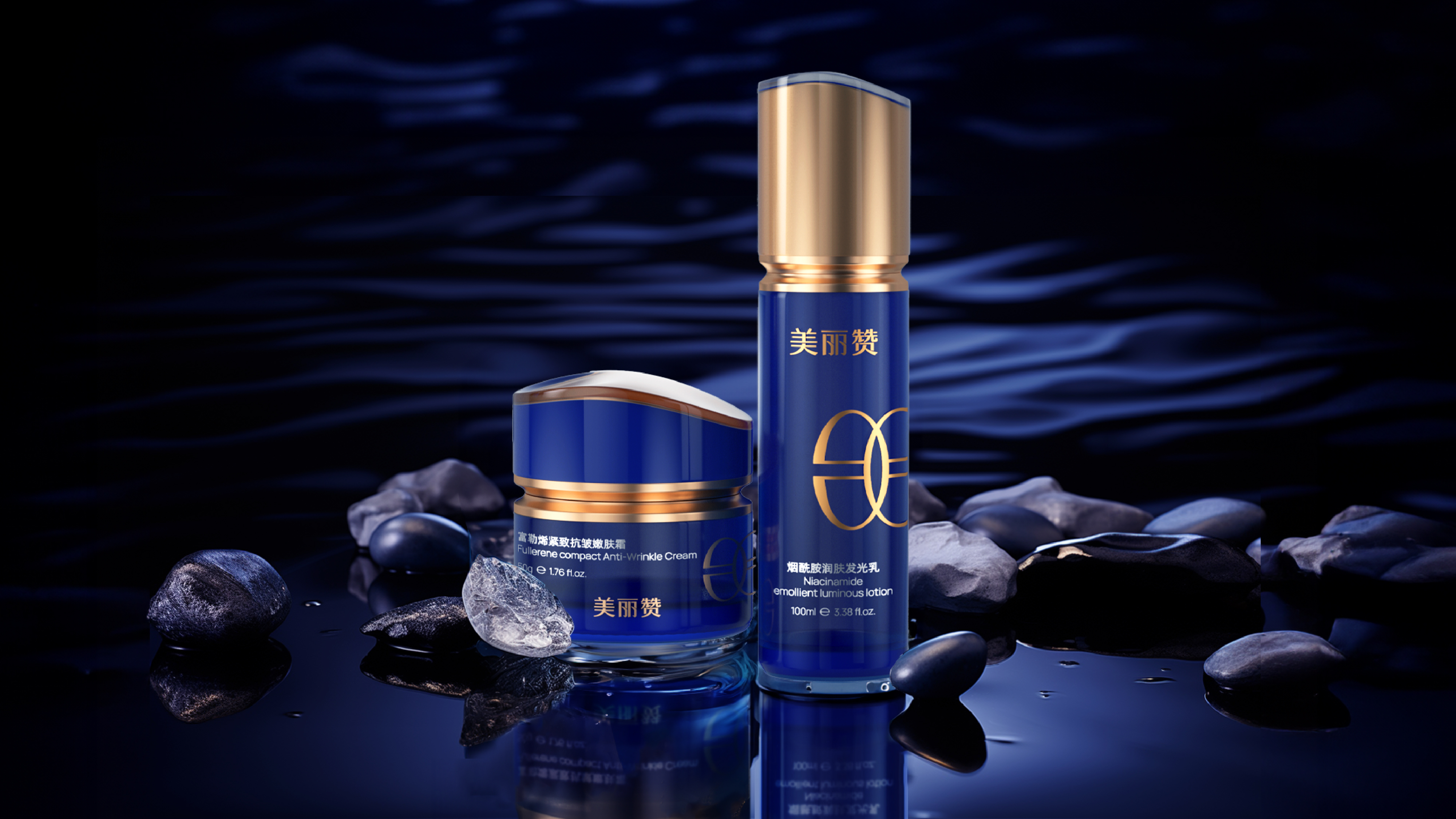
This project is to create a brand visual and packaging design system for Meilijian's fullerene firming, anti-wrinkle, and skin-lightening cream. Starting from the core concept of "for beauty, praise it", the team established a scientific and professional brand tone in the visual aspect for Meilijian. The brand color was selected as blue, which is visually more scientific and professional, effectively conveying the core value of the brand "enabling beauty with technology". In the auxiliary graphic design, the team processed the brand name's initial letter "m" into horizontal symmetry, obtaining a unique auxiliary graphic symbol. This design not only strengthened the visual memory of the brand name but also conveyed a precise and rigorous scientific attitude through symmetrical aesthetics. The overall packaging presents a simple and professional visual language, allowing the product to have clear brand recognition on shelves and e-commerce pages, effectively helping the brand establish differentiated visual assets in the efficacy skincare sector.
美丽赞通过系统化的品牌视觉与产品设计升级,成功在竞争激烈的抗衰老护肤市场中建立起专业、科研、可信赖的品牌形象。品牌创始人全网粉丝200W+,采取直播矩阵的方式进行全网销售,实现了品牌的快速起量与市场渗透。在用户端,产品收获了大量真实好评,消费者反馈其“质感轻盈”、“对黄皮超级友好”、“不含香精和酒精,对敏感肌也很温和”;有用户评价其为“黄皮姐妹的‘救命霜’”。凭借差异化的品牌视觉与卓越的产品功效,美丽赞成功从初创品牌成长为备受30-40岁女性消费者青睐的功效护肤品牌。
美丽赞母公司坐落于浙江宁波,于2022年成立。产品成分主要以玻尿酸、植物提取精华为主,针对于30-40岁女性护肤消费群体。品牌致力于以现代生物科技赋能护肤产品,为都市女性提供科学、有效的抗衰老解决方案。
本次项目是为美丽赞富勒烯紧致抗皱嫩肤霜打造品牌视觉与包装设计体系,从品牌“为美丽而赞”的核心理念出发,在视觉层面为美丽赞确立了科研专业的品牌调性。品牌色选定为蓝色,蓝色在视觉上更具科学感与专业感,能够有效传递品牌“以科技赋能美丽”的核心价值。在辅助图形设计上,团队将品牌名首字母 “m”进行水平对称处理,得到了独特的辅助图形符号,这一设计既强化了品牌名的视觉记忆,又通过对称美学传递出精准、严谨的科研态度。包装整体呈现出简洁、专业的视觉语言,让产品在货架与电商页面中拥有清晰的品牌识别度,有效助力品牌在功效护肤赛道中建立差异化的视觉资产。